Yeah, having others look at and revise your work with fresh eyes is really crucial. It's becoming my favourite part of the process because it needs least effort from my part haha
Here are some visual examples...
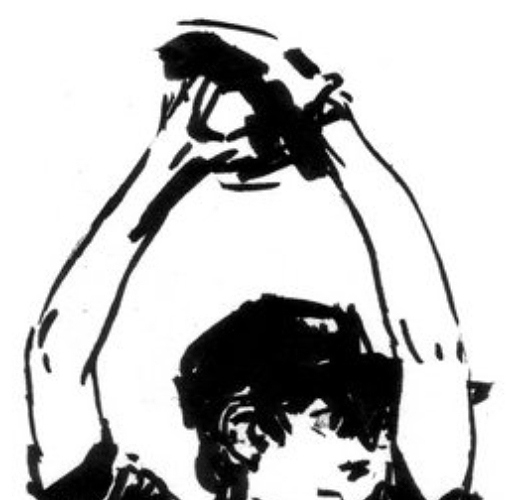
In this picture, the thicker parts of the lineart show shadow and weight of the fabric, contrasting to the thinner lines of the arms. In action scenes, you can maybe thicken the parts of the lineart where you want to draw attention to.
the artist is
rvsa (nsfw warning). I think they have a lot of great examples of dynamic linework.
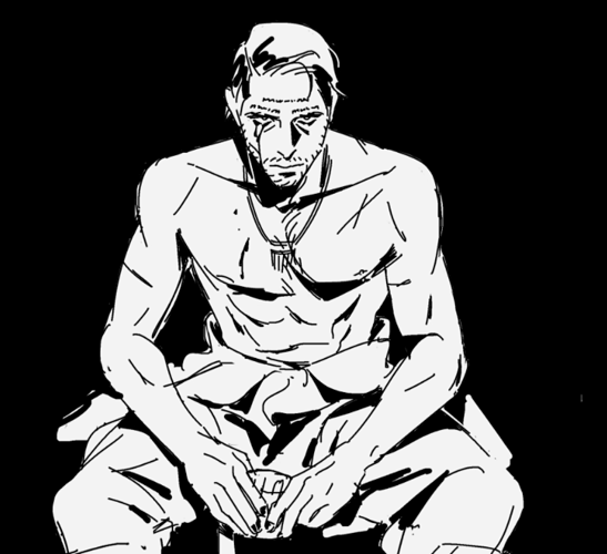
This example is for showing more examples of adding shadow with your lines/inks and really adding more life to them. The use of black in the image puts more emphasis on the figure, lets the viewer give more focus to the details that are there and adds a dramatic effect. This is something you can possibly utilise in a critical/climatic moment.
Artist is
grassdlc (also nsfw warning

)
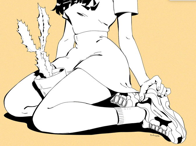
If you want an example with cleaner digital lines,
chootalks has quite a lot of them too. They balance shadow with neat, thin lines.
Take my advice with a grain of salt though, I could be just biased by personal taste. I've seen a lot of webcomics with very clean and 'monotonous' lineart that works well, even if it's not my thing.
I can really relate to the story problem, we comic creators get so excited over our stories and just want to get everything out at once. You can either trim it or give it more room to grow while giving the story some breaks. Consider getting beta readers as well and ask them what they think is going on or what the story is so far (in the storyboarding/thumbnail phase), that would help narrow down the more problematic parts.
Honestly, I would describe your comic as good though, especially if it's your first one.