@Eightfish @jcmraz
Yeah I'll give this a try. Please bare with me, and thank you for the opportunity!
Would I read this comic?
There's a lot of potential for sure. You're trying out some really cool shots. In it's current state however, I don't think this would be in my list of comics I'd be checking back in weekly for.
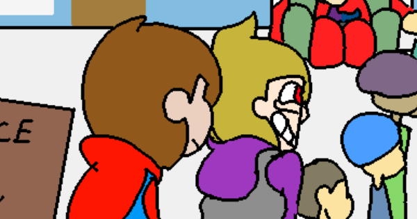
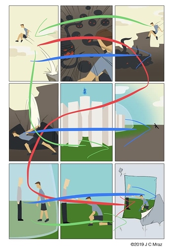
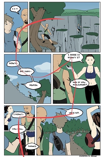
I don't feel invested in the story enough to stay and wonder what is going to happen next. All I know is they essentially run and fight. I had to read your description to really understand why they're doing that in the first place. As much as I did really enjoy the artistic exposition of the poster in the first few pages, you should try to have their reason for going out in the first place come across your comic better. I feel like I would be way more interested if I knew what message they were trying to bring across this dangerous world.
The consistency of the panels kind of works against an action comic like this. It brings down the impact a lot of the sudden/explosive scenes could have if you tried going for a dynamic panel frame that would fit the intensity. Some of the instant action scenes come off a little too sudden as well, like I'm missing a few pictures of what went on in between the moments when the worm suddenly appears. Having more pictures does not necessarily cut the timing of an instant action if your panels have the proper flow.
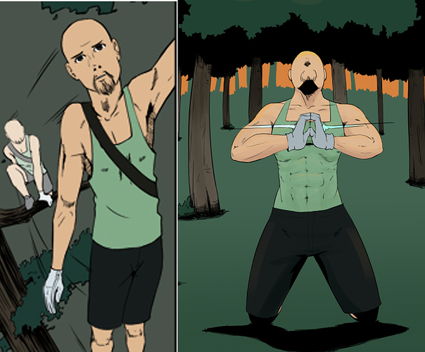
When I was looking over your discussion with the art improvement comparisons I thought this was over a longer period of time, which I think would have justified the frustration more so. These were all done within recent time frames of each other. So even to me, the improvements you see in your work were not so clear to myself as a reader.
Looking at the available pages it seems clear to me you are making a very serious effort to understand the details of human anatomy because of the nature of the comic. Which is honestly no small feat, and I have massive respect for you keeping at it. Unfortunately this did make me notice whenever there was a glaring change in their anatomy in certain panels. I feel like you're in the position of improvement, but not fully having a grasp at the level you're trying to achieve just yet. (if you want me to point out examples let me know!)
The backgrounds and colors I'm not entirely bothered by. I can see you're trying out different methods to your treelines and adding bushes in some panels. It would work better if that was consistent when you do add the background in your shots. The gradient is really easy to abuse, you'd be surprised how much action drawing lines and spikes into your background colors of an action scene can instill a greater motion to the readers looking at it.
The concept and the way your art is progressing is promising, but it's current execution does not hold my attention long enough to stick around.
I hope this was alright! Take care and Happy New Year!
I feel like I'd be escaping if I didn't put up my own comic for critique so I'll leave a link for anyone who would like to review it. I am very aware of some of it's issues, but I'm more than welcome to hearing from an outsiders perspective anything I may have overlooked!