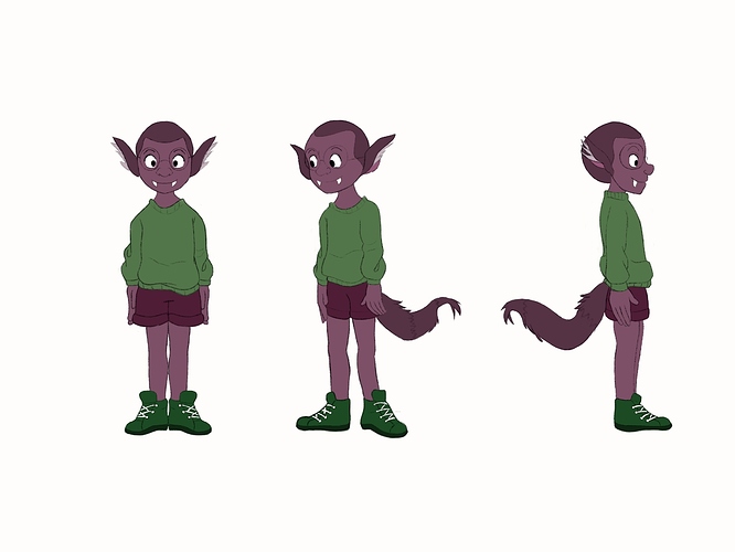
Color theory is great and all, but at the end of the day the most important thing is to just look at it with your own eyes and see whether you think it looks good or not, regardless of the theory. Also remember that the colors of the background / environment the character will be in will impact a viewer's perception at least as much as the colors of the character himself (that is, if you are planning on using this character in a comic or something).
That said, I agree with previous comments that he is lacking in contrast, otherwise nothing wrong with the choice of colors. By contrast I mean value contrast - try to break up the form into more distinct areas of light and dark. This will make it more visually interesting and easier to look at.