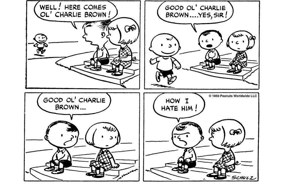
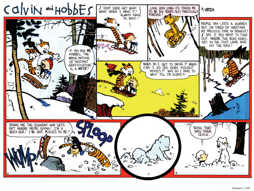
Bill Watterson was famously against that rigid Sunday-style layout and fought with his syndicate for years. It was toward the end of Calvin and Hobbes' run that they finally relented and gave him the freedom to make his Sunday comics as he wanted.
And rigid they were. All Sunday comics had to use that same layout:
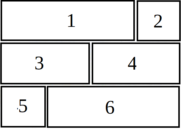
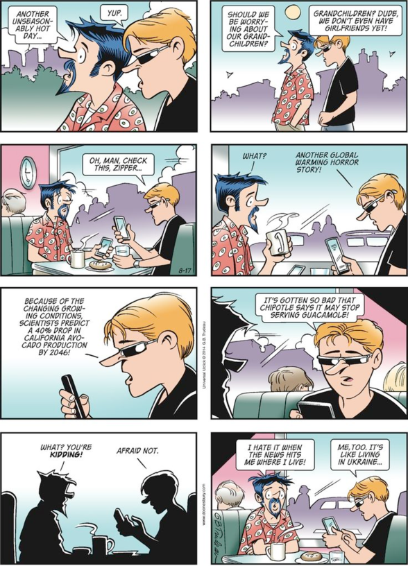
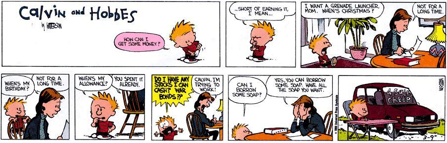
Panels 1 and 2 were usually used for the strip's title/logo and were considered throwaway. They would typically contain a small gag that had nothing to do with the main comic because many newspapers literally threw those two panels away.
Panels 4 and 5 had to be identically sized and their sizes had to add up to panels 1 and 2. Artists could break the panels down into smaller panels if they wished (and as Watterson did with pane 4 of the example you provided) but it still had to fit the layout shown above. Panels 5 and 6 were mirror images of 1 and 2 and again could be broken down into smaller panels (as Watterson did with panel 6 in your example) but again the smaller panels had to fit within the layout shown above.
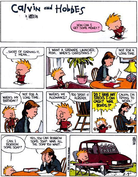
This was done so that the comics could be published in different layouts for different newspapers. Here is the same C&H comic you've posted, rearranged as newspapers would have:
First, the "standard" layout: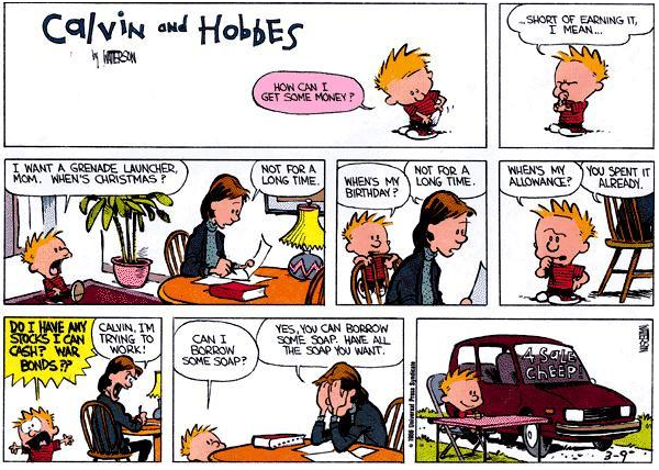
Next, the "Vertical" layout (which might work better for a site like Tapas):
And finally a "Horizontal" layout, which wouldn't work well on a site like Tapas at all because they gear it toward phones.
Note that these layouts are all possible because of the strict layout that syndicates forced on cartoonists. If you read virtually any Sunday comic published in the late 1970's, 1980's, and early 1990's they will follow this format, because they were forced to.