1 / 17
Apr 2020

Hello, what brush size do you use when you draw a comic? And come along with brush size, what about the canvas and page size? I am really curious because I used to draw comic with G pen 3 px, it all makes mess when the brush tip is too small. However, if I adjust it to 5 -7, the line gets dark and not pretty. So I am wondering what could be the best. Thanks all! ( I use CSP )

  • created

    Apr '20
  • last reply

    Apr '20
  • 16

    replies

  • 3.8k

    views

  • 14

    users

  • 21

    likes

Hi I tend to go with 3000 x 3000 on 300 resolution then go from there. I usually crop or extend the canvas later. as for bush size I don't go with numbers I just go with a really small brush as I sketch, then I paint in all sizes. I paint all my panels not filling in cell shades that's just my style.

4 px, lol :grinning: I use A3 page and 3px brush for thin lines and 4 px brush for usual lines (1st pic - 3px, 2nd - 4px). Sometimes it is hard not to make a black mess with 4 px, but with time I found out that 3 px is not enough.

Haha, thanks :smiley: just doing it a lot with a lot of cussing in between I guess =) Also trying to make longer strokes. Not good in that, but doing the best as usual.

Hi Papaladie :slight_smile:

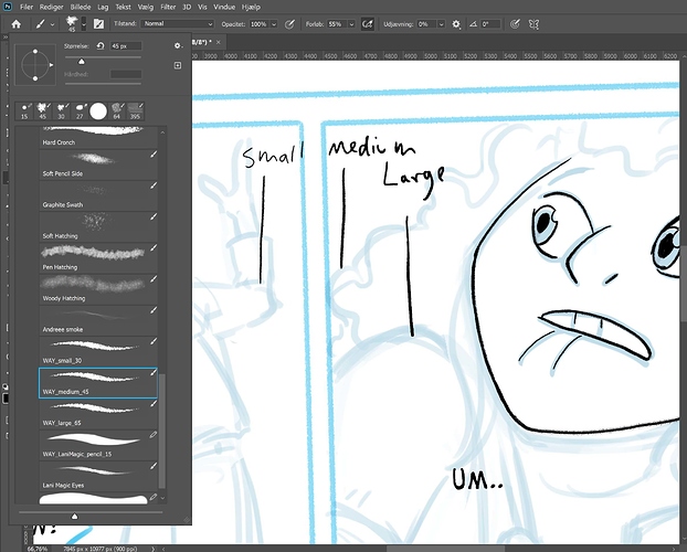
I work on a 210mm*297mm canvas on 350 resolution, that I then resize to 50% of its size once I'm done (the big initial size helps making details, and then resizing hides the pixels and smoothes the details).
As for the brush, as I draw in black and white, lines need to be a bit thick. I use 9px for main lines and 6px for details, hair and "light" fabrics/materials, with minimum size value at 40% (to prevent the brush tip to be too small and invisible).

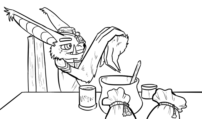
Kelheor : nice lines :slight_smile:

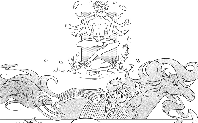
If I can help with some tips of my own to make smooth lines : use big strokes if you have a long and easy line. But as soon as you have a complex line (such as the nose or the hairline on Kelheor's left exemple), zoom as much as you feel comfortable and use small strokes. If your stroke is too far from your original sketch, you can CTRL+Z. If some part of the line is good enough, but not the whole line, you can just erase the part you don't like, living the tip of your line in a "pointy" shape, so that you can resume your line correctly. Sometimes, when I get frustrated because my lines are almost right but not right enough, I create a temporary new layer with only one stroke that I move/rotate so it's nicely lined up with the rest of my drawing.

Hello! My file sizes are 7x10.5 inches at 300 resolution. My brush size is pretty thick compared to others on this thread so I don't know how helpful this will be. It is set to a maximum of 25px, although I usually use fairly light pressure unless I'm emphasizing lines for a close-up or something. plus I use a really fuzzy charcoal brush because it helps me be less conscious of line smoothness so I can actually get my drawings done. :3 So the art style of my comic really came out of working with this one thick charcoal brush.

I use a 12px calligraphy brush for my lineart, but it has settings to actually show up way smaller if I'm not using too much pressure. My canvas is at A4 size (2480x3508) and 300dpi resolution, which is then resized for Tapas' 940 width at the end.

My advice is to always practice quick strokes, and that it's better to overshoot than undershoot and have to mess around with a series of lines. Opening a new layer for a particularly hard line, then cutting the extra and merging is perfectly valid.
(this WIP is before I did a lot of line adjustment for shadows and whatnot, but it's the basic look)

First for sketching we use whatever brush we want (photoshop)
canvas is a little bigger than A4 300 px (for bleed margin and all that jazz)

When we ink, se set it to 900 px

We have 3 set brushes. We don't go bigger or smaller, simply for consistensy, since we are two people working on the same comic!

I work on 11" x 17" size canvas at 600 DPI for my pencils & inks; I used to work at 300, but I noticed when I converted the Clip Studio file to Photoshop for coloring, it would look pixelated as hell- so I started working with a higher DPI.

As for my pencil brush, I work anywhere between 15 and 22 px; my inking brushes range between 2 pt(detail/small lines) to 4 px(my normal lines).

I work at B4 size, 600DPI. My brush width is between 12-20 or more pixels. I've been keeping to 20px for main lines so I can get a variety of thickness in the lines. I usually go down to 15 px for details and sometimes less if needed. Sometimes I use above 20 for thicker lines when needed. When I use the line tool, it's usually about 3-5px.

I started with larger, thicker brush sizes but really prefer the thinner ones now after giving it a try. It makes it look just a touch away from lineless, being more animé-esque and less toony. I use PETPEN(+) a lot on about....I'd guess a 3? If my canvas is exceptionally large I'll bump it up. But as it stands with a canvas of 800 wide and a 1,200 DPI (yes I'm crazy. And yes it takes forever to render out and split) I use that brush size.

I draw in sketches. Refine the sketches and just color behind them. Example I guess?:

I use a pen from the Kyle Webster brush Megapack (comes free with Photoshop CC) and it's called "Kyle's Inkbox - Finer than Fine" and it's set to 4 px. I draw it on a 8.5x11 canvas at 300 dpi. Occasionally, for closeups, I do a thicker line with "Kyle's Inkbox - Mr Natural Brush" which is at 31 px. My closeups just don't have a good punch with the thin brush so I like those to be thicker for now.

A useful trick I figured out kind of late in the game, is that if I want to boost contrast in my linework, to make a duplicate of the line layer and set it to multiply--I do that as many times as I need to in order to get the contrast to feel the way I want it. Especially since I'm using a light layer of tone more often lately, I really have to make sure the lines are dark enough to not disappear.
It ends up with lines like this.

im a weird person that wants to work a bit more free form since I have no idea if this will ever become a printed comic. Just in case i keep the width at printing format and do whatever with the height to be edited at a later date if necessary. I work in 3055 X 13501 pixels, the height depending on how many panels i'm trying to fit in. work with a 300 resolution.

My brush size changes depending on the details im trying to work with. usually 12 px but sometimes ill go down to 9 px or up to 20 px

After i size it down if i need to. I think my biggest problem is i refuse to close my lines which causes me issues in the coloring possess.

Hmm, I don't really work from a set line weight, but I think I usually bounce around in the vicinity of 10 px? I don't like to go much lower than 5 if I can help it because the lines start to feel too light, and I like to go up towards like 15 px when I can to really get a lot of range out of my pressure levels, but I find at times that that results in lines that are a tad thicker than I want for like non-close ups :sweat_smile: But yeah, I usually just try out several different sizes when I go to start inking a piece and stick with whatever feels good for the drawing at hand. Random example from a commission series that I wrapped up last month:

So like not super duper thick, but also not super duper thin. I think these lines probably run on the thinner side of what I typically put out though.