Sooo this one had a few challenges for me to figure out what you could do to improve your art.
It's obvious that you are practiced at comics. I also looked it up on tapas and yea. around 90 episodes? that's a lot.
so your character drawings are really well made as are your backgrounds. (if you really want to improve your characters, I think a good next step would be to work on the clothes.. specifically folds etc, so the materials get across a bit better. for that nothing goes over studies and references. but yea, that's a minor thing)
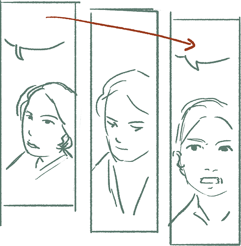
now, there's a few things that would improve it that are unrelated to your drawing skills, because they are is safe waters. you even change up poses during longer convos.
firstly layout.
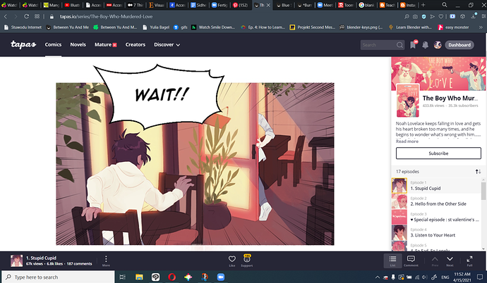
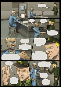
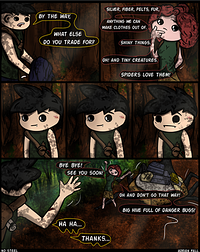
there is a LOT of text. in your exampes as well... while I'm reading through the first few pages as well. so this seems pretty consistent
and it's not just the volume.. the way the characters talk feels a bit unnatural as well. it conveys the info, yes, but it's a bit dry? and sometimes very much for the reader's sake. Who, honestly, can most of the time fill the gaps themselves from context clues or from the characters reaction and reply.. even if it's just implicit.
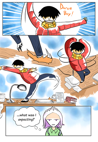
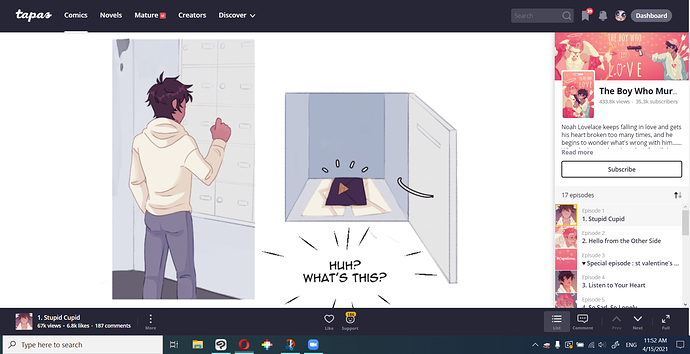
the paneling itself is solid! the sizes are great for desktop and mobile alike.
not to the meat and the part where I'm the most comfortable at feedbacking.
I am going to be a bit influenced by personal taste... and I'll be a bit blunt probably. since you said to "tear it to shreds" I think you are prepared .. .I hope.
but still, don't worry. you do have a really solid comic here. what I'm going to be going on about is for /additional/ visual appeal.
that said.
your pages could look a lot more fun with more distinct light and color direction. /color grading.
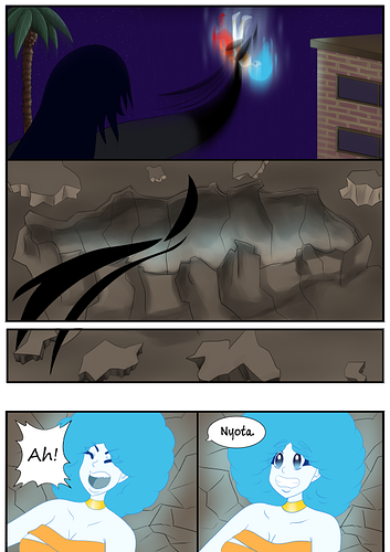
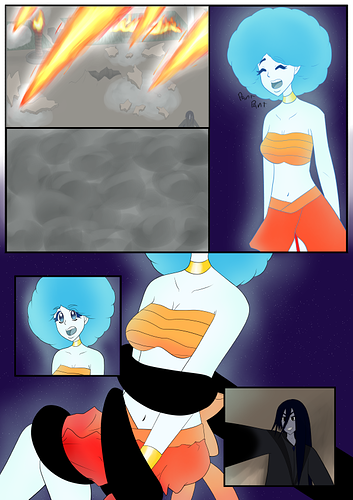
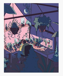
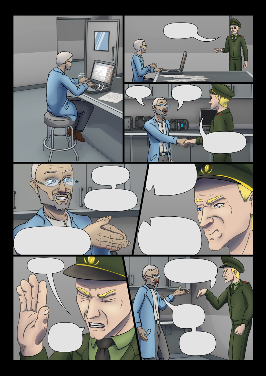
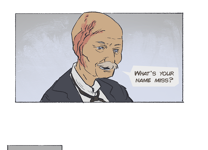
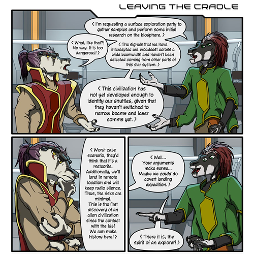
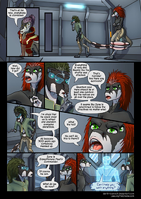
you already use very different light settings in some parts like these:
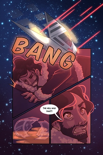
but in the space ship with the gray walls, when you use perfectly neutral gray... it gets bland really qickly.
the color of the scene will set the mood, so a neutral gray is .. too neutral to say anything about it. It also usually makes scenes distinct /cues in on changes in location etc
aaaand the execution isn't ideal yet either.
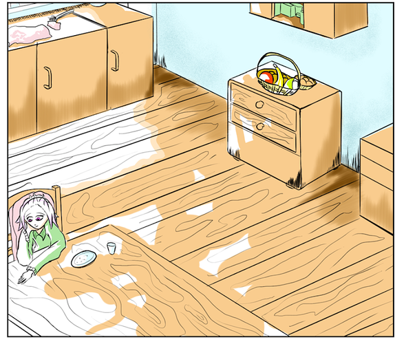
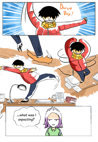
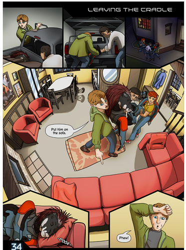
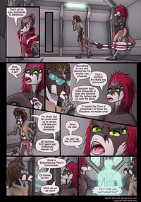
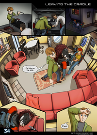
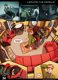
like, take the page right above. you have two different scenes. the one at the car, and then the one in the house.
but the characters are still colored identically even tho the lighting changed. (most easy to see with the green jacket.
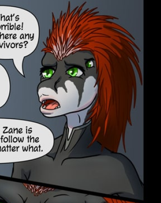
and that's a general trend I've seen, that the character's colors, don't quite fit into the scenes, Which isn't helped by the characters colors themselves.
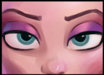
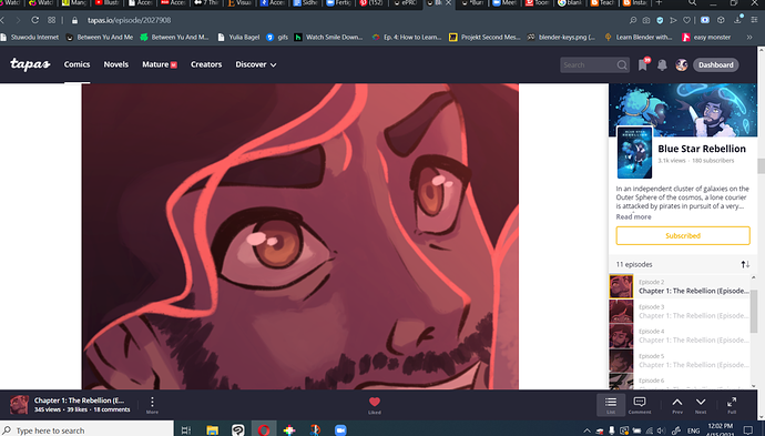
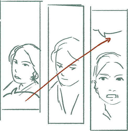
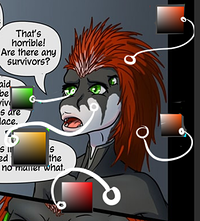
like the red haired character. her Hair and eyes are at Maximum saturation while the clothes, and skin are completely desturated. I did some color picking:
if there is light that isn't pure white (which is almost never the case, since most light sources have a temperature, and if not, there will be bouncelight from the surroundings which will give it a tint) then any object that is colored neutral like completely desaturated white or gray and even black, WILL get tinted.
that applies in art most noticable in eyes. having them pure white in a drawing with backgrounds, almost always looks weird.
now the opposite case with the completely saturated colors...
colors get usually broken by the light source unless the light has the same color as the object, are a lightsource themselves, or are exposed to really bright white light.
that's why having two colors that are maximum saturation (and even more, dark and saturated) in the same place feels kinda off and you will rarely find it in visual media unless there's a color scheme going on or the like.
even just pulling the colors a bit more together, will give a more coherent result:
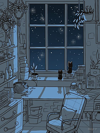
For the scenes as a whole situation is the same the backgrounds are mostly neural grey.
a possible fix is to either work with a fixed color scheme for scenes like Hilda (webcomic and Netflix series) does for example or use overlays and adjustment layers. that way the characters will also get tinted and everything gets pulled together a bit.
I'll do it for a few pages for demonstration
I hope it helps! there's a lot of tutorials on how to use color out there as well. Id really recommend you this one:
I find it super useful ESPECIALLY when youre not a beginner anymore. everything he talks about applies perfectly on colorgrading for scenes and setting the mood right!