I'm working on a logo for a new comic called Techno Devil. The premise of the comic is a beautiful sexy scientist and her cyborg boyfriend fight to free themselves from the troubles of demons from hell. I was going for something that eluded to a dark but cartoonish feel. It's not going to be a series that takes itself too seriously. There's gonna be blood, sex jokes, and guns. While it'll definitely have horror elements it'll never really be a horror comic.
Anyway I've made logos before, I even have a degree in graphic design, but this was my first time experimenting with this particular style. It's not my first time texturing things, but it's probably my first time going so far with hand drawn textures.
I'm curious to know 3 things
Which of the two versions do you prefer
How does the overall logo make you feel, or more specifically what would it make you expect, what would you expect to get out of the story if you saw one of these logos
How do you feel about the execution, be it in use of color, texturing, placement of elements, or perhaps something I'm overlooking
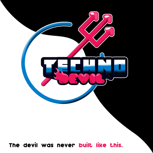
For further context, the colors were chosen because the blue is the main characters primary color (the cyborg) while the pink is his girlfriends Primary color ( the sexy scientist).
The idea behind the elements was to mash up two symbols, one that relates to hell while the other relates to machines or technology. I used a pitchfork to relate to hell and a power symbol to relate to machines. If you've ever seen a power symbol its typical a circle with a portion missing that has a straight line coming from the center out, i used the pitchfork as that center line. And I know it's a subtle thing that could potentially be overlooked, but that's also why I tried another version where add a bit of blood coming from the ring for extra flavor.
Any opinions will be appreciated, but I'll be extra happy to get constructive criticism. Or maybe you like it as is, I'm happy to know if you think it's a job well done. I just want someone's opinion since I'm the only one working on it and it would be easy to miss things without any feedback.
---‐-----------
Made a few updates from suggestions and comments I've gotten so far.