I've changed fonts mid-series before after finding out that what looked great in theory didn't work out so well when the book came out. In a web comic, I would advise making any changes after a break in the story, as a change mid-story can be a bit jarring. Or go back and change earlier installments to the new fonts.
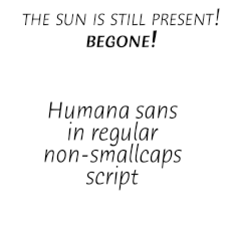
Regarding recommended fonts, I've got a couple of points to make. First off, I find Trajan to be an acceptable font for the title of some swords and sandals epic. However, I think it looks a bit overblown especially as a dialogue font.
The other font's serifs also make reading a bit harder for those of us with vision problems. While I have used similar fonts sparingly for date or location captions, I wouldn't use it for dialogue.
I also tend to not like dialogue fonts that look typeset. They're all right for novels, but not that good for comics because they almost never complement the art. I know most of us are typing it in. However, I prefer fonts that look a bit more hand lettered. Comic Life's Lint McCree, Blambot, and to a lesser extent Antihero are my favorite fonts because they suit a lot of comic art styles and are also easily legible even without my glasses.
Yeah, that's something to consider. Some of your readers may have visual impairments, so please keep them in mind when choosing fonts.