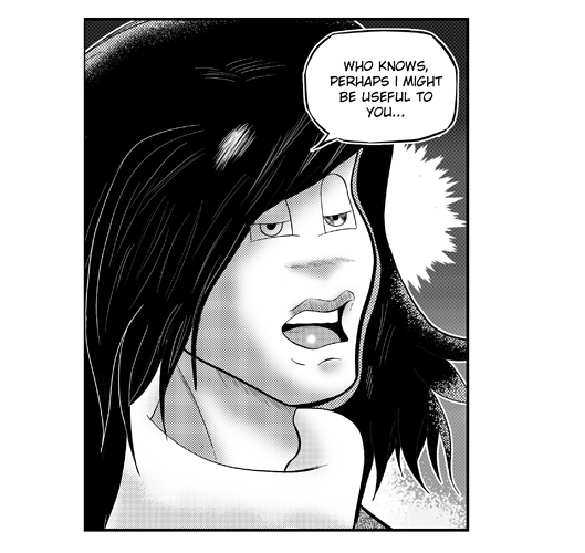
They greyscale has moire on the tones (something that happens when tones are used at the wrong resolution, creating a plaid-like pattern), so if you are going to use greyscale, I'd recommend either switching to flat grey fills or using tones at the resolution you're going to display the images at, or at least scaling only in increments of exactly 50 or 25% etc. Since the tones have been used with dots too small to read as dots here, it looks like you need to have bigger dots for the screentone manga aesthetic, or to just not use dones and to use clean grey fills, and a texture or noise overlay if they look too mechanical. To me, as somebody with a manga background, the use of tones on top of hatching just feels like an odd choice though; hatching and tones aren't generally used together like that because they're meant to do the same thing.
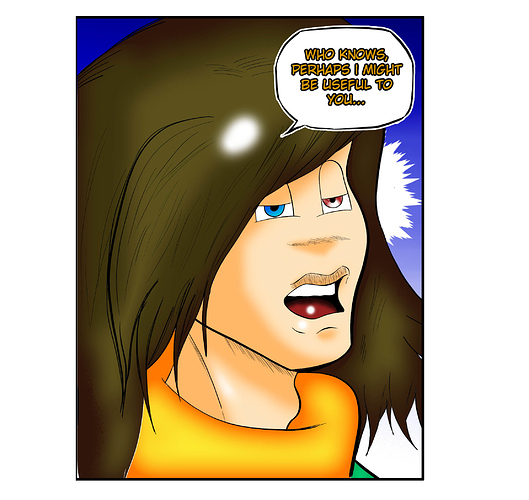
So personally, I like the colour better, because while the colours used are a bit over-saturated and there are issues with pillow shading and random lens flare/shine marks, there isn't moire, it suits the American cartoon look of the eyes, and colour just generally attracts more readers on platforms like Tapas and webtoon.
Whichever you go for, I'd recommend doing some study on using consistent light source directions and using shadow to define solid feeling volumes.