
So I know you said you wouldn't re-review comic you reviewed in that last thread and you can say no to what I'm asking. If this thread is still available when I finish my redraw/rewrite of my first chapter and a slot is open, would you be willing to review and critique that for me. Just the first chapter, nothing more. If you don't think that's unfair to other people wanting reviews since you already reviewed my comic for me, I understand. I just wanted to ask. 
I think that sounds reasonable and I'm happy to allow it. I've noticed you getting some good critiques from a variety of threads, so I'm interested to see what you create. 
Oh thanks so much! I hope you know yes all really appreciate the time and consideration you put in to help others in this thread. Your advice really means a lot. Thank you! 
Just wanted to pop in to say I love your reviews/critiques, and how I'm in awe of your dedicated to keep up your thread in spite of it being such a time consuming, thankless task! Also I appreciated the Google doc you put together, I'm sure a lot of time went into it.
If you're still running a critique thread by the time I start working on a child friendly, light-hearted comic, (and you have open slots.) I would love some of your feedback.
Aww man, been away from the forums. I'll try and get in there for the next batch. Not ignoring you, sorry!
Hey! There you are! You get a special 6th slot! I'll do your comic after I finish these first 5 but before I open for submissions again!
My first comic may have been put on hiatus, but I'd be interested to post in a thread like this sometime this year.
Also, I think you and @IndigoShirtProd are alike when it comes to in-depth reviews!
No, but I've seen you review other comics in a similar vein to @darthmongoose in other threads.
All right, so we're starting with a shortish comic, one episode, but it hits my guidelines for length, and it's a nice way to ease into the new thread, being both short and a shounen-influenced action comic, so the same genre as most of my work! Let's log into Ignis Somnia...
Title thoughts:
The title is something that jumps out at me as something I'm not necessarily feeling so I felt like it needed discussion. I'm not a latin speaker, so I can't really comment on the grammar, and even if it was wrong, that'd line up with the shounen manga feel anyway, but my reason is more that I don't think this title matches the tone of the comic. The comic has a comedic tone that most reminded me of more silly and irreverent shounen manga; something like One Punch Man or Bleach, but the title sounds really grand and serious and sort of generic. "Fire Dreams" in intimidating Latin just doesn't really say "this is a funny comic about an ordinary guy who enters a virtual fighting tournament playing as an accountant". It's potentially a bit late to change the name, but it is something I wanted to flag. Latin titles sound serious and epic, but this comic is irreverent and down to earth. It's fine as the title of the game, but works less well as the title of the comic. It's probably not necessarily an easy thing to change without rebooting, but I think it's maybe worth thinking about how the title of a work relates to the content and tone.
Art talk:
Being in black and white, you're always at a disadvantage in webcomics. It's not really a criticism, since black and white is in no way inferior to colour, it's more just something to be aware of, so that if you're ever feeling like no matter how hard you're working or how much you improve you still struggle to build readership, it's often simply due to being less eye-catching than colour comics.
Drawing an action comic is daunting, and anyone who says otherwise is either lying or an art thief. When you step into the action comics arena, there's no place to hide weaknesses in your ability to draw anatomy and perspective. Every genre has things that are challenging to draw, and with action the hard part is that you don't get to cloak what's happening in shadow or hint at it; you have to draw it, and the poses and space showing one or more characters doing dynamic things with props or punching each other all has to read clearly. So basically, props to you for choosing a tough genre to draw. Be daring and confront your weaknesses head-on and you'll improve quickly!
The style here has a shounen manga vibe that feels most inspired by the sort of mixed cartoonish yet naturalistic look of One Punch Man or My Hero Academia. It's pretty well drawn, but I feel like one of the biggest issues is generally inconsistency, both in style and quality.
It's hard to get a sense for any consistent style rules here. It often feels like I'm looking at a very cartoony face, a very naturalistic sort of slim body and then these very stylised big squared-off chunky hands in some panels, but much more naturally proportioned hands in others. The face style seems to change depending on the angle they're drawn from too, particularly the noses. Often the individual parts of the characters are well-drawn, or a panel or expression will be drawn well, but because the quality and style aren't consistent, it brings down the general polish of the comic. Going off-model for comedic or dramatic effect can be very effective, but ideally, you want about 80-90% of your panels to have the characters drawn to a consistent "on model" style so that the stylistic switch feels deliberate rather than accidental.
I'd advise spending some time practising getting your character designs consistent through different head rotations and maybe making some model sheets.
A good model sheet should give you some nice clear rules about how things are drawn from certain angles etc. You don't have to follow them perfectly all the time, but staying fairly close tends to give a nice "pro" feel.
Here are some good model sheet examples: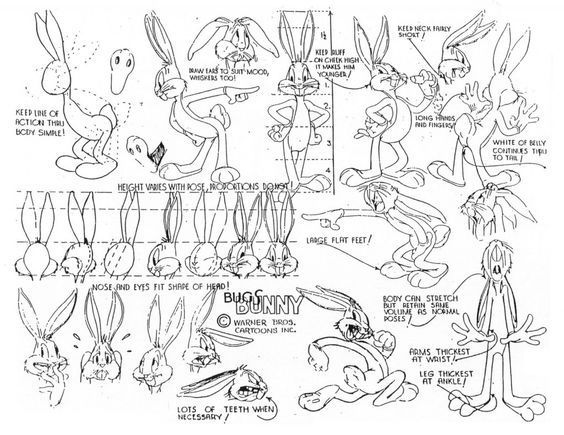
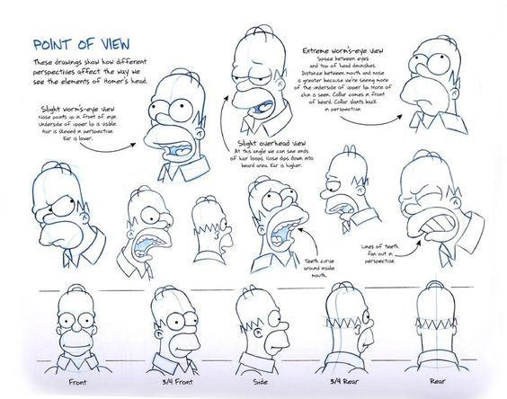
Come up with some rules for things like "Where do I put the hatching?" and "How does Jin's nose look straight on, in profile, 3/4 view and when viewed from a low or high angle?
For general anatomical guidance, it's overall not bad, but I'd give some attention to the pelvis region.... Yes, I know, it's always the most embarrassing area to look for tutorials and reference, but you need to nail that area to draw good fight scenes and get a really solid sense of depth to figures!  Here's a decent tutorial/ref for getting started there:
I often find learning to draw characters wearing underwear is effective for learning this. If you can't draw pants on them and have the pants look right, you know it needs fixing. (Yes my amazing tip is draw characters in their pants
 )
)
In terms of composition, I feel like there's awareness and use of a lot of stylistic techniques here from manga without always a full understanding of where to best use them. It's good that you're giving challenging techniques like extreme angles, dramatic lighting, fisheye-effect and popping out of panel borders a go, because these are all great techniques to learn and can add a lot of drama. The problem is, right now these extreme impact panels currently are everywhere. There are very few panels where it's just a box where a person is doing a thing or interacting with another person. The panels are mostly very small and pulled in very tight with extreme focus on small parts of the characters bodies zoomed in very close, and very few panels where we see more than one character to get a sense of spacial relationship between the two.
You don't have to be extra every panel. In fact, it tends to give the impression that the artist is relying on intense closeups and exaggerated stylisation to avoid drawing backgrounds or more subtle expressions or full bodies; things that are hard to draw but not as exciting or eyecatching, and it can get a little tiring and hard to follow the tone and spacial logic of the scene. Dial it down a bit, do more panels that are a bit more subdued so that the ones where you break borders and use wacky camera techniques and extreme close-ups will have a lot more impact.
Story Talk:
So right off the bat, we get a generally fairly classic setup for a shounen manga style story. Ordinary guy hates his ordinary life. There's an opportunity that leads to him being thrust into a big high-stakes contest of might, but there's a twist on his capabilities and origin that makes him an underdog. It's a good structure to hang a comic on.
The pacing isn't bad and it's easy to follow, but there are a few things I feel could be done to improve this:
Firstly, I think it would have been more impactful if we saw what the game is like in the opening instead of a guy in a suit standing in darkness, talking about the game (I don't think I've ever seen a commercial like this, I guess it's kind of like an E3 showcase, but he's talking about the game like he's not involved with the company like a documentary, unsure what this was going for). It would better set up the main selling point of the series as an action comic; "check out these cool characters fighting!", it would get across why the main character wants into that exciting, glamorous world so badly if we saw the contrast between it and his mundane life, and it would also show just how funny and out of place his accountant character is among all these cool like knights, wizards, space marines and ninjas and the like. It'd also be a great place to tease characters who will show up later and show how amazing and cool they are so when the character has to fight them it's like "Oh geez, it's that badass archer guy from the trailer!"
There's really not a good plot reason for how cagey the comic seems to be about showing us the game. It's been around fifteen years and is part of daily life, it's a central aspect of this story's plot, but at the end of the first chapter, when the main character has been recruited to take part in this game, we know nothing about it and don't have a sense for what's so cool about it or why he's hilariously out of place as an accountant because we haven't seen the game. It doesn't need to be shrouded in mystery because the characters ought to already know all about it; it is such an old game it would hypothetically be on the Game Cube/PS2/original XBox! and people are still playing it with a thriving competitive scene! There would be dedicated sites and wikis and youtube channels about this game, it'd be so ingrained in pop-culture that there would be stuff literally everyone knows without even ever having played.
We're sold the idea that the game is exciting because you can be anything, but being able to play a game where you get a randomly generated class doesn't really affect our protagonist's life in a concrete way. In terms of audience excitement, it's about the same as the protagonist getting Netflix. "Yes! I have acquired access! To this amazing video streaming service that appeared a few years ago and became beloved worldwide because on Netflix I can watch practically anything!" I can play a huge variety of combinations of character types, classes and builds in World of Warcraft, and playing it makes my life a little more fun, but you wouldn't read a comic about me playing WoW, because it has no material impact on my life or particular stakes. This is a pretty common issue with stories about playing videogames, and the reason isekai tends to involve the character getting sucked into a world that functions like a game, but where the life and death stakes are very real.
It currently makes no difference to me if the character plays the game or not because he doesn't really stand to gain or lose anything and has no particular motivation.
Like you could currently summarise this comic like this:
"My life is boring, I sure wish I could play this cool fifteen year old fighting game."
"Here is a copy of that game you want for free!"
"Wow, thanks! Now I can play the game I wanted!"
"But I gave you it because I want to train you to be really good at it!"
Where's the story here? Why should I root for Nine? Why should I worry about him? Is Jin going to KILL him if he doesn't become good at the game? Is becoming a star player and earning a million dollar prize for winning first place the only way he can pay for a relative's lifesaving surgery? The current issue is, the only thing he has stated a desire for is to play a videogame, and the only stakes are he is bad at playing the video game and has to keep trying. He's already straight up said he has no particular interests, hobbies or ambitions, so my initial feelings about this guy are that he's.... kind of boring and I don't get why Jin has chosen him as a person to train? If he'd said something like "I used to play fighting games all the time, I even placed in some national tournaments... but after dad died, I knew with needing to provide for mom and my siblings I couldn't pursue some flaky dream like being a pro gamer, so I'm studying to be an accountant. I hate it. I wish I could play that cool fighting game..." I think he might be a more compelling and sympathetic character.
Overall, I don't think it's a bad premise, but I do think it needs to have some stakes and a goal and more protagonist agency to really feel like we're being told a compelling story about an interesting character who we want to see succeed.
It's not a bad comic, but a bit more thought used with the composition, style and use of impact panels, and giving the story a bit more "oomph" would definitely help push up the overall impact and polish.
Thank you very much for the review. I'll work hard to improve on the points you mentioned with the art and composition. I hope to be able to continue improving as a writer. Once again thank you for your hard work and amazing insight.
Time for Rum & Done, a title which accurately describes both what everyone's doing and how everyone's feeling during lockdown.
So... this is a first for my review threads because... there was actually a point where I couldn't continue reading due to content and had to take a break overnight. This comic contains a scene in which a guy has sex (or maybe they kiss and he feels a guy up or gives him a hand job, it's left vague but.....) on his parents graves. It then shows the parents in heaven and his mother has a comedic nosebleed over watching her son doing this.
I'm sorry but even as an open-minded person, generally agnostic, sex-positive and gay I was really quite angry at the framing of this act as somehow cute, funny and sexy. The vague content warning about religious imagery didn't prepare me for "dude f*cks another dude on his mum's grave and his mum's ghost is turned on by it."
I've had to spend some time calming down in order to do an objective review as best I can, but I want it to be clear, I was shocked by that, it didn't feel in-line with the rest of the very light and fluffy content of the comic that has no other edgy or taboo content.
Art notes:
Rum & Done is a very polished looking comic in terms of art. The characters are very well drawn, with the anatomical drawing improving throughout and the delicate but characterful inking and fine proportions remind me of Emma Viecelli's work in a good way. The colours are great and really pull the comic together.
I'd mark visual storytelling as an area for improvement. The figures are nicely drawn, but there's a tendency for them to not quite feel like they're looking at each other; but sort of staring through each other or looking off into space, and complex sequences of actions are hard to follow.
The use of generic 3D model environments also harms the comic at times, though the backgrounds do significantly improve later, with environments that feel less empty. There is still often a lack of a clear sense of where characters and objects are in relation to each other in some scenes. The transition towards putting filters onto the backgrounds so they look less like a generically shaded 3D model really helps a lot with making the art look more cohesive. I'd definitely keep doing that.
Design:
This area surprised me because the cover and logo are very polished looking, so I wasn't expecting to have much to say, but the speech bubbles and text font really aren't up to the same polish, with straight tails that often aren't properly pointing to the speaker (I had a good laugh with my fiance at a panel where it looked like a strawberry margarita was talking). The shape has improved from the "default oval tool" shape in the later pages, but the tails need fixing; if they must be straight, they should be a bit smaller or thinner to be more elegantly proportioned. Also connecting lines between bubbles should be a nice even line, not a wedge, which looks a bit messy.
The font not being a comics style handwriting-look font is an issue that would be easily fixed to immediately make the comic look more professional. Comics use fonts with a handwritten look because it makes the bubbles feel more like part of the art. You'd also find that because they don't have such a big "x height" as the modernist sans-serif font you're using right now, they'd feel less awkward in a circular space.
Writing talk:
The writing is definitely the weakest area of the comic, and the area I'll have the most to say about.
The English could really use running past a native speaker or somebody with a higher level of fluency. The consistent misspelling of "sure" and "surely" in particular was hard for me to ignore, and there are a lot of words spelled incorrectly throughout (could be fixed by running dialogue through a spell-checker). There are often attempts at using casual slang that aren't spelled in the way you'd expect, or characters using slang that's typically used only in written English, or using British English slang randomly when it generally seems more established that the characters speak with American colloquialisms, vocabulary and speech patterns. I understand that English is a really hard language, and I'm lucky it's my native tongue so I don't have to write a comic in my second language to reach a wide audience, but teaming up with somebody, or just generally working on the English writing in your work would really make it more professional and easier to understand. It would make a big difference.
The story, or lack of a clear narrative is also an issue. One of the big problems is that the central concept and the first line of the comic blurb, the fact that people get superpowers when they drink rum,
is really never explained clearly in the comic itself, and the powers it gives them have no bearing on anything that happens. If a character has superpowers, and your comic is named for that, and it's the first line of your blurb, then those superpowers ought to be one of the most important things; absolutely central to the core conflict of your story.
The famous writer Anton Chekhov said it best:
“Remove everything that has no relevance to the story. If you say in the first chapter that there is a rifle hanging on the wall, in the second or third chapter it absolutely must go off. If it’s not going to be fired, it shouldn’t be hanging there.”
If you say your story is about people with superhuman abilities as your headline, as a reader I expect a story exploring the unique problems and scenarios that happen due to having those abilities. X-men is about people with powers coping with the fact that other people are scared of them and resent them, Superman is about a guy whose powers make him a god among men and how he deals with that responsibility, Spider-man is about a guy who knows he has to use his powers to help people, but it's really difficult because of the conflict it creates with his need to have a job and relationships. Think about the question of "What do the superpowers actually add to this story?" and "How can I use these superpowers to create interesting situations, spectacle and drama that I couldn't necessarily create without them being in the story?" So far nobody has done anything with superpowers that couldn't have been done without them, so it's not really delivering on that premise.
If you remove the superpowers angle, it's a comic about some people in a band that seems to be doing quite well doing regular gigs at a nightclub, and two of the people in the band are having an affair, but one of them seems resentful and kind of homophobic, and the sister of one of the band members is concerned about her brother's drinking habit as well as trying to make the band function as a viable business. This seems much more developed and to me seems like the thing you actually want to write and enjoy writing; a BL slice of life drama about people in a band, like say Gravitation or (giving a non-BL example because I just don't read enough BL to have a large stable of examples here) Nana. That angle just feels like the place your heart is more than the superpowers.
You can't really remove the superpowers angle at this stage, so try to tie them into the drama somehow. Come up with scenarios that could only happen when drunk people have superpowers. Have something get set on fire. Have somebody have a vision of the future, or have a shapeshifter mess with them. Have somebody teleport while blackout drunk and wake up wondering where the hell they are, have somebody go on a drunken rampage that destroys a bunch of property etc.
The other thing you need is a goal for your protagonist and one or more obvious obstacles that are preventing him from achieving it that he needs to get over. A story doesn't necessarily have to have an antagonist, but it can really help sometimes to have one. Basically, your story has a lot of cool concepts, but they're all kind of just there. You could get stronger engagement if there was a solid story to hook people.
Overall, I think as a creator, you have a lot of potential. Your drawing work and polish are very good. You've managed to build a significant following with what you have here based on strong art, character design and trope appeal. I think your work could see a lot of success and become very popular if you polished up some of the design elements and worked on your writing or teamed up with a writer.
Wow thank you so much! I really needed that one. I can agree with most of the points and I am already thinking of refining first episodes in so many ways)))
As to those superpowers well maybe it's just another mentality but it was supposed to be a funny metaphor for overcoming your weaknesses or at least more down to earth powers like power of will or being too embarassed to perform on stage unless you drink. like danganronpa sort of ultimate powers. But I guess the comic world can't take it that way when it comes to superpowers unless someone actually shoot laserbeams from their eyes =)
The Danganronpa "ultimate" powers are literally just people being really, really good at their hobby or profession though in a hyper-real anime kind of way. They're not really superpowers. The powers your characters have seem to be literal superpowers, like breathing fire, rather than being hyper-competent, so I don't think I'm just being some comics nerd who can't deal with magical realism. Scott Pilgrim is one of my favourite comic series ever, and it uses magic realism in the form of video game or anime style fighting and mystical powers as a metaphor for Scott's inability to grow up, as well as to create amazing spectacle.
The problem here isn't that the superpowers are too low-power-level, it's that they don't impact the plot. The only significant thing I've seen somebody use their power for is chasing away some dudes who are hassling a girl. If you replaced "can breathe fire" with "knows karate" or "has a gun", the outcome of that sequence doesn't change. That's the issue.
Yes i see your point perhaps I shoud clarify that moment. Because you don't need magic to breathe fire - just a special liquid such as absinth or overproofed rum lol, though people at fireshows use some other stuff I guess =)
My comic was blessed with a Staff Pick while I was reading this one leading to a very surreal experience where the bottom of every page was recommending me my own comic. It's been a wild week. So this comic is Million!14
Design talk:
So overall, the design in Million is very professional, with clean panels and speech bubbles that, while they use an unusual style, it's a style that perfectly fits the look of the comic, and as a comic-making-nerd I have to direct attention that perfect font pairing to the comic. The font is so readable and it goes so well with the art style, I have to ask, did you make your own handwriting font? It looks great!
Really the only thing I have to discuss in a way that isn't gushing praise here is the thumbnail, and not because it's not a really beautiful design, but because it doesn't necessarily illustrate what this comic is in the context of Tapas. Obviously thumbnails will be phased out very soon and you'll have to update to a full cover, so this is a good time to bring this up. I really like the thumbnail on a personal level, but when I saw it (and thought, "what a beautiful thumbnail design, it would make a nice sticker") I made a number of assumptions about what this comic would be that the comic didn't deliver on. The kind of military emblem angle is nailed, but the way the swords are bronze with that winglike hilt design, combined with the delicate roses and the peachy pink background made me think "ooh! This is probably a fantasy comic about lady knights! (because swords and roses are practically shorthand in manga/anime/Japanese games for "beautiful swordswoman") Maybe a romance angle!" Now it's possible I'm a fluke, so I checked with my partner (a designer and comic artist) "what do you think this comic would be based on this thumbnail?" and she also said "Some kind of Fantasy thing."
I think that because of the blurbs on comics being kind of held back compared to the thumbnails, a lot of people make their decision about what to click out of the sea of comics just based on the thumbnail or cover, so personally I'd advise making your cover (because you might as well jump straight to doing a cover, thumbnails will be gone soon) more descriptive in terms of what it's showing us; key points being: "near future setting", "large diverse cast" and "check out this rad unique art style." So I'd probably recommend putting some characters on there. You could still use the crest as a design element, just make sure people know what you're selling.
Art talk:
This comic has a really cool unique art style and the basic drawing is very confident. I'd say it's definitely publishable quality in the lines, proportions and colour palette. I really like the aesthetic overall and especially the warm, earthy colours and how restrained the detail is without feeling unfinished.
I have only a couple of suggestion for the visuals, and they're less about style and more about readability and visual storytelling:
First maybe try to use value or saturation and/or line weight to differentiate the foreground and background more? Right now, panels tend to feel a little flat, busy and crowded, and it's not because of the detail level, but just because the characters and foreground objects use the same fairly high level of colour saturation and generally kind of mid tone value as well as the same line weight as everything in the backgrounds, this flattening effect combined with quite small panels for a Tapas format comic made me feel like I had to really concentrate to pick out important details in panels, so fixing it would just take away that cognitive load and make getting into your comic feel easier, which would be good because the story being told here clearly isn't going to be a simple or fluffy one.
Second, on a similar sort of track, there are a lot of panels pulled in really close to people's faces and upper bodies and cropped really small around that area. It makes things feel crowded and claustrophobic and tends to remove sense of space, place and where people are in relation to each other. Try to pull back a little when things are relaxed or to give us a sense of space so that you can move in when you need things to feel cramped and intense.
Writing talk:
I feel like this story tries to set up a bit too much too quickly and is expecting me to do a lot of work piecing together what's going on rather than establishing it early, especially in the sense of the state of the world. I only really know about the long-running war from the blurb, and I don't know which countries are involved or the ideology of the conflict, which makes it hard to see where the characters stand in that conflict. So I'm there like like "oh okay I guess they're in the army and somewhere in eastern europe because of that writing? But it's a very relaxed army in terms of dress and haircuts and even though it's the future their uniforms are quite retro and evoke the Cuban and Chinese military uniforms so maybe it's like some little communist state; a banana republic or something... and this guy has an eagle and this aggressively American kinda name? Is that significant? Did America invade and occupy them? Where's Port Vista? (googles) Oh... that's a fictional place? okay (or there was a battle at a hotel in Benidorm, which honestly I wouldn't put past British tourists...we're awful). Oh and now we're with this singer lady... singing in fake flag country also somewhere in Eastern Europe? I don't know where she is or how she relates to the others... Are all the countries in the story fake? Nope, the soldier girl is Czech and Poland is apparently a place." My brain is trying to fill in the gaps to make this story work, but you're not giving it enough info to work with and when it's a real world setting, but some stuff is just fictional, but not explained, I don't know if it's my own ignorance of the politics or history of a country or just a lack of related intel from the story causing me to not follow. I'm modestly well-read and politically and historically knowledgeable, so if I'm struggling this much with the context of your story set in the future of the real world, a lot of people will be struggling way more. If your story is set in fictional nations, you need to give them names, a rough sense of place and culture, like the fictional eastern european country of Serkovia in the Marvel movies. All the info the audience needs is: it's a fictional former-USSR type place in Eastern Europe and it's called [place name], their current ideology is [whatever] and they're at war with [country] over [reason].
The writing of the scenes is good, with clear, natural dialogue, but I don't really always get what the significance of the scenes is or how they relate to each other in time and place. What are you trying to tell me about this world and the culture and these characters in a sense of the greater narrative?
I have respect for the incredibly gutsy decision to do a sort of George R R Martin style massive story with multiple PoV characters, but eight characters is an awful lot to juggle in comics, which have naturally slower and higher-effort storytelling. It's doable, but it's going to be hard work, so you'll need to make your scenes hyper-efficient in terms of setting up what a character is about, where they are what their core conflict is and how they tie into the greater conflict of a future world mired in some kind of long-running war. At times it feel like there's a conflict between the very small, personal stories and the ambition to have them set against this huge, political conflict. The key to success is going to be balancing those two things carefully and I do hope you succeed because this is a unique and interesting work.
Overall, Million is a work that stands out. It's not afraid to be different from other comics and it's very ambitious. I feel a lot of respect for it because of that. I think of my comic as a bit of an oddball on Tapas, but this is even more of one in terms of going against popular trends. It's well-made and confident, and I feel like even if this comic hits some stumbling blocks, you're a creator who could really go places. I'd mainly focus on trying to make your comic accessible in terms of readability, because when the comic is going to be complex and political with lots of jumping between characters, you need to make sure the reader's brain has no other obstacles to deal with when thinking about the things you want to be complicated and challenging.
Thank you so much for this incredible in depth critique. It was so lovely of you to do and I will definitely take everything you have said into consideration. I think I might restructure the story - the first chapter will only be about Anna, Arthur Rivera and world building. Sofia and co. would have the second chapter to themselves and only in the third chapter would the POVs switch. Thank you, thank you, thank you!
2 months later
hi my name is josh i would appreciate if you would look at my comic the art gets better each chapter https://www.webtoons.com/en/challenge/lions-den-/list?title_no=371341