Neighbours... everybody needs good neighbours,
With a little understaaaanding,
you can make a better daaaaaaaaaaaaay!
- Okay done with making references probably only people over 35 from like... the UK or Australia will actually get. Let's get to the review! (Also welcome to more fun with comics with titles that are spelled differently in US and UK English!). This is Neighbors (With the US English spelling), not to be confused with the Australian soap opera, Neighbours that most British people my age used to watch after school. 
Oh boy.... 288 episodes huh.... (yes, sorry, that's part of why this review took so long to come out. That's a pretty daunting thing to make time to read).
Art Talk
I have to open by saying that this comic is just wonderfully expressive. The facial expressions, bodylanguage and even subtleties like where people look and how they lean or incline their heads when speaking to each other is just incredibly good. The faces always seem to perfectly hit the expression you're going for and honestly I felt like I was learning reading it! No criticism of that area, I just want people following the thread to give it a look because it's just really, really good.
The large character heads proportional to their bodies isn't my personal cup of tea, but I can also see how other people might really like it. Usually heads that big you'd expect to see with much more cartoonish characters, and seeing it with quite detailed heads, clothes and otherwise fairly natural proportions kind of made me think of those old animated sitcom openings for things like Bewitched or I Dream of Jeannie. Overall, it's drawn consistently, so I never felt like the heads being big wasn't a deliberate stylistic choice, and over time I got used to it. It's an unusual style, and I'm not sure how it'd impact readership here on Tapas. Obviously it's not "on-trend", and maybe it's not everyone's taste, but it is undeniably well drawn.
One area of the art I found a bit tiresome was the backgrounds always being that same gloomy purple colour. I like the use of a flat coloured background with simple linework to get across shape, and with a slice of life comic, where the background just needs to evoke "it's just an everyday house/street" I think it's pretty effective, so really my gripe is simply: "does it always have to be purple?" I feel like if you switched up the colour to show changes in location, time of day or the tone of the scene, it would be a really easy way to keep the comic feeling fresh. The purple has quite an ominous feeling, like a dark sky, and doesn't always fit with scenes that are meant to be quite light or easy, and sometimes when the point of view switches from "what these characters are doing in the street" to "What this cat is doing back at home", you could make that scene change as well as the interesting contrast clearer with something as simple as just a different colour ie. "here in the street, these two are having a nice, sunny conversation, the background is a soft, subdued orange, BUT meanwhile at home, the cat is plotting and causing mischief and the background is a moody purple."
The visual storytelling is also strong. You have great instincts on where to focus your "camera" and how to show the spatial relationships in a scene. I did sometimes feel like the shot distance tended to default to being pulled in a little too close to the characters, however. At times the large heads feel a bit crammed into the panels, which are generally not very tall, and it can start to feel repetitive and even a little claustrophobic when so many of the panels are a tight close-up of a face without a lot of space around it. A little more variety of shot distance and angle and space some extra breathing space on panels where we don't need to be pulled all the way in would allow you to use the tight close-up shots to increase the tension when you need it and give the overall comic a lighter, breezier feeling that fits the calm pacing and very low stakes of the narrative.
Design Talk:
A small but ongoing issue I had with this comic was how cramped the text feels. The font is all caps and it's quite a tall, squared-off one, rather than the wider, more rounded form of typical comics fonts. It's an elegant font, but can get just a little tiring to read mainly due to how small the letter spacing is. Combined with the line width on the font being only about as thick as the artwork lines, and speech bubbles that are almost brushing the corners of the text with almost no breathing space and I kept having to force myself to focus on the text while my eyes skimmed over it. I would definitely advise experimenting with some fonts to improve the readability, as well as trying to increase the distance from the edge of the letters to the edge of the speech bubble. Typically it's advised that the space between the letters and the edge of the speech bubble should be at least the width of an extra letter.
Writing Talk:
I should be upfront, as I have been before, that I'm not much of a slice of life reader. I've said this before when reviewing slice of life comics, but I do have a struggle staying focused when reading them to review. I always want to be clear to state this because of the chance any opinions I give about slice of life being coloured by the fact that while objectively I can see that lots of people love slice of life comics, I struggle to see the appeal and so may not be good at giving advice to make better ones.
This is a very slice of life-y slice of life comic. It's extremely slow-paced, particularly because later updates are in single-page format, and deals with small, subtle everyday interactions. As such, it's really hard to give any advice to improve it. Would I like it more if there was more intense drama, suspense and intrigue? Yes. Do I think that the over 3000 people already reading this would like it more? Not necessarily!
I do personally feel like if more happened in episodes, or each one had some kind of a stronger story beat, punchline or surprise that it might be a bit more attention-grabbing, but as I've said when reviewing other Slice of Life comics, there clearly is an audience who like these very chill, down to earth stories of just everyday interactions, and I don't know if my advice would really help performance... it might actually harm it!
One area that does need work is the English grammar. The spelling is generally good (but with some errors. Try to run your script through an English spell checker if you can), but the grammar and punctuation definitely read like "this person's first language is a Romance language". Sometimes it actually added to the charm, because in my head it was like "Oh, I get it, the characters are really speaking Spanish, and I'm watching the subtitled version", so I think having a little of that Romantic flair adds character. Sometimes though it does make me sort of slow down and go "Wait, what?" and need to read a line a few times to get the meaning. The main issues I found were:
- Punctuation: Using more commas and apostrophes would really help make the dialogue more legible. Words that are contractions, like "don't", "weren't", "wasn't", "I'm" and similar read better with the apostrophe, and using a possessive apostrophe s when something belongs to somebody (ie. Kate's review thread) is just good practice (yes, I know a lot of English speakers use this incorrectly, I'll just quietly glare at everyone who incorrectly uses apostrophes to denote plurals like "post your comic's!"  ) . Leaving off full stops (periods) at the end of final sentences in speech bubbles is accepted as a stylistic choice in comics, but leaving out punctuation almost entirely can be a bit rough with a language like English, which relies heavily on it.
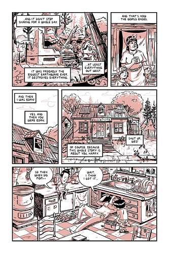
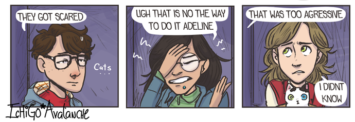
So for example these panels:
The first panel is fine.
The second should read: "UGH, THAT IS NOT THE WAY TO DO IT, ADELINE"
the third: "I DIDN'T KNOW"
- Phrasing: Sometimes the phrasing is a little stiff or funny. As I said before, at times, this adds some nice flavour, like I don't expect a comic to use perfect British or American idioms, but a little time practicing conversational English, and taking notes of the way English speakers tend to phrase things in films and TV shows (with the note of warning that it's good to pick one out of British or American English to imitate first. We do phrase our sentences differently, so learn one first, then learn the differences so you can choose which to use for different characters and use it to add texture) would really add some extra clarity and sparkle to the dialogue.
Overall, this was an interesting one. Not the type of thing I'd usually read, and very unique! The main area for improvement is readability.
All right... another one to go. I'll try to not have the next one take so long...