Za-ankoku na tenshi no yo-u ni... Oh wait, wrong neon thing. This is Neon Soul.
Fantasy/Action with Shounen manga influences and a hybrid art style? Well now we're definitely in my wheelhouse!
Art Talk:
The art in this comic improves significantly with steady progress and then a big jump when we hit chapter 3, which adds full colour. I had to throw out a lot of the notes I made when going through the early chapters!  Well done! So for the art criticism, I'll only be going off issues still present in chapter 3.
This is a comic where I do wonder if the early pages would put readers off, because it's not just the perspective and anatomy that improves, and it's not just the addition of colour that makes it look more eye-catching and polished, but the visual storytelling and how you block in characters in scenes to show where people are in relation to each other and stuff that improves significantly later on. Ultimately, it's always a hard one, and I don't necessarily want to advise a reboot, so I will simply say this: If you started a comic now with the quality of art and visual storytelling you have in the recent pages of this comic, there's a high chance it'd get more readers. It really does look a lot more polished and read much more clearly later on. Also the colours are great, love the bold palette! (obviously kinda personal preference there, I do love bright colours!). This isn't necessarily me saying "reboot it", but I want you to know that you are on the right track, I appreciate your growth as an artist and I think your future chapters or comic projects will really benefit from this polish.
In terms of areas for improvement, there are two main places I think it would be good to pay some attention: Making your environments feel "full" and giving your figures mass.
You've definitely started putting some effort into your environments in the later pages rather than pretty much just leaving them out like the early ones. I can see you're using 3D fairly well, with the angles generally being a close enough match.
The figures in the street scenes could maybe do with a little more detail, like feel free to leave them as a faceless grey crowd (for both speed and panel focus), but use the models as an aid rather than just using them straight off and do just a little drawing over hinting at jackets, hair and the like to add texture so they look like a crowd of people instead of Putties from Mighty Morphin' Power Rangers.
A lot of your environments are very big empty spaces lacking in texture. I'm not going to tell you not to use 3D models, since plenty of even premium comics do, but my tip for making 3D stuff look good is to add some clutter if you can. Clutter can break up hard edges and add pleasing overlaps. It usually only takes a few things, so some ideas to get you started on stuff you could put into your 3D scenes to add clutter might be: bins/trash cans, signs, hydrants, grids, manhole covers, skirting board, light switches, aircon units or vents, posters, graffiti, stains, scratches, cracks, plants. Try looking around you everywhere you go, or look at reference images. There can be so many little details in an environment and adding them can really add the illusion of realism. Try to break up the hard, empty rectangles in your environments as much as you can, even just adding a little bevel to an edge or breaking a up a big wall into panels (both of these tricks get used a lot in sci-fi games environments).
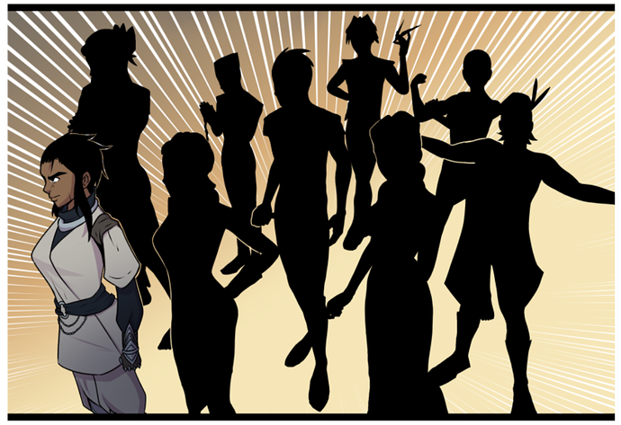
So now let's talk about GETTING BEEFY  . The figures in this comic are proportioned well, and you're clearly making strides on drawing characters from a variety of angles, but currently you're giving everyone pretty much the same very slim physique like they all have the body of a teenage ballet dancer. The silhouettes here illustrate the issue very clearly:
Usually I'd reserve a physique like that as the "extreme" for a character I want the reader to be able to tell is very agile, probably young and a speedster, dancer or gymnast, because it's a very slim physique with muscle tone, but not much muscle mass and very low bodyfat. I did notice there was a beefier guy in chapter 4, but it felt like his torso was still a bit slim for his arms. I'd recommend looking at how to add bulk and mass to the arms, legs and torso so you can add variety to the cast. Practicing life drawing might also be good for learning to relax your characters a bit. They tend to stand like they're about to do a gymnastics routine with their head up and shoulders back and chest puffed out, which is fine for characters it suits because they're elegant, flighty dancers, but it might add nice variety if some characters have more relaxed body language like slouching, and others perhaps stand in a more heavy, square, planted way like a soldier or bouncer.
Here's a collection of tutorials about drawing various bodytypes. The tutorials vary in style and quality, but it's good to have a good scroll through. WARNING: As with most anatomy tutorials, some of these are a little NSFW. There's nothing too explicit, but there is some mild nudity throughout:
https://imgur.com/a/IqeD2
Design Talk:
Fonts and balloons and the like are pretty solid here, so the main area to comment on is all the padding out of the content
There's a bit too much stuff under the pages. The combination of a large advert for another comic and then a comment showcase and then a CtA to like, comment and sub all padded out with a lot of space is a bit much with the length of the episodes being only about equivalent to a couple of pages . It really slows the reader down. By all means interact with readers in your comments and advertise other comics, but maybe consider cutting that stuff down? It's probably not so bad when reading new episodes as they come out, but when going through the archive it's like watching a video where the presenter stops to tell you about the sponsor, audible or nord vpn or whatever, every one minute or so.
The gaps between panels are often very large. Generally even when reading a long-scroll comic, I expect to be able to see at least enough of the next panel on the screen to know there's another panel when I scroll to the bottom of a panel, but sometimes on desktop with this comic, I thought the next panel hadn't loaded in yet because the gap was so big there was nothing but white space for an entire screen's worth of scrolling. It really makes the updates feel very slow, because the amount of content, as mentioned before, is only equivalent to 1-2 comic pages, it's just spread out over a big distance and then with these big ads and things at the bottom. Used in moderation, techniques like this can make content feel like there's more than there is, but when it's excessive, it really makes the comic drag and feel padded out, like there's a 5-10 second pause between every line a character says.
Writing Talk:
This comic in terms of scenes and dialogue is competently written. It's always clear what's going on and and dialogue flows nicely. This isn't a poorly written comic, so I want to be clear on that before I get critical. The problems are much more with the ideas and plotting than the writing itself here.
The main issue I found in Neon Soul was that the content didn't assert a strong personal identity or get me emotionally invested in the characters. The early episodes feel like we're trying to speedrun a checklist of "things that need to happen in an action webcomic". or "things that were cool in other comics and shows in this genre." There's nothing wrong with cliches and tropes, like I can't criticise you at all for making "a young person with unfortunately no magical talent who wants to be a knight to follow in the footsteps of a famous family member suddenly develops powerful abilities..." because yeah that's also the cliched setup of my own comic! But the thing about a cliched setup like this is that the devil is in the details. The comic definitely improves later on when we get past the training parts and onto the more unique plotline of "squire at the end of his training with friendly, open personality has to go to a dangerous city, but he doesn't know there's a dark unknown history to the power he wields", so you're clearly learning as you go. There is one thing I specifically want to go into though, and that's Quinn.
Quinn, the protagonist, is one of the weakest elements of this comic. There are quite a few characters in this comic with strong, interesting personalities and distinct voices, but the main character is one of the least interesting people in the story. Quinn is just...nice? He's a nice, decent guy without any obvious strong character flaws other than once in a while he can be a little flippant in a slightly meta-feeling "saying what the audience is thinking," way in response to people talking like melodramatic shounen manga cliches. Generally though, he's a good guy and the other characters around him all just seem to be falling over themselves to help him too. He's given not one on one tuition, but five on one tuition to become a knight, like he's a super-valuable rockstar or a prince or something. He has a fitness coach, a personal tutor, a magic teacher and two fighting teachers. Because he has so much support and no rival or antagonist, it really feels like he's leading a charmed life where he gets handed everything he needs. The training is so effective and dedicated that he easily becomes good enough to undergo his final trials in half the usual time with no issues.
I felt as though the story would have been stronger if he'd had some classmates at the knight academy who were either intimidatingly better than him at first due to experience, or who resented him for the special treatment he got or the suspicious speed of his improvement. Either that or if at least one of his instructors, possibly his uncle, had been more biased against him or didn't believe he could be a great knight and had to be convinced over time. Basically, I think Quinn needs a rival or antagonist who throws his personality traits into relief and pushes him to work hard and prove he's not just some lucky guy who gets handed everything he needs. We need to see that even when all that support network is taken away, Quinn has the heart and guts of a hero, and that his niceness is the source of his strength.
Generally, somebody needs to not immediately like Quinn, or even if they do like him needs to at least needs to criticise his actions. The only bad decision he's made so far has been to singlehandedly run off to find and help Holden (I mean, who wouldn't help a Holden in need, am I right?  ), and nobody was angry at him for this, only his uncle got yelled at, and Quinn meanwhile got basically everything he ever wanted with seemingly no downside. Somebody, be it a teacher, a rival or even a friend, needs to think Quinn is a dork or a loser or a fool or a jerk, and he needs to either fail at something or to fail at the conventional approach and to have to scrappily improvise a solution. It's really important for making the audience like a character.
Fortunately the next time we see Quinn he's going to be this fish out of water in this big, scary city, so it's the perfect time to have him experience some struggles!
Overall, I felt like Neon Soul showed a lot of potential and most notably, a lot of improvement over time, showing growing confidence in art and storytelling. The main weak area is various writing and design factors that lead to it feeling a bit slow and lacking in urgency or drama, and that the art could use a bit more depth and weight. Try to push your improvement in these areas to really add some intensity! 
Okay..... are you all ready? FOR THE FIRST TIME IN FOREVER five new review slots are OPEN!