Alright thanks for subbing! Hope you stay on for the ride! on to my impressions
That gif banner, its cool, but its more of a distraction than a draw. The most important thing on your Tapas page is the comic pages, the banner distracts from your comic page, hence counter productive.
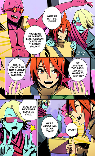
The extreme close up intros are a bit unsettling, you know that saying that you know you can recognize pornography when you see it? The shots of the colored intro seemed to objectify the main character more than my liking, the problem being well you dont have a "subjective empathy" towards the character. Oh this is just an object and things will happen to her...uhh alright.
What you want is to start with the main character and how she relates to the enviroment, and close ups literally cut out the enviroment. Yes there is an establishing shot there, but you never really see the MC AND the enviroment at least at the first chunk of story, and thats a big missed oppurtunity.
On to the black and whites, its a very clusterphobic comic. Everythings too close, I feel attacked by the blocking of the comic, its shot as if everything is in 1st Person POV, I'm reading this in desktop, and this might play better on mobile where I can just move my phone away to keep from looking at things too big, but the framing doesnt allow for the character art, which is beautiful, to exists within the context of its enviroment. Something for you to note there.
The other downside for closeup framing is you dont have a sense of geography, so when action scenes hit its like they all come out of nowhere, yes the moves are great and the art is well done but without the context of where the attack camefrom and where it might lead, you cant really appreciate whats happening.
Here's a good video you can watch to learn about framing and action scenes.
It says comedy on it, but trust me it works on any action scene
Also close up framing fucks you up when you try and depict something big like the dragon in page 40. Because its a close up full body and there's not perspective to it...you really dont know how big it is and why we should fear it.
I think you know this already as in the later chapters you move the camera back to where the scene can be better appreciated in scale, use of creative overlapping paneling helps to to emphazise certain scenes and stuff so thats all good.
One more advice I'd give is, if you are doing infinite scrolling comics (mobile or webtoons some might say) you dont have to fill up the whole width of the frame. Have some frames offset left, some right, so you have a zig zag motion for the readers eye that is more engaging than just a straight down scroll all the way.
Over all story is alright, nothing to fault there, but if its presented better, im sure it will be way more engaging!