6 / 8
Jul 2017

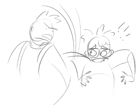
Hey! I'm Redringedtail, a creator on Tapastic. I'm surrounded constantly with people too nice to tell me what is wrong with my art, my writing, my layouts, and I need some serious feedback. Though I will totally accept compliments (who wouldn't) this is oriented towards what i can do to improve. I'd like to know while I'm still early on in my comic.

To give an idea of what I am already improving however, to avoid a sea of the same critic:
-Text and drawing size (first page is really bad with this I know)
-That's it thus far, but I'll keep updating if necessary.

Thanks again, and here's my comic:

  • created

    Jul '17
  • last reply

    Jul '17
  • 7

    replies

  • 1.1k

    views

  • 7

    users

  • 2

    likes

  • 1

    link

It seems that the text is too small indeed. Whilst handdrawn text gestures that you prefer to put more effort into your comic, it doesn't mean its a good way to go with. Some people may ifnd it troubling to read the text. Apart from that, it's a fine comic and you have your art style on a fine level. Keep doing what you do and eventually you will improve and make your comic be even better.

That's all what it matters in the end. The longer you do it and the more things you challenge yourself with to try - better you will become sooner or later. If you are struggling to receive a fine criticism on yours works, then simply wait a day or two and then look with a fresh set of eyes on your art. Ask yourself "What could I have done better?" and "What do I personally would like to see?" and be honest with yourself on that department.

Anyway, good luck! :slight_smile:

I agree with this. While handwritten text can be very expressive, it must be done exceptionally well to not be a deterrent. I suggest really refining the text, or typing the text. I've heard that sometimes, the creator will create a layer with typed text, and write over it so it maintains the neatness of typed text, but the expressiveness of handwritten. Seemed like a good trick.

Also, I think your pages need to be wider and larger size to fit on the screen better. Overall it just seems kinda small to read. Which you already touched in, so I won't get into it.

I can tell by the 3rd episode you are starting to get into your groove. Use of panel space gets better and the flow of the comic feels more natural. All good things so far. I left some additional comments as I was reading. Hopefully they are helpful.

I'll give you some feedback!

I find the text really hard to read not only on the first page, but the rest too. I suggest doing the letters digitally, or make your handwriting much easier to read. (The letters are too cursive, which doesn't suit well with comics). The speechbubbles could use more space too, right now they are very cluttered. It's not unreadable, but they are not pleasant to read. It also doesn't help that the pages are very small.

Regarding the artstyle, I like your character designs and they are very good, which i find to be the best part of the comic. You could get better at backgrounds, I see the perspectives is a bit off (example is the third panel on page 3). It does not look like you used guidelines for the backgrounds. If you are unformiliar with how to draw perspective, I suggest checking out "one point perspective" and "two point perspective" tutorials.

That's my little critique on what can be improved. Your coloring and panel layouts are good. The overall arstyle is cute and relatable, and the anatomy is pretty alright. I think you have a lot of potential. I can't say much for the story as there are only 4 pages.

TEXT TO SMALL, needs a bigger font or pages, the art style is cute and cartoonie but also looks amaturish, as in the cartoon style is a crutch you use(as in trying to hide errors with it), the backgrounds are too flat, needs more detail and more shadows to seperate the characters from the background, the color pallet is also too bland (though that could be cause again it being too short) I would suggest you use references for most things and also draw the settings before hand, IE sketch the rooms in 3/4 birds view and sketch where everithing is have this at hand so that you can see where things are.

also darker and more defined shdows for your characters and background would help with making them pop,

though this is just my opinion I hope it helps and also will be following this comic :wink:

i dont really know what crit to give, i think tnhysi is pretty good! i think you have an issue of cramping your pages; a lot of the time your speech bubbles cover up something a little bit, that make it feel very claustrophobic. This is kinda effective for the scene, but still, good idea to open out your panels and, if youre not already, factoring in your speech bubbles to your original sketches.

i think there are many instances where you could exaggerate more for dramatic or comedic effect, but thats a case of taking a lot of time to work that out within your style. your drawings are pretty flat, as well - i dont know if thats a stylistic decision or if form is somewhere where you struggle. regardless, im gonna recommend watching proko on youtube, because hes infinitely helpful to everyone ever at art.

an example abt the exaggeration thing:
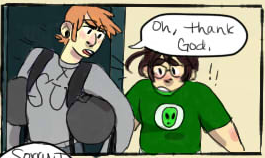

obviously this is just a crappy sketch, but you can see how the pose and expression is more exaggerated, which makes the panel Talk to the reader more? to make a comic really talk, it has to have good movement and expression above all else.

but anyway im basically grasping at straws because you've got a good start here! give yourself smaller gutters and bigger panels, improve your gesture and maybe your form - also, try being more playful with colour and tone, to induce mood. its not a must, but play around and see if you hit on something you like. and maybe look into colour theory and construct your palettes more careful, as a harmonic colour palette could make it really visually pleasing (although your colours are good as is)

I think you have a good start.

I would say be mindful of the panel background color vs the page background color. Being the same color everything kind of meshed together, especially with thin panel borders.

Your style is really cute. It could benefit from some thicker outlines around the characters to help them stand out from the background. This can also be helped by some different color choices, the dark dresser for instance behind the dark colors of the character's costume makes them blend into each other.

Some general notes. Think about establishing shots so the reader knows where everything is in relation to each other. Also think about the 180 rule, in a nutshell when changing the POV of the camera keep the character on the same side of the screen.

Otherwise, great job so far.

jumping of off from the point about bubbles from "punkarsenic" the artist of scott pilgrim says the first thing he draws is the bubble so he knows how much space he has for the panels drawing