I accidentally hit 'ctrl+enter' instead of just 'enter' when trying to do a line break in my first post, so I'm just gonna continue in a second one.
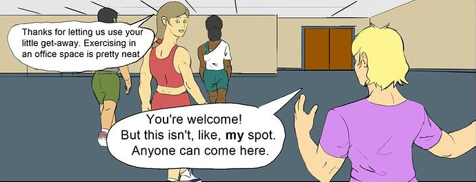
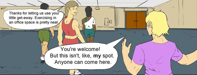
a lot of little things in your presentation are really bugging me. These wobbles I've circled in read stand out like sore thumbs, especially because it's a close-up on architecture, which needs straight lines to function.
If you don't have any sort of tool to create those straight lines for you (and, honestly, I've seen people literally hold a ruler against their tablet, so you can absolutely pull it off), another option is to completely lean into the wobbliness, like this:
Almost none of the lines I added here are particularly neat or straight, but because there's so many of them and it's a consistent effect over the whole thing, it doesn't stand out and feels like a more cohesive style.
If you want examples of comics that do this well, I HIGHLY recommend reading Jujutsu Kaisen or Chainsaw Man. In addition to both just straight up being absolute bangers, they both have very loose, sketchy styles that use a lot of imprecise and messy mark-making in a way that feels natural and cohesive.
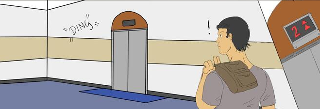
Generally speaking, your sound effects should stand out a lot more than this. Don't be afraid to really go all-in on drawing the words, rather than just writing them. The 'ding' in the panel above is not actually physically there: it's an element you're adding in to represent the sound, so it doesn't have to be identical to your regular lineart or handwriting. It has to mesh with the rest of the art decently, but it's an artificial element of the drawing you've included to represent a non-visual element, so it doesn't necessarily have to feel like a part of the world.
In this case, the 'ding' is supposed to be sort of jarring and noticeable: it draws the character's attention straight to it, it's sticking out in the 'soundscape' of the scene, so have it stick out in the artwork as well.
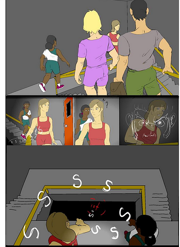
Same issue as before with your environments: this is a dark, dingy stairwell. Have you ever been inside a dark dingy stairwell? I can tell you with absolute certainty that they are not this clean and smooth.
Additionally, you have a big issue across the board of making your characters not really feel like they're IN the environments. They're just kinda floating on top of it. One of the simplest and easiest things you can do to remedy this is to add drop shadows. especially here in this dimly-lit stairwell, why aren't the characters casting any shadows on the walls? Make them interact with the world they're in, even if it's just by virtue of being IN the stairwell, they're going to have some sort of effect on it.
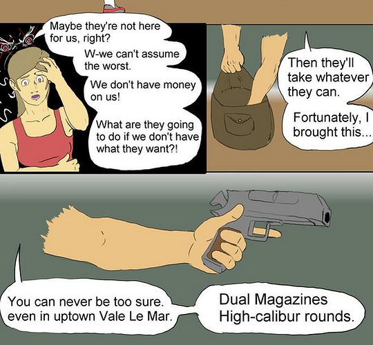
this effect is absolutely killing me. I cannot even fathom why you would do this. Just draw the entirety of the arm. Have it go off panel. Having it cut off like this is just... bizarre. There's absolutely no reason for it. Either use the entirety panel you have made for yourself, or make the panels smaller.
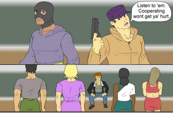
I think these two panels here exemplify the issue with your drawing the most: you seem to have a good amount of experience with just drawing a person. Standing there, maybe a little of gesture or pose. That first panel looks really good, lots of nice details and construction, the figures feel solid and weighty despite the thin, delicate lineart, it looks great.
But then the second panel clearly illustrates to me that you lack experience in drawing characters moving around, interacting with things, and emoting in more than basic ways. The guy is supposed to be sitting lazily on a table, yet he's just kinda... there. His proportions are all squashed up and weird, and the other characters are all just kinda... there too. None of them has any body language: they're being held at gunpoint by a criminal, yet they look like they're lining up for a drill sergeant for the most part.
You need to work on your character acting: your actual base drawing ability is pretty solid, but you're not using that drawing to tell me anything about how those characters are feeling or what they're doing. I can see you trying in a lot of panels, but you definitely don't have as much experience with that yet, and it almost looks like 2 different artists at points.