Yeah... I wasn't sure how to say this gently, but since @UrMom already said it... I personally wouldn't read these as "artsy", I'd read these as "this is a developing artist still learning how do use their style." There's nothing wrong with that, but I think it's going to hold you back if you use "I'm being artsy" as an excuse in response to people suggesting that a stylistic experiment isn't quite giving you the audience reaction you want, rather than looking for ways you could perhaps improve on it.
For example, if you think full colour looks "sickly" or "kiddie", you should probably look at colour comics that don't, like... Watchmen:

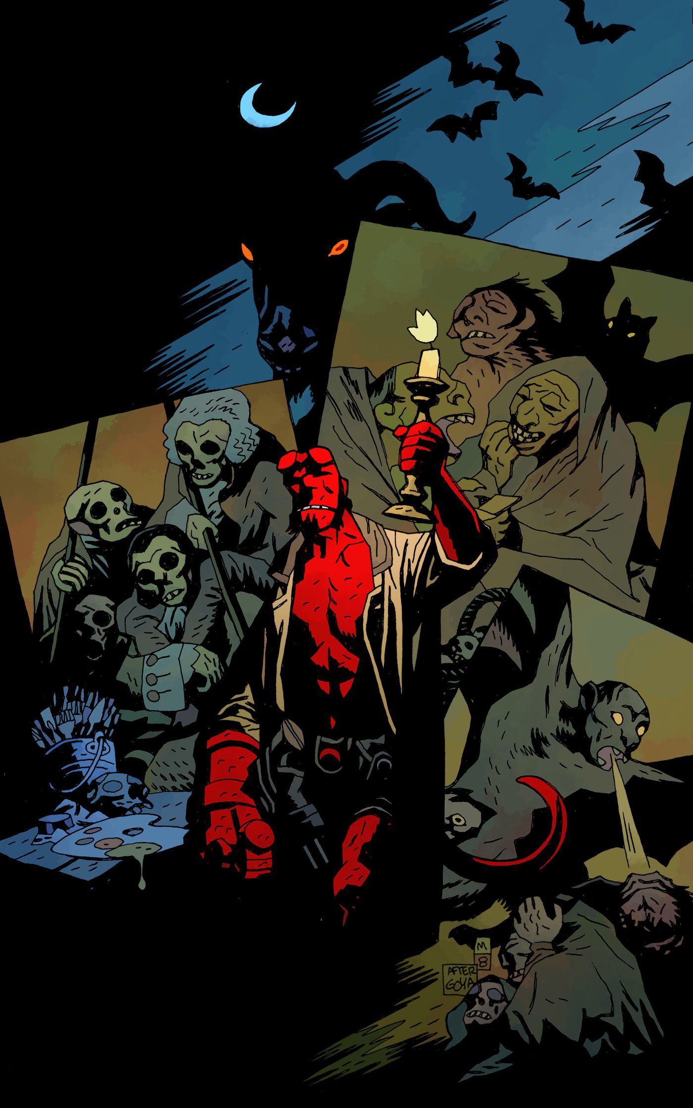
Or Hellboy:
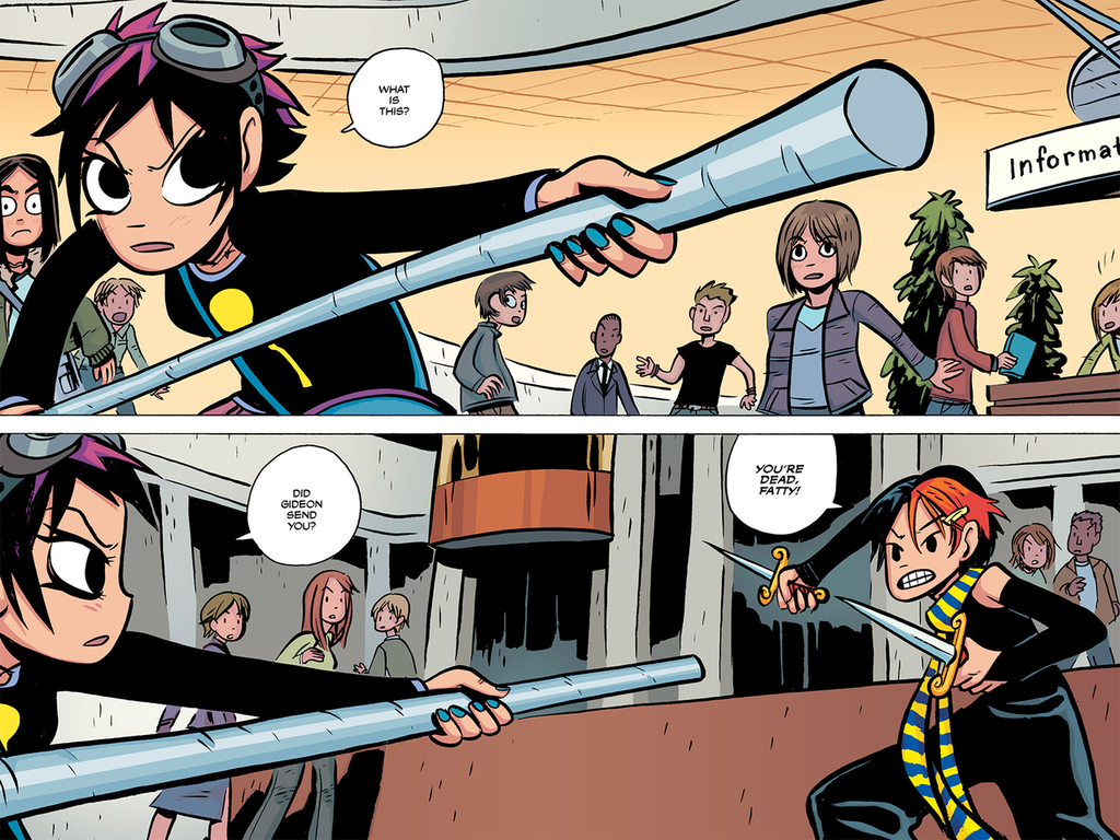
Or even the colour versions of Scott Pilgrim:
Because it's not the fact that the work is in colour that's making your colour pages look sickly and childish, it's that you're picking colours with a really high saturation, rather than picking some saturated colours, and some less saturated ones to create a harmonious colour palette.
A lot of the places your work deviates from a "normal" or "fashionable" comics style don't feel like deliberate choices from a seasoned artist who knows all the rules, could make a polished looking webtoon in a fashionable style if they wanted, but has decided not to; they look like things you've done because you didn't actually know how to do it the other way, or thought the other way looked difficult or time consuming.
Compare, say, Heartstopper.

This comic breaks a bunch of "rules" of what's popular on the Tapas front page. It uses very minimal colour, the linework is simple and a little wobbly, it's not in a manga style but a sort of simple indie zine vibe, and the text is hand-written. But this looks deliberate, because the colour wash, in a soft watercolour style to match the rough "hand drawn" looking inking, is used to add depth and make the figures pop. Black fills are used on the characters to make them stand out in panels. The hand-written text harmonises with the art style, and the innocent "schoolboy romance" tone. The wobbly panel clearly gets across the transition into a flashback. All of the choices Alice Oseman has made here look like the confident choices of somebody selecting what they believe to be the best balance of a style they could make a good number of panels of per week to a consistent level of polish, that clearly tell the story, and which evoke the intended vibe.
I think having the humility to admit you don't actually know how to do certain things you see in comics, and being able to say, "hey, how do they do that? Does anyone have a tutorial?" instead of saying, "It's my style! It's meant to look like that!" in response to any criticism, Is an important ability for a comic creator. You can get weird later, once you've mastered doing all the basic stuff to a competent level and can make your stylistic choices feel deliberate.


