
Pre-production test pages are always gonna be your best friend. Also, color charts to pull from while you work. I just set it up as a PSD with labels for characters, locations, etc.

From the beginning I wanted a cell shaded look for my comics. The easiest way to achieve this is with a shadow layer and using opacity to adjust the opaque value. 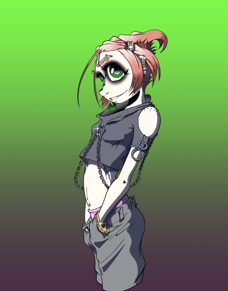
It looks really good. But I can tell it takes pretty much a lot of time and patient xD which I don;t have that many xD
at it's base i'd say it's pretty good but it could be the direction of the light or color choice that could be making things feel off. like taking this and doing some editing (redoing flats, new shading gradients, and a texture layer) i happened to get this from the time that you sent this reply to now
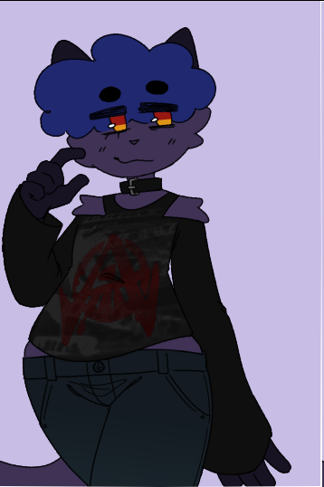
like for the most part it looks really good but whenever i feel doubtful about lighting or shading i just do a two tone gradient overlay to emphasize and then a noise or texture like this noise pattern i got from photoshop and turned into a brush
or this texture overlay from sandflake on deviantart
then i take those and set it to an effect like overlay, multiply or hard light that way it gives it that nice gritty/paper look to it
when i do it for my own work it's kinda like this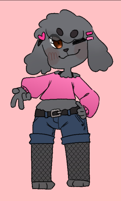
or to give an example of a comic focused style this ones really old but about the same as how i do colors now with flats and then some gradients or small details for things like hair, blush and clothing
probably the biggest reason why i like the texture overlays tho (especially the sandflake one) is that it helps give flats a bit more volume so it can look like there's that brush stroke look to it without breaking my wrists to get it. granted i sometimes break my own "rules" and go ham on specific drawing or panels coz i want those to pop the most but i think it's not so bad coz it can sometimes help to guide a reader to those things or add to pace or flow
That actually a conceivable option!! I might copy your version i like texture. I’ve tried texture as a brush before and it takes too much work, but from what I gather from your version it’s just overlay on the whole canvas right? Like adding noise filter. That only takes seconds lmao. I don’t know how much this helps me  The demonstration helps a lot thank you sooooo muuuuch I want to experiment it /o/
no problem! but yeah overlay on the whole canvas to get the texture and then choosing a layer mode that best suits the effect you're going for (ie, multiply, overlay, hard light, etc)
usually whenever i use effects like that it's like lines and flat colors
progressive details (which i only went extra for the shirt coz it's an illu and not a comic page tho it's mostly more overlays and edited assets)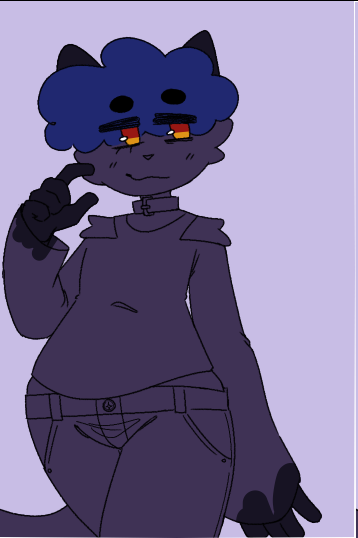
and then noise grain set to multiply
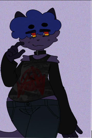
or texture set to overlay/hard light (depending on the look i want)

it definitely takes some messing around but it's been my go to for colors for a while now since it achieves the look i want but without straining my body
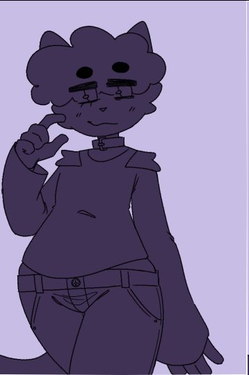
me on the exact opposite end being like 'can I get away with non existent lineart quality' :P
But yeah, I've personally read and enjoyed comic in your first style; even though I mostly stuck with those comics for the story, it wasn't like in a 'this art sucks but I'll tolerate it because I need to know the story' kind of way, but more of a 'this art is competent; I'd get bored if I sat and stared at it for 5 minutes, but it complements the story well' kind of way 
(And if push comes to shove, you can always go back and shade it later ig XD)
You can not only "get away" with it, I think it can be a good decision to keep things simple.
I think you shouldn´t shade at all when you dislike shading. I grew up with reading ligne claire
comics, no line weight, no shading. The readers don´t think about stuff like that.
When you look at different art styles / artists, they all put their focus on things and leave
out other elements. Some don´t use outlines, some don´t colors, shading etc.
Your focus can probably be on dynamic lines, it´s good that you can draw without sketching
HELL YEAH!
I'm a huge proponent of no shading styles  it shaves off so much time.
No-shading style does benefit from
* having simplified gradients here and there, especially for moody scenes
* having some sort of overall paper (or halftone/noise) texture
* characters with varying line weights to indicate shadows
* making sure the characters look very distinctive from the backgrounds even before the colors
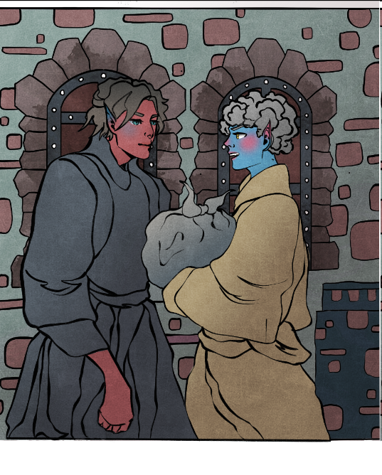
I pretty much only shade skin and very light-coloured stuff in Errant (like yellow or white fabric), and everything else I just make a layer on "add (glow)" clipped to the foreground colour layer and throw on an edge highlight, like this:
Simply changing the highlight colour allows me to tweak the lighting really easily while being very fast to do on a comic I make two pages of every week.
You have really strong lineart with a lot of character in the line weight variation, so I say keep the colouring really simple, you could even get away with totally flat colours or just a texture overlay, or blobbed in watercolour style colouring like something like Buuza!! or The Princess Beast2.
need to hear this sentence to remind myself of my priority. Yeah I mostly do lineart right away but if it’s more than two characters I still need a rough sketch to get the composition right. Thanks a lot 
@hakei that looks so gooooood like whoa but it looks not empty because the background doesn’t feel like an eyesore. Thanks for pointing out the benefits of no shading it makes me relieved to see really professional looking with no shading looks that good ‘o/
@darthmongoose I’ve tried using watercolor style but my lineart is in that awkward place of not really loose style which I think works really well with that two gorgeous comic you share! Thanks for sharing those comics btw, great styles! I might use flats or overlay texture on top of gradient, whichever works best. Do you think it’s okay to publish shaded prologue but no almost no shading for the next chapter? Or do I need to redo/ delete the prologue shading? Anyway thanks a lot
Personally, I'd redo the prologue for consistency if possible... but it kind of depends on how much work that would be. 
Yeah, I think as annoying as it'll be... that's the best decision. I've seen so many comics fail because the creator locked themselves into a style that's a bit too much work and they got burned out trying to keep up a schedule! You gotta have time for quality of life! 
... on the other hand, I personally might be more likely to be hooked by your first chapter if it's shaded, and I won't feel betrayed if later chapters are not, since I'm used to artists streamlining their styles over time So I'm not actually sure if consistency in this case is even the strictly better option wrt getting viewers XD
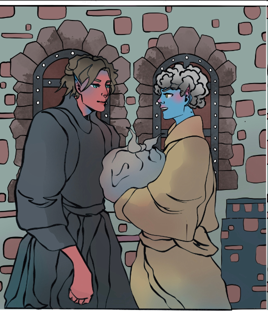
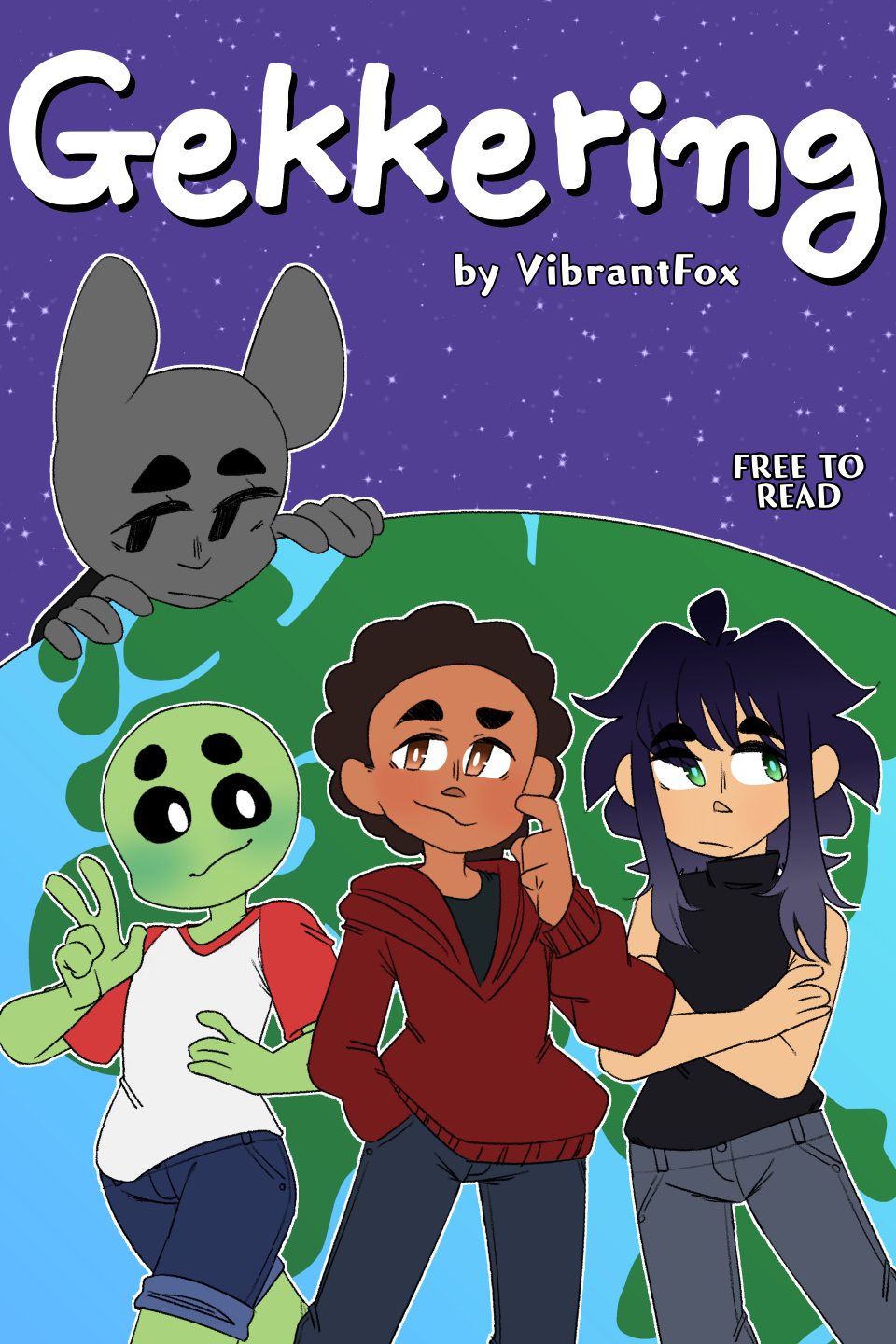
Actually I really like the second picture. Your style is very distinct and such styles are my favs 
Definitely wouldn't call it non-existent, you're way too harsh to yourself. You're doing great 
@TheLemmaLlama At any rate I’ll have two version to publish lmao
@DarkSena that’s very nice of you, I’m glad that you like the style, thanks a lot
Suggested Topics
| Topic | Category | Replies | Views | Activity |
|---|---|---|---|---|
| Looking for advice on updating old episodes | Questions | 0 | 185 | May '24 |
| How do i change my episode list order? | Questions | 2 | 219 | Jul '24 |
| What type of anthology comic would interest you? | Questions | 3 | 238 | Aug '24 |
| Q&A Submission for Embers of Hope! (100 Subs Special) | Questions | 2 | 214 | Aug '24 |
| What to include in a reader survey? | Questions | 4 | 232 | Oct '24 |