I really love the simple, clean black and white artwork you have! I'm not a sequential artist so take all of this with a grain of salt! 
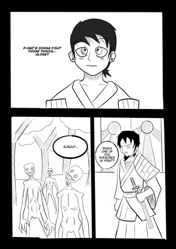
There's just one panel that I'd like to give feedback on! The second to last, with the monsters. Those are so scary, and you did a great job with their design! Tilted, smiling heads, desiccated bodies...terrifying! I love it! However, I think the background does not do them justice. You could really punch up the effect of their moment by giving a little more attention to the detail and atmosphere.
Right now, they are "trees". Standard trees that don't say anything about the setting, the tone, etc. If they aren't communicating anything, why are they there at all? But we still need a background, right?
A teacher of mine once told us to draw a tree without looking at one, and the result was a lot of these "standard" trees. Then he had us all go outside to draw actual trees. The result was fantastic! They really don't take long to draw, and they are really fun detailing all the knots, texture of bark etc etc
After the tree exercise, you can play with the values, shadows, shapes...make it a spooky tree. Because the trees you find in a beautiful meadow full of friendly critters are going to look different from the ones you find those creatures lurking around!
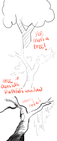
Here is a very quick drawing of what I mean by all this:
In any medium, we have to be intentional in what we put on the page/screen. I can tell from the first panel that you're really good at shadow and pushing value patterns! Take advantage of that and those trees and use them to make those creatures even more scary!!