gonna be honest, there's not a whole lot I can say. Gag-a-day strips rely so much less on camera-work and composition than what I usually do, so as long as the drawing is solid (which yours is), then it really comes down to comedy writing, which I am not qualified to talk about in any sort of detail.
The only real critique I have is that the default grey backdrop to everything makes it almost feel unfinished. Even a little bit of color variation to help sell the mood would make it feel like something is going on there, rather than the space around the characters just not being done.
Obviously some actual environment drawing would be great (and probably good for gags, too: the kind of housing arrangement that a bird and a dragon would share could be very interesting to explore), but any amount of texture and color variation would be very welcome.
okay, same thing I've told to a million other people on this thread: Construction drawing, construction drawing, construction drawing.
you need to be thinking in terms of 3-d shapes literally everywhere. You've got a little bit of it there, so I can see you're capable of working like this, but you need to build up such a skill in this regard that you're thinking about this sort of stuff in your sleep. It can be exhausting at first to constantly remind yourself 'three dimensional form, three dimensional form...' for every little detail, but after doing it enough, you won't even have to think about it.
Specifically stuff like the arm holding the cell phone and the hand on the far dude's hip: I can tell you reverted to thinking of them in very flat 2-d terms, so the fingers don't actually look like they're resting on anything, and the arm looks like a paper cut-out.
Additionally, you're using Pillow Shading.
All of this? It sticks out like a sore thumb. I can SEE the shape of the airbrush you're using for this effect, and you're not actually using your light source to define form, you're just kind of vaguely making the character look embossed.
Watch what happens when I take a panel from your comic, extract the lineart, and then just use the basic G-pen in Clip Studio to add some directional lighting:
From this...
to this:
Smoother, cleaner, easier to read, and actually a shitload easier than a more complicated method of shading.
Honestly, less is more when it comes to this stuff. It sounds nice to do detailed, soft, painterly effects all over your comic, but the fact of the matter is, the amount of time, effort, and attention to detail required to make those sorts of rendering techniques work is way too high to be able to reproduce them regularly and quickly enough to make a comic for most artists, especially ones without decades of experience under their belts. Make sure you're using your grey tones in such a way that they increase the clarity and readability of your comic, rather than detract from it.
Here's mine. I'm ready for the hard critique. I do know my art does need work.
I will be redrawing some pages of the latest updates/fix some colouring/shading errors after the next update.
First thing I noticed were your faces. You're clearly going for a style here, and I don't mind that, but you have a lot of places where it's not working.
This isn't a 'realistic skull' that I've drawn here by any means, but it's a geometric shape that is much more analogous to a real human skull.
Like I said, I know you're going for stylization, but the way you've deformed the cheekbones while leaving the chin in roughly the correct spot makes it kinda just look like his face is melting.
I think a great example for you to study would be Nichijou. It's got a similarly simplistic, cartoony art style that moves the 'point' of the cheekbones down, but does it in such a way that it feels natural and cohesive with the chin, the noses, and the eyes.
The faces are almost rectangles, with just a slight curve across the bottom for the chin, but the cheekbones being so far down don't jut out and draw attention to themselves, which is the issue I was seeing all over the place in your comic.
Again, I wanna reiterate, I'm not telling you to change your style or make your art more realistic, but as I've told so many people in this thread, you've got to know the rules before you can break them. Practicing realism and life drawing is useful for EVERY artist at ALL TIMES, even if your art is super simplified and exaggerated.
Speaking of exaggeration, you simply aren't using it enough.
For a more realistic style, you might be able to get away with more minimal movements, but one of the greatest strengths of such cartoony art is the ability to exaggerate and go over-the-top to really sell your reader on the movements.
Remember that in comics, you're working with static images that are meant to trick the reader into thinking they're actually moving, so if you draw an exact snapshot of what something in motion would look like, it's going to look very simple and flat compared to actually being able to watch the movement happen with your own eyes, which are capturing the before and after moments and putting them all together seamlessly in your head.
So when you draw a character running...
You have to REALLY draw them running. Push those action lines, have the characters lean into movements, go further than what they might look like in real life (again, KNOWING what it would look like in real life helps you do this better. Hence, knowing realism is still a good tool even for very cartoony artwork)
Same goes here: I recommend not going for the full spike-tooth mouth unless you want a character to REALLY look evil, so instead I just exaggerated the canines in her mouth to look like fangs. The mouth shape, however, can be larger, and more angular (again, knowing how different types of loud vocalizations look in real life when doing them helps this tremendously), and I added the little wrinkles under the corners of her mouth which technically probably wouldn't be there realistically, but they help sell the idea that her face is deforming in 3 dimensions, making it a lot easier to read the anger quickly and effectively.
Overall you've got some good stuff here. Nice sense of style, good use of line weight and form, decent, if simple, coloring. Generally pretty easy on the eyes.
I'mma give you the exact same critique I gave the last one, though: when your pretty anime boys look like this
but your MC looks like this:

it doesn't feel like her face is stylized, it feels like her cheekbone is melting.
it's definitely possible to have extremely simple/cartoony characters in conjunction with much more realistic ones, but that typically works with a stronger contrast, like in Bone:
In this comic, The Bone Brothers are weird blob creatures, and they exist alongside normal, exquisitely-drawn human beings, and it doesn't feel unnatural. You can definitely do this, but that cheekbone on your MC is the ONLY detail I noticed about her that's abstracted in this way, so it doesn't feel like she's a more simplistic character design in general, it feels like you just got the anatomy wrong.
I know you mentioned in another thread that you don't like drawing backgrounds, and I can see that in some places, but the real issue is, in fact, that you seem to be focused on drawing backgrounds.
Don't do that.
Backgrounds exist behind your characters. You don't want that.
You want environments, because they exist above, below, behind, beside, and in front of your characters. You've got some nice shots from the latest episode with the whole beach-and-forest setup, but there's never anything that the characters are interacting with, only standing in front of. No foreground elements, no footprints in the sand...
Why are there no blades of grass sticking up in front of their shoes here?
It's all the little details like this that really sell your comic on being a real place filled with real people, so pay attention to making your environments more fleshed out.
Thank you so much for the critique!
She's not the MC xD the bishonens are xDDDD yet you are right, I didn't have the right to melt her cheeckbone xDDDDDDDDDDDDDDDDDD
I wholeheartedly agree with all about the backgrounds / enviroment thing (Im avoiding drawing the footprints on purpose tho-because them have no bodies- but I did really forgot the footprints for the other people in the beach!! ;o; woah)
one of the best advices Ive received in ages. Deeply inside I was really afraid to "cover" the characters in certain panels even if I knew there was idk some folliage or a fence corner but with this advice will not be afraid anymore
THANK YOU!!!
The first thing that stuck out to me is your overreliance on 3-d models.
You're using them incredibly well in some places, I can see you doing good enough draw-overs on the city that it wasn't immediately apparent, and using them for the crowd of students was great; makes them easier to draw, but putting the uniform over each of them makes it hard to tell which is great.
However, when you're using them for the fight scenes, you're a little too beholden to them.
If I am, in fact, completely wrong about all this and you aren't using 3-d models for this stuff, then the problem remains: you're drawing as if your characters are stiff plastic action figures.
Look at that left panel. The whole point of this fight is that our MC completely outclasses this guy and he effortlessly wins the fight, yet the dude he punched doesn't look like he got hit, he looks like he got carefully lifted up. If someone gets punched in the chest hard enough to throw them into the air, the spine is going to arch in the direction of the impact. Ribcage will turn inward, and everything will be dragged along behind the part that got hit with that much force.
Additionally, regardless of how much stronger our spiky blue-hair boy is, he doesn't look like he's really throwing a punch. He's delivering an uppercut here, so he should be trying to get his weight under the dude he's punching, in order to use the whole body to lift up and add more force.
All of this works in conjunction with your composition; you want to lead the reader's eye towards the point of impact, so having the arm, leg, fist, and arch of the back all lead towards the point where the punch landed makes the action more readable and more dynamic.
Okay.
Look at this girl's hair.
You know what this hair made me think of?
Go on, take a guess.
Did you guess Hobbes?
Because that's what I thought of.
So the primary thing I did here was adjust the way those texture marks are drawn on the hair. I don't want you to get rid of them entirely, they're a great effect, but you're using them like a pattern and not like a texture.
Think about where light and shadow would fall, where the hair is going to be darker vs. lighter. Individual hairs are a pain in the ass to draw, so the vast majority of art styles simply exaggerate what happens in real life and make the hair 'clump' into larger, more solid masses with a hair-like texture drawn onto them.
The thing about textures, though, is that they are different ways that a surface reflects light. This means that textures will be visible when there are TRANSITIONS from light to dark. Thus, those texture marks shouldn't be spaced out in even perfect rows like that, they should follow the light and shadow.
Additionally, I looked at this and realized she's in the middle of a glowing golden sunset, yet her shadows are still grey and desaturated, and the hair highlights are perfect white. She's got golden-orange light ALL around her, which means that the shadows will be getting 'filled in' by that orange ambient light, making them tint more orange, and the light shining directly on her is a very golden yellow, so it's not going to reflect perfect white back at our eyes, so the highlights on her hair are tinted towards the color of the light source.
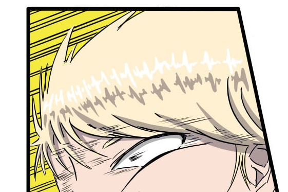
I noticed this all over your comic; the hair highlights are in these very even, repeating shapes that don't actually look like they're defining the form or volume of the hair, and they're always a perfect, stark white, which is rarely going to happen unless everyone has drenched their hair in grease or hair gel.
Which... I guess from some of these hairstyles, maybe, but then again my main character looks like this:
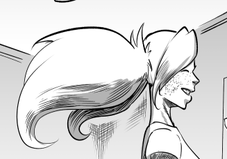
so, y'know, throwing stones in glass houses and all that.
Thank you very much, reading over and looking at the images this really helps. my art always felt a bit off and now I know why. I'll be working on getting some new character art and better poses to fix this. I started to let go of my realistic/ still life artwork, but it's obvious now that I need to practice that more, especially anatomy. I'll be going to school soon for art so hopefully that on top of more practice on my part can fix this. Again thank you very much for taking time to critique my work.
Once you're in art school, you should definitely check and see if your school does weekly life drawing sessions and attend as many as you can. Before Covid shutdowns, I would try to get to a life drawing session at least every other week, and it really does inform the rest of your drawing (even very stylized cartoonish drawing) in a lot of very positive ways!
A resource that I use all the time is this: https://line-of-action.com/practice-tools/figure-drawing11
Usually I set it to 60 seconds per image, and then go as fast as I can for 15-30 minutes or until I fill a page. Your drawings don't have to be perfect, don't even have to be good. Just draw. The more you do this, the more you'll pick stuff up and it'll become part of your muscle memory. Often I'll use it before I start a pencilling session to loosen up, or to shake off the rust after not drawing for a little while.
Hello, my comic is new and I only have 8 episodes up now, but would appreciate any of your feedback. It's a cartoon style but I hope you would still like to see it.
https://tapas.io/series/When-You-Were-Sleeping8