206 / 278
Aug 2021

I like a lot of what you are telling people so far. You're doing nice with the critiques. :sweat_02:

I understand, Thanks for the tip. Honestly, I'm still trying to get the hang of the whole thing. I'll try my best to improve it in chapter 4. Sadly, i had already repeated the same mistakes throughout chapter 3 so I'd have to work on it in chapter 4.
Once again, thanks so much for the correction.

I would love a critique on my sci-fi/comedy, Space Pack if you've got the time! I'm always open to critical, honest feedback, and would love to hear what you have to say. If not, no worries! Thanks in advance! :slight_smile:

11 days later

Okay, this one... this one interests me.


This right here? This feels like a punchline.
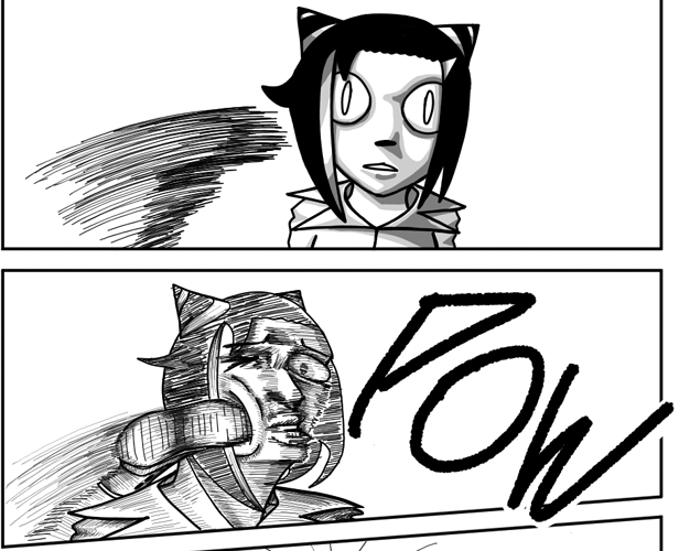
Like the art style shifts, DRASTICALLY from one panel to another. I'm referring specifically to your line quality. Most of the time your comic is drawn with these really dense, dramatic hatching marks all over the place, and it lends a serious air of liveliness and intensity. I love it. You could definitely do with a little more control in some places, but overall, it's an extremely unique look and I love it. However, you seem to switch back and forth between that and this very smooth, glossy grey shading, seemingly at random.

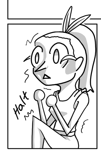
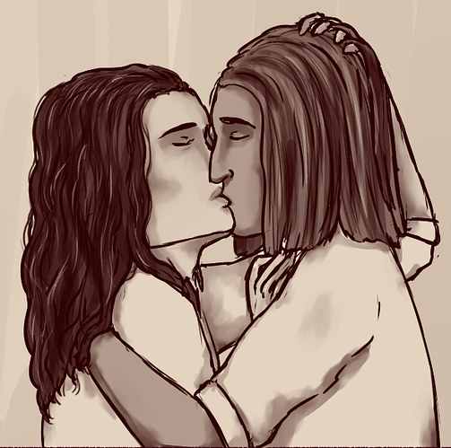
Like... in the example above, it goes from the greyscale shading when the character is sitting still, to all the messy sketchy hatchmarks when there's a moment of intense action. Okay, so you're giving me a visual language here: those hatchmarks indicate intense movement and action, but then in the very next moment...


This character isn't moving, they're standing perfectly still in the aftermath of that kick, but you're still using all these dense texture marks. so... those hatchmarks DON'T indicate intense movement? Alright, then that means the greyscale must have indicated something else, right?
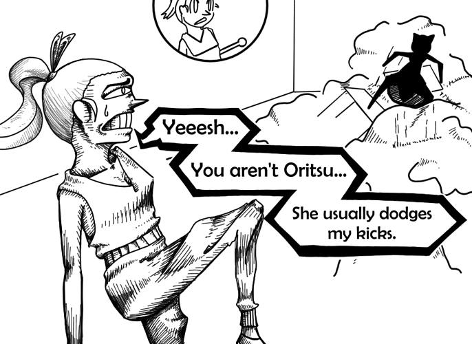
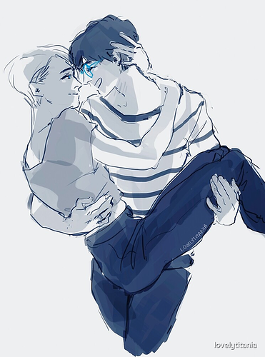
So where's the next place we see it?

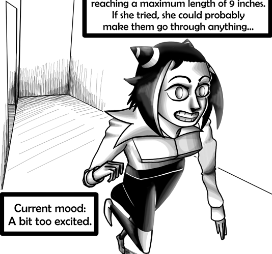
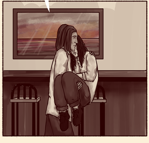
huh... this looks like it's being used as a punchline for a gag; the character is overly simplified and doing something kind of silly, so... the greyscale shading means funny gag moment?
but wait, if I scroll up a little...

This DEFINITELY isn't a comedic punchline as far as I can tell, so what gives?

My point here is that it's okay to change up your art style within a story like this, but it needs to be done with intent and purpose. You know how like... black-and-white scenes in the middle of something color kinda automatically mean 'flashback scene'? Or how watercolor textures are used to indicate dream sequences? THAT is how you should be changing your art style. Make sure your visual language is consistent, otherwise you'll end up unintentionally communicating the wrong thing to your readers.

I really do love the style of this. Like I said, the really dense, crazy, almost frenetic hatchmarks make it feel really active and lively, but they also might be eating too much of your time. It doesn't look like you're focusing very hard on the underlying structure and anatomy very well.
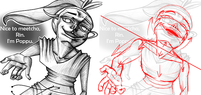
Like here:


You've set the horizon line in the middle of Poppu's neck, meaning we're looking up at her face and down at the rest of her body. The angle is REALLY extreme here, so it's like a fish-eye distortion, which is fine; she's obviously supposed to look kinda creepy here, so that works in your favor. However...

With perspective this extreme, EVERYTHING needs to be affected by it. You would never see the lower lids of the eyes arch down like that if you're looking up at someone; the cheekbones and general curve of the face would cause them to look squished in. Same goes for the bottom lip; you'd barely see the edge of it, while you'd be able to see the top lip in full. This is a SUPER difficult angle to draw people from, so it's going to be a challenge no matter what, but you're only making use of the twisted perspective you've got going on here in some places, making the rest of it really heavily clash with what would otherwise be a really striking composition.

There's generally a lot of issues with your anatomy as well. I recognize that your art style is very angular and abstracted, so it's not quite as big a deal as if you were going for a more realistic design, but it does have some major effects even to a style like this. If you make a neck too thick or an arm too long or a hand too big, it should be on purpose. Learning real world anatomy is useful for any and all art styles at all times, even if you're going to distort it, because you need to know HOW you're distorting it before you can do it effectively.
Definitely keep with that messy, scratchy, ballpoint-pen-lookin' shading style you've got going on, just try to be a little more consistent and intentional with it. If you get it down, I think you could have a really striking and unique visual aesthetic on your hands.

I... uh... I don't...

I've been staring at your comic for like 20 minutes trying to put together anything to say, but I feel like my brain has melted out of my ears.

Does that read as a compliment? I mean it as a compliment.

I genuinely can't say a whole lot because your style is so insanely psychedelic and abstract that it's almost a different skill set entirely from my kind of drawing.
It's obvious you're really comfortable with your style, and you've done a better job by FAR than I would have expected making the comic readable even with the flat, abstract, and candy-colored insanity you've got going on. Like legit, I wouldn't have thought it would be possible to actually make a comic this dense, loud, and busy while still making it possible to read and understand the story, but you've done a decent job.
My only caution, with regards to that, would be that you're kind of walking a razor's edge here; one slip-up and a page could go from drug-trip-nirvana to unreadable mess. I can't find any egregious issues with it yet, but there are a few points where it becomes more collage and less sequence-of-images.


Like here, I can read what's going on, but it could probably be a little clearer; when it comes to comics, even taking an extra fraction of a second to find the next text bubble, look at the next panel, or parse what is moving where can be a MAJOR detriment to a reader's immersion, so pumping up clear, easily-understood visual communication needs to be at the top of your priority list.

Like I said, you and I are almost working with completely different skill sets here, so I know I didn't do a very good job here, but this is just some really quick and rough indications of thinks I think could help clarity here; shadows being cast by characters to indicate their relation to the objects around them, slight color shifts to indicate foreground and background in a subtle way (I tinted the characters more red-magenta here, and the background more blue-green), and large black shapes to really draw attention to things. I guarantee you could do a better job of this than I could, given how far outside my wheelhouse this is, but in general, keep an eye out for places where you can use tools like this to help boost that clarity and readability.
Overall, though, absolutely stellar fucking work. I've never dropped acid before, but I feel like looking at your comic has given me a pretty good idea of what it would be like.

So long as this could help improve my comic and story telling, I'm willing to hear your critiques.

So far the prologue is done and the chapter will be coming this year,

I legit can't say a damn thing. How the hell are you not working for a publisher already? this shit straight-up blows anything I can do out of the water, and even many full-time professionals working on marvel and DC comics right now. Absolutely stellar.
I could probably give some really small little individual panel-by-panel critiques, but I highly doubt I'd be able to tell you anything you don't already know.

Also


best easter egg I've ever seen on this site. Good show.

A'ight, first off


why this comic starring Weird Al Mothafuckin' Yankovich?

Anyways


First thing I noticed, you're being real hasty with these fills and tones.

Lookit this; I just took about five seconds to go clean up all those little white bits in the hair where your paint bucket didn't catch the corners. They may be tiny, but they REALLY stand out and become distracting. I know I can't say too much, because I've had this issue in my own comic on a few occasions, but making sure there's nothing from a technical or craftsmanship standpoint to get in the way of your comic being readable is a pretty big deal, and when you have a sketchy style like this, you can't afford to sacrifice much in that department.


now, biggest issue I'm seeing overall is just some flatness and lack of construction drawing. The characters look stiff and emote in pretty bland, robotic ways. Not a good look for any comic, but in a romance story, especially, subtle body language and character acting are like the biggest of big deals.
I can tell with this panel, you just didn't look up ANY reference. Like... let's go google 'bridal carry' and see what we get...


3-4 minutes of searching, and I've got 2 really good photos for reference on hand placement and how the legs of the one being carried bend, and a really nice sketch for style and expression/body language.

So let's see if we can take what we see in these photos and use it to help us position the characters a little better, really sell the reader on this moment, ne?


Put it all together and clean it up a little, aaaand

Could definitely still use a little cleaning, but the pose feels a lot more naturalistic now.
The more you do this, the better you'll get at it, but in general, don't assume you know how to draw anything, even if you think you already do. You don't just want to 'not be afraid' of using reference, you should be EAGER to look up and understand how people do things in real life. It's not about finding an exact pose from the exact right angle and copying it either, it's about how weight shifts, which muscles are used for which actions, what overlaps what and where, all stuff you can learn just by looking at someone performing the action from nearly any angle. Keep referencing for everything, and you'll build up an internal library of sorts, of understanding how people move in order to do certain things. You've got a pretty decent foundation here, so once you get the subtler nuances of character acting down, I have no doubt you'll be able to go far with this.

Don't have a comic for you to review.

Just wanted to say how awesome and amazing what you are doing is.
I am sure everyone appreciates it!

Bravo for devoting all this time to helping people improve.

You sir are excellent!

Hahaha, thank you very much! I was honestly expecting something much harsher, I guess that's me being critical of my own work. I know some panels have issues and wonkiness, particularly in the first parts of issue 1 when I was still getting my feet under me making comics. The dialogue in issue 1 feels a little hammy at times too, a little forced. There's some drift in my lettering style in the first half of that book too--hahaha I could probably pick that first book apart all day, but I was still figuring stuff out, so I guess I can give it a pass.
You're the first person to recognize the cabbage man in that panel! Hahaha, Avatar was one of the inspirations for Heaven Hunters, so I felt it was only right I pay homage!

For the shading style, there hasn't been all that much thought behind it. Most of the style changes in episodes 6 and 7 were me kinda experimenting. I guess the softer shading is supposed to be for more light-hearted scenes, but that's not an all-the-time thing. Like in that scene with the thick line shading that isn't meant to indicate intense movement, the reason I used it there is that I thought doing it with thick lines would be faster than thin lines. And it could've worked if I spaced out my lines more and didn't make it look so harsh. The only time it works in this episode is when Rin makes an angry face and it's supposed to be an intense expression.

I felt like the difference between the shot of Rin running and the panel with Poppu stopping suddenly was the level of detail put into it. Like Poppu is shaded with a harder and simpler cell shading, while Rin is shaded with a softer and more rendered kind of shading. Maybe I should've used hatching on Rin for a more consistent tone, but I feel like the softer shading matches with her mood a little more.

Sometimes tho, I decide how I shade based on how much effort I wanna put into a panel, and it's just... lazy. And it's really obvious where I'm being lazy too because I put so much effort into most of my art.

I do probably spend way too much time on shading and not enough on making sure my anatomy is accurate. A lot of my art includes very detailed faces (not always well-drawn, just detailed) and then the rest of the body is just like "yeah, that's kinda what a body looks like"

I'm obviously still trying to figure it out, it's the first time I've tried making a comic like this. Some of these problems have kinda been fixed in the episodes I'm currently working on. Nevertheless, I'm still really proud of my small victories in all my drawings regardless of how bad I end up thinking they look. I'm always trying something different, and it really helps to have someone else put it into words so I can look out for it more. Thank you for your criticism

I always jump to the most recent pages to make sure I'm critiquing current work, so I didn't even really look at the beginning stuff. I'm also almost exclusively looking at art stuff here; there's way too many of these for me to read through the narrative of each one and get enough to sink my teeth into for a story critique. Same reason I'm not doing novels, so un-hamming your dialogue isn't something I'm gonna be able to help you with on a quick visual criticism like this.

I second that!

Thanks so much for offering your time for those super detailed reviews. I've already learned so much just by reading the responses ^^

Thanks for offering your time for this. I've been lurking and I've wanted to get to posting my first (actual) comic here so feel free to get to this whenever you have the time. This is mainly a series I'm doing just to "find my footing" if that makes sense?

Also the third chapter might be posted by the time you get to it since I'm currently working on it. Just letting you know.