
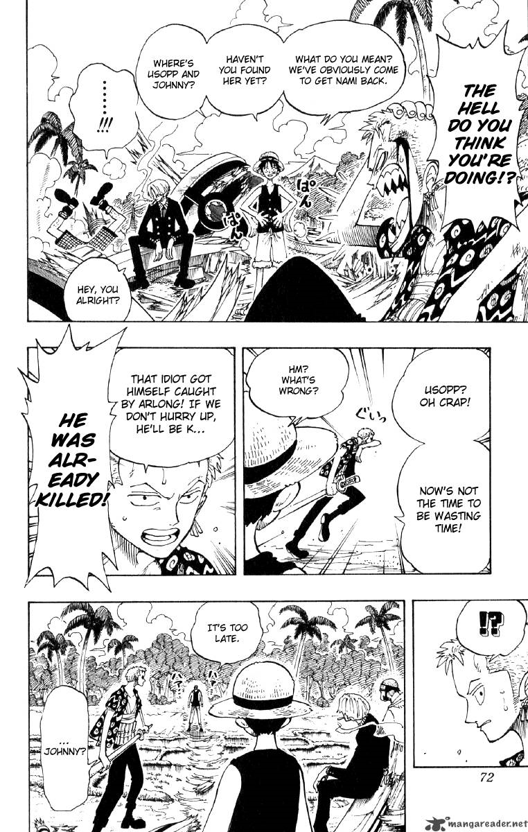
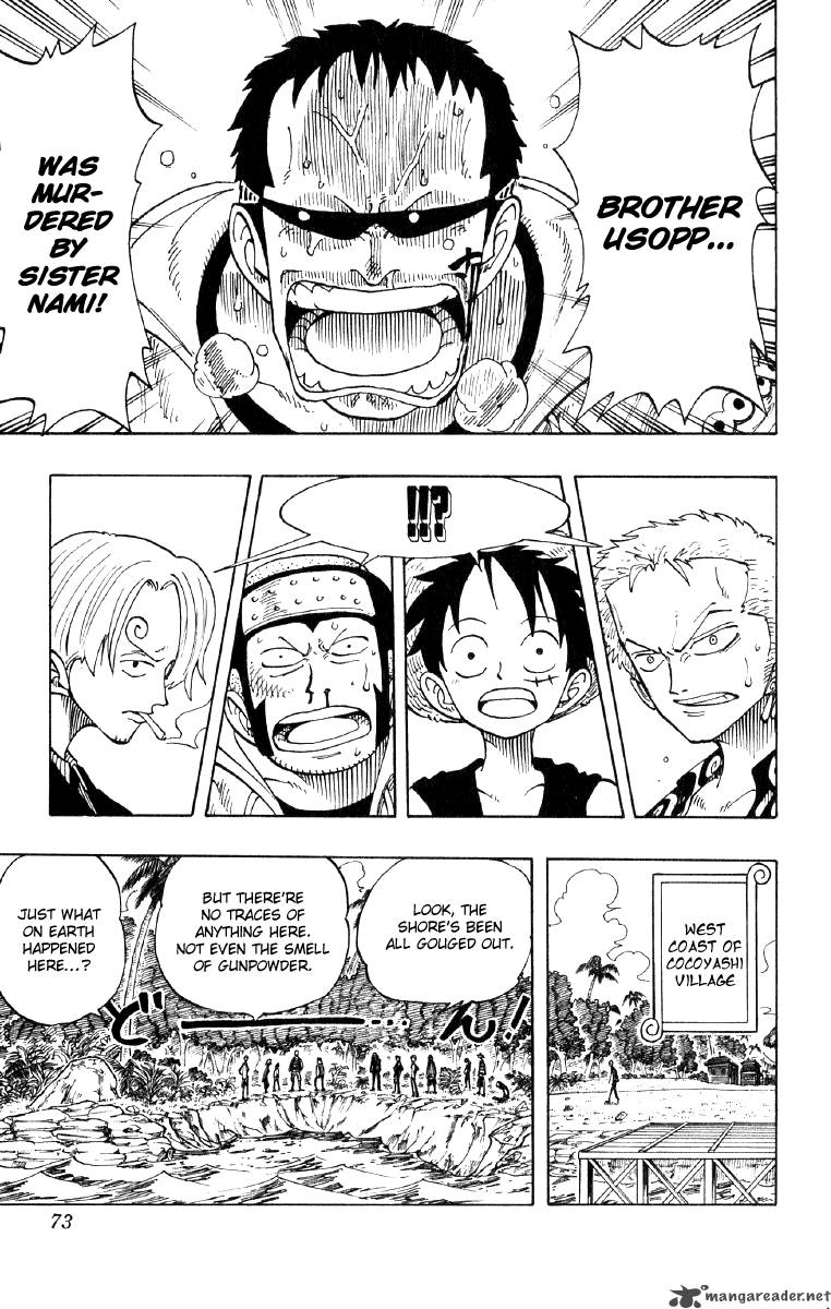
I’m in need of some harsh criticism.
12 days later

I would recommend making them full width, and then adjusting the height to match whatever's necessary for any given panel. If you're able to thin out your line weight and also make your text bubbles more legible, those three things together will give you more leeway, and you'll have the freedom to make panels bigger or smaller based on what looks best for pacing and aesthetics. Generally speaking, though, err on the side of caution and make the panels a little bigger rather than smaller, if you're unsure.
Okay, I'm breaking my regular policy here and we're going to talk about your writing because it's by far your biggest weakness.
Your art is simplistic, but you're definitely comfortable in your style and have got a pretty solid grasp on how you want to convey things with a cohesive look. Some of your environments could definitely do with a little tightening up, but it's not a big deal.
What immediately stood out to me was that every character speaks in these short, flat, declarative sentences.
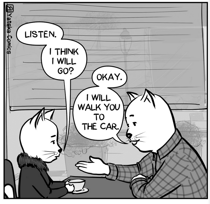

The characters technically have personality traits: they state out loud what they're interested in, what they do, and what their past is like, but they don't actually emote or express themselves in any way other than just saying things in this very flat, factual sort of way.
I mean... just go read through this thread: my way of writing these critiques conveys more of my personality than just stating what I think of things. I make snarky comments, I clarify some things but not others, I do pop culture references, and I have a general 'tone' that I speak with.
None of the characters in your comic have any sort of tone. What can we learn about Kate beyond just what she directly tells us through words? Is she sassy? Self-deprecating? Combative? We should be able to answer these sorts of questions without Kate ever saying 'I am sassy' or 'I am self-deprecating', she should act that out in her tone.
In an animation or movie or anything involving sound, this would definitely imply 'tone of voice', but we don't have that in comics, so you need to convey as much information about your characters through other means: Does she pause and stay silent before answering certain questions? Does she cut people off if she gets excited? Are there topics she'll just nerd out over and talk for hours on end?
We can learn just as much about a character from how they say things as we can from what they actually say, so start defining some concrete and understandable personality traits for your characters and think about how you can show those to your audience without just saying them out loud.
Oh jeez, I missed this thread when it debuted- just noticed and read through it today. Great stuff! Would love some feedback on my latest work if you're a glutton for punishment and are still reviewing works at the end of the current queue:
Comic is discontinued at this point, but would love to take critiques into consideration whenever I move onto a new project  One thing to note is that the first episode is actually the newest work- I drew the comic starting from episode 2-on then decided that I needed a better introductory episode before publishing.
This comic makes me angry.
like... very, VERY angry.
Trust me when I say this is a good thing.
If your comic was just shit, I wouldn't be mad. Might be disappointed or annoyed, but I wouldn't be filled with the righteous indignation of a thousand suns if you were just making a bad comic.
The problem here is that you're making an amazingly cool and interesting comic that I really WANT to read, but cannot because of some crippling mistakes you're making.
I'm about to rip you a new one, but I want you to understand: I'm being extra harsh here because I genuinely think you've got potential for something incredible, and I hate seeing it hamstrung like this.
Okay?
Okay. let's begin.
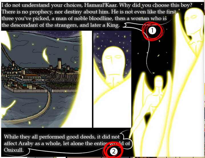
This enrages me more than I can possibly put into words.
Never, under any circumstances, should this be necessary. Absolutely not. no. stop.
IF these numbers are necessary, then you have failed as a comic artist.
there are no possible situations, not a one, where it is okay to put your text bubbles in an order that would make it so difficult to tell what you're supposed to read next that you need to label them with numbers.
If the numbers are required to understand, you have failed.
If, as in most cases, the numbers are not required to understand, then they are MASSIVELY distracting. They're constantly pulling my eyes away from just looking at the art and reading the text, which is where you want your reader.
I've said it multiple times in this thread, but even a TINY amount of time spent not immersed in the story can be catastrophic. Comics ride this razor's edge of immersion, relying heavily on the reader's imagination and unconscious mind to connect the dots. Even a split second of time spent consciously thinking about what comes next or what the image is supposed to convey can ruin that: it changes that unconscious flow of understanding into a conscious thought process, and it can be really difficult to stop once it starts.
flow and clarity absolutely have to be your top priorities at all times, and using a crutch like numbered reading order on your text bubbles is going to kneecap the natural ability of comics to be read smoothly.
If you're running into a situation where you think the reader might not know which text bubble to read next, then space things out, make bigger panels, bigger spaces between them. You are feeding information to your readers, and if that information is delivered to quickly and too densely, then they won't be able to parse it and follow the story. This is part of 'pacing': making sure the information is told to the reader at a steady rate that doesn't become boring or repetitive, but also doesn't overwhelm them with too much at once.
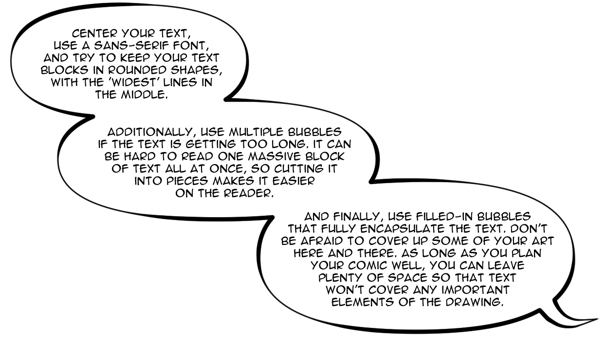
here's some more thoughts on lettering.
I understand that you're trying something stylistic with the white text in the gutters between panels, but it simply isn't working for you. Traditional bubble styles work, and they have been used for a very long time without changing for a reason.
Once you're very comfortable with lettering, you can do some things to experiment with it, but for most situations, normal-ass comic bubbles do exactly what they're supposed to do and they do so very efficiently.
Generally speaking, I love your color palettes: the bright, saturated colors and period-accurate clothing makes for a really unique and immersive fantasy feel. That said, your linework is very flat and static, meaning you need to pick up the dynamism in your coloring to compensate.
See how on the right, I just made the background a little darker and a little less saturated, while brightening up the two guys in the foreground? it's a fairly small and subtle change, but it helps reinforce depth quite a lot. If you're going to be keeping with this ligne claire art style (which i think you should, it works with the sort of storybook feeling you've got going on, then you NEED to be able to use the coloring to add depth.
And I'm not just talking about highlights and shading: that's one part of it, but your overall palette choices need to be working to help the reader know quickly and concisely where things are in the panel and what they should focus on. Saturated colors, warm colors, and light colors tend to come forward, while desaturated, cold, and dark colors tend to feel like they're farther away.
Contrast between any of those pairs (warm/cold, Saturated/desaturated, and light/dark) will draw the reader's attention and help them intuitively understand that there's a distinction between different elements in a drawing. It helps make things feel like real three-dimensional spaces instead of flat coloring book pages.
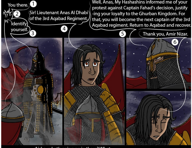
This is a great example of where your lettering is killing you. Having all of the text forcibly shoved up to the top makes it so my eyes are jumping from the artwork up to the text, identifying which bubble Is next in sequence, reading it, then back down to the art. it's jarring and uncomfortable and makes for a really awkward reading experience.
watch what happens when I space out the panels a little and place normal text bubbles with a little bit of care and focus put into the composition:

Now there's so much more going on here:
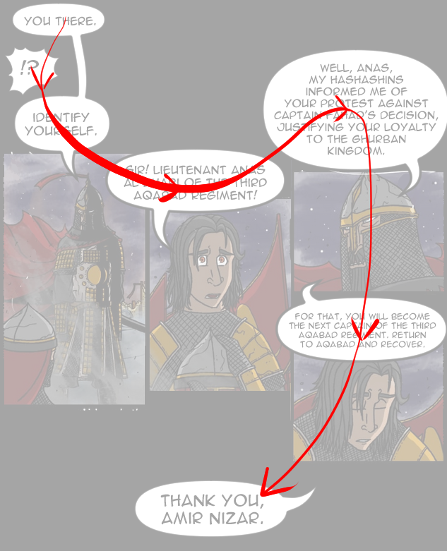
for starters, the eye flows naturally from one bubble to the next: there's no need to label which one goes in which order because it just makes natural sense.
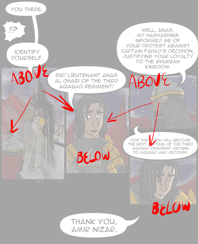
additionally, this allows us more freedom in composition: Nizar (a figure of authority and power) is LITERALLY above Anas in the composition, just as he is FIGURATIVELY above him in status and strength

this one's a little situational detail, but the text bubble that is placing the responsibility of leading the third regiment is now able to be placed quite literally on top of Anas's head, the figurative 'weight' of new responsibility literally pushes him down.
Finally, after all of this, there's a lot more blank space underneath these panels, making it easier to transition into the next scene: the final bubble at the bottom is allowed to linger a little bit and make it feel more like a transition or a fade-out in a movie, naturally giving a little breathing room to ease into the next scene.
This is what I mean when I say you're kneecapping yourself. the choices you've made as far as lettering and composition go are completely strangling the writing and composition. I haven't read it too closely, but it looks like you've got some solid political drama here, and the setting of a middle-eastern fantasy like this is almost never seen. It's an incredibly cool concept and you've visualized it pretty well, but it's almost impossible to read because of the layout you've chosen.
Your drawing overall is just so-so; decent cartooning and good use of pattern and shape design, but flat and lacking in construction or weight. You can go read through many of my earlier critiques in this thread to learn what I'd say to you about that, and generally speaking, you're on the right track.
Technical details of drawing and anatomy take a lot of time and practice to build, and you will likely develop those naturally over time.
the structure, lettering, and panel compositions are a much, MUCH bigger issue that could ruin this comic even if you were the most skilled draftsman on the planet, so you absolutely need to deal with those as soon as you can.
First thing that really stands out to me is just the craftsmanship.
All these little white confetti flakes were your paint bucket just didn't quite fit everything naturally? yeah, those stand out like a sore thumb, especially in a fully colored comic.
Trust me, I know how tedious and boring it can be, but these types of details can really make a huge difference.
As with most of these, I refer you back to earlier in this thread in order to see my thoughts on construction drawing: your stuff is flat and lacking in life and movement, you need to push your depth, form, and character acting across the board, but I would need more time than I have if I detailed that out for every artist who's lacking in it.
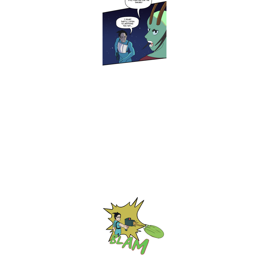
So you have a number of panels where the spacing feels incredibly weird and unnatural. Like... okay he says 'I doubt they'll listen to anything you say', and then there's a massive pause, and then he shoots?
Shouldn't he shoot immediately after saying his line, and then the big pause comes as the shock of 'oh fuck he shot someone' settles in, and then you get the big reveal of the dude with a hole through his chest?
If you're going to include big pauses or breaks like this (I generally avoid them overall. I prefer my comics less spaced out than most manhwa), then they need to be serving a purpose: building tension, showcasing a character's silence, or a break in scenes.
Big blank spaces like this cause a reader's mind to sort of reset, clearing out the preceding information and allowing them to intake new stuff, so if you use a big break in panels during the middle of a sequence of connected actions, it's just jarring.
In general, your panels are very heavily focused on keeping your camera eye-level and mid-range. I've mentioned it a few times before, but changing up that camera can make a world of difference in your reader's sense of engagement and excitement.
Take a look at how Eichiro Oda uses the camera in this sequence from One Piece:
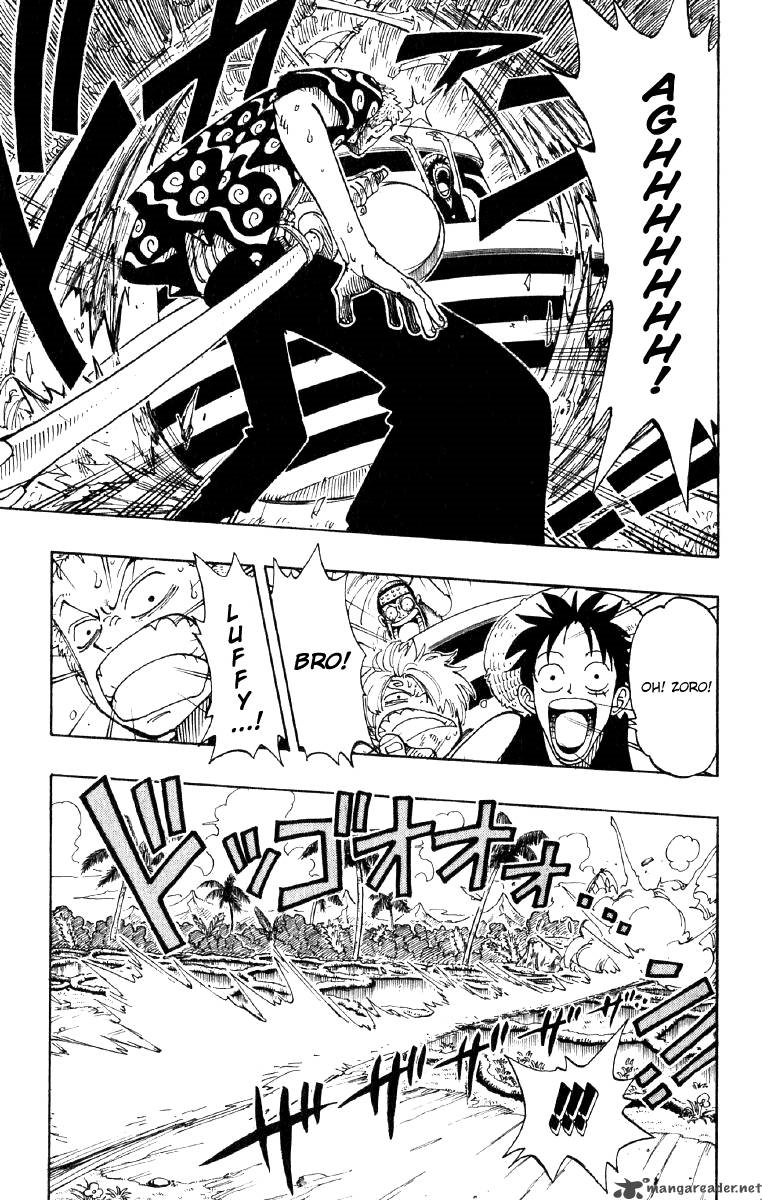
there's plenty of shots that are good, clear showcases of the characters and their emotions/movements, but there's also tons of panels that pull back and really let you see the environment they're in and where in said environment they are.
Don't be afraid of doing an entire panel or even a whole page dedicated to your environment and location. High-angles, low-angles, really move your camera around and choose the best possible angle for what you want to convey in each panel, not just the one that's most comfortable for you. Some sequences in your comic are a little hard to follow simply because the camera isn't showing me all the information at once, and I'm having to stitch things together piecemeal.
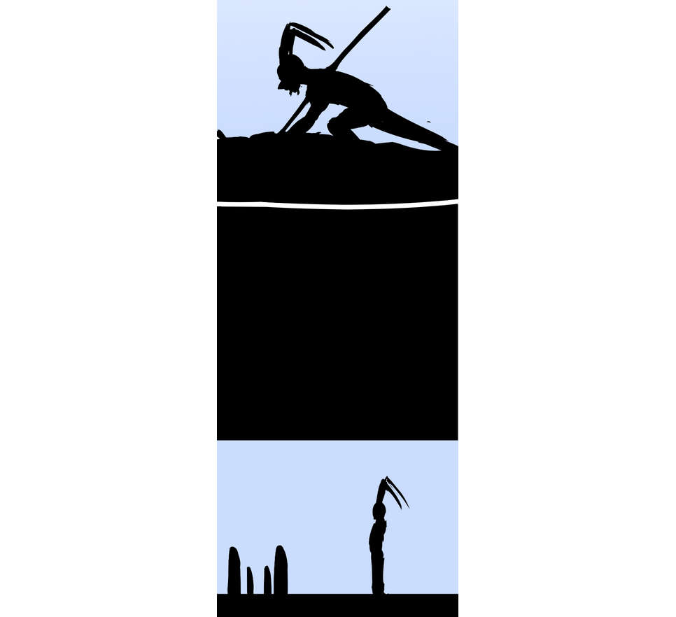
this is a great transition. you've got some really good instincts for dramatic storytelling. It's a little bit difficult to tell what's going on at first, but I think that's more due to the immediate follow-up panel:
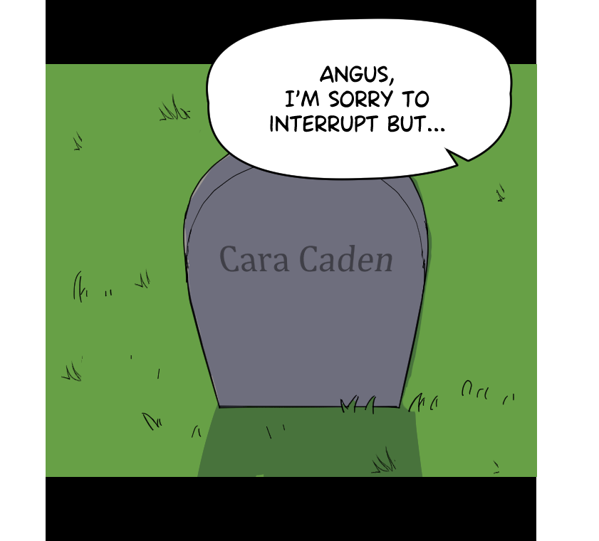
Since this panel is JUST the headstone, and its being viewed from a different angle than the silhouette shot, it's a little difficult to form the connection between what we saw in that silhouette to this.
Pulling back the camera a little, making it an over-the-shoulder shot of angus so we know that he's standing in front of it makes it easier to handle the sudden transition into flashback.
Promising start, mostly focus on those technical details of craftsmanship and using your camera and panel placement well. The technical details of drawing skill will come with time.
Yeah I think I'll have to color those small details by hand in the future to correct that. Honestly, I got a bit lazy regarding that. That's also probably the reason that the panel spacing was so weird in that example you showed. Pretty sure it was bad slicing that I just never fixed. Sorry about that. I'll have to pay far more attention to the previews in the future to catch that issue.
As for the construction drawing, yeah I could probably still stand to work on that but I feel like I probably got better in this aspect from my more recent work maybe? Though this is pretty accurate considering that this is four months ago while I was still working on that comic and its a pretty fair assessment. Still, It honestly feels kind of weird looking at the art right now. I just see how sloppy it all was.
Ah good point on the camera angle. I think part of the reason I didn't use much of the camera is because I wasn't really all that confident in my environment work back then (and I'm still not really all that confident in it but I'm trying to work on it when i can), I honestly thought it was one of the weakest things about the comic. Also I didn't think my perspective work was that great. Though for my next comic I plan to really improve on both aspects especially when you pointed that out!
I'll be sure to bookmark this as a bit of a small checklist to keep this in mind for my future project! Thanks for the help!
it's all a process and it all takes time, but one of the biggest things is that if you aren't confident in your environments or perspective or any other aspect of your work, you should force yourself to include those things as much as possible (without damaging the story, of course).
Actively finding your problem areas and working on them is good in general, but specifically doing it IN your comic pages (as opposed to just doing it in practice or studies) is something I advise because A: it shows you how to utilize those things in action, as opposed to just in theory, B: makes those things unavoidable (I know I would unconsciously put off and avoid doing practice on something I know I'm bad at if I had more fun/interesting things to do), and C: leans into one of the biggest strengths of webcomics, which is watching the creator grow and evolve over time. If you're bad at something right now, it just means you have more room to wow your fans later on when it drastically improves.
Thank you very much for the Critiques.
I will fix the issues you pointed out, especially the text, add text bubbles, remove the numbers in white circles, reposition the panels to space things out, and change the brightness to make it less distracting to focus on characters.
About some characters having the same colour clothing.
I am aware of other fantasy and even historically classic/medieval ages that people have their taste of wearing clothes with different colours to stand out from others.
The reason why they're having the same colour is that I want all readers to know the difference between Tribes, Clans, Kingdoms, Republics, and Empires based on the colours they wear.
This was heavily inspired by Avatar: The Last Airbender where each faction wears distinct colour clothing that differentiates themselves from others. This was later reinforced with strategy games such as total war, Age of empires, and Mount and blade.
Aside from that, I will do the changes for the sake of improvement for everyone to read.
I actually like the coloring choices on the characters, and their outfits work well. There's no problem with them having similarly colored clothes, and the really bright saturated colors on the clothes give it a sort of storybook/fable feeling, which is good. I was mostly pointing out that you can shift those colors a little, making them a little lighter or darker, make a green slightly more yellow or blue, a red slightly more orange or purple, etc. etc. in order to help readability. It's not about changing their color palettes entirely, just using those slight shifts on the existing base colors to make things easier to understand at a glance.

21 days later
ahahahahahahahahahahahahahahahahahahaha wow, what an analyses...tanks for the time u spent for me, i would never have thought of such a comment...i AGREE on everything u say, i was already on this points, i know i have problems with ballons, "sometimes" it seems an invasion of words over the panels. i think it's natural, i want to have low pages for event, but some dialogues can't be cut, i'm searching a way, but i'm so far. as for the lettering, some times i do wrong ok, it also uppen in italian, i would say "distraction"...thanks man i would think a lot about your words
(YES I WANT TO PRINT IT)