
Since we just started, we are looking for valuable feedback:
Thanks for the extensive feedback, and for taking the time. I'll definitely take it into consideration in the future.
As for the coloring, I can definitely see where you're coming from. Truth is, I had next to no experience with digital art before working on this comic, so it's a huge learning experience.
Thanks!
Thank you so much for talking the time to do this. I agree that backgrounds and coloring are where I’m weakest. I think the tips you gave me will really help!
Well, you took my weakest area to destroy, hahaha!
Yeah, backgrounds are one of the things that I always forget and try to fix. I still wonder how to do a correct camera placement to put everyone on escene.
Another thing, if you liked lines and faces, and proportions, on chapter 15 and onward there was an update on style! Check it again if you wish later!
Thanks for your words, they where very helpful!
Thank you so very much for your feedback!! Varying up the shots and being less lazy with the zoom-outs is something I will work on. It's always hard for me to tell what I'm getting away with (and what I'm not  ), so I really really appreciate the critique <3.
Let's see if I can reciprocate! Disclaimer: not a writer but I do read a lot so you're getting a reader/artist feedback here.
Cover & description: Your cover is beautiful but I'm not sure it matches the vibe of your comic - I would expect something flavored like Legend of the Galactic Heroes based on cover alone and it's a bit jarring to go from a bright anime-ish space cover to the dark almost gritty underwater scene that you open with. Your description got character across but also left me a bit confused/tldr. It was a little bit rambly for me. I went in expecting sort of a sci-fi comedy with a slightly goofy MC dealing with her powers and taking on aliens. Not a huge deal but the disconnect between that and your opening scenes might turn off potential readers.
Art Stuff:
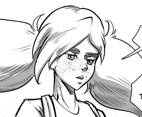
Anatomy - this is one of those skills that will just improve with time/practice but I'd focus on skull shape first in your case. There were a couple more jarring examples, might be helpful to pencil in the head before drawing hair. This one top of her hair looks too tall for me, for example. Watch the back of the head too on side views!
Backgrounds - on ep 9 you mentioned upping your game - YEAH. Definitely. Looks nice. I think for the most part your environments were either seamless and I didn't pay too much attention over the characters (sorry... I'm your typical reader that way) or cool where you were putting obvious focus on them (underwater was really nice for example). There were some panels with hatching textures that kind of bothered me. But then I was conflicted because it worked for some panels.
Here I found it distracting (especially with Piper's freckles as another texture):

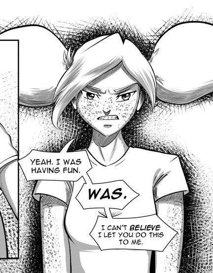
And here I thought "oh that is working:"
The gradient backgrounds where you had them on the night scene were much more seamless I think.
Overall I thought your art was most successful/striking with dramatic lighting - night, underwater, space. I thought this panel was fabulous:

I think you can add a bit more contrast to your more lit indoor scenes to take advantage of your strengths with shadow. It does feel like you're still looking for your art style a bit - I'm curious to see if it converges more as you go.
Story/Overall: Your comic feels a bit disjointed to me for now (both narrative and art-wise) - perhaps that will change when the different threads connect. The first episodes had me feeling like I was reading a sci-fi horror with a more... traditional?... feel to the art then we switched to a more manga-feeling high school drama. They're different enough that I think you're leaving room for readers to pick one they don't like. I did enjoy the humor and am invested in what happens to Pensky  .
.
Ah one more thing - there were a lot of names. I absolutely didn't remember them (and I am bad at this but I can't be the only one), just make sure to keep repeating so readers can learn them!
I already mentioned it but one more time - if you're primarily looking for internet readership, that text just has to get bigger/less dense. It's way harder to follow a comic that is tricky to read on mobile. Looks like you might be planning to print? In that case it's probably fine.
Hope any of this is handy. Thanks again for the feedback and in general for doing this!!
Oh wow, this is a popular thread!
If you ever get some time to read and bash mine, please do!
I feel like I can't get any further or even get better any more, I feel like I'm kinda stuck?
So a brutally honest critique would be absolutely swell! 
Long while back and I think I've improved a lot since, but I need someone who won't just say "yeah art good lol" https://www.webtoons.com/en/challenge/scum-town/list?title_no=60986010
I'd love to know what to improve on now that I've recently started a new comic (if you're able to get around to it among the rest, haha).
give it a shot now. I took another look and realized that the text is still definitely too small for mobile reading, so I just spent like all night reformatting the whole thing to make it actually work for mobile. Hopefully it's better.
And yes, the disparate narrative threads are actually going to be colliding very soon and will hopefully be a lot more cohesive in a little bit, but we have a shounen action fight to deal with first.