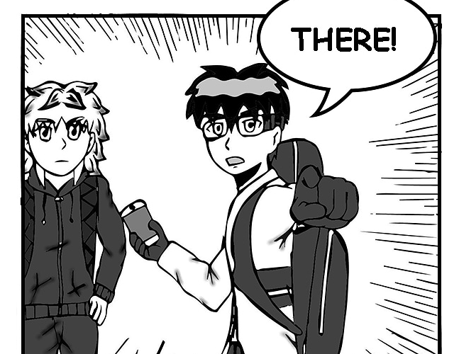
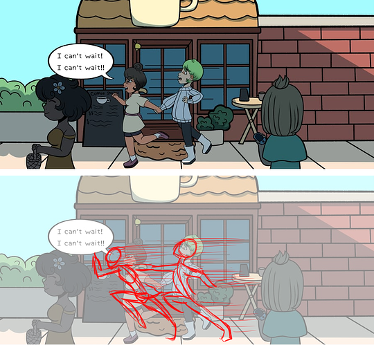
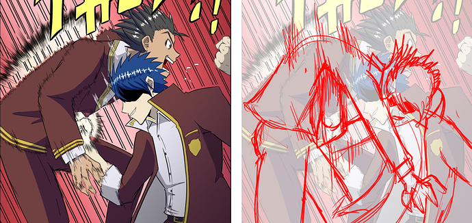
The first thing that stuck out to me is your overreliance on 3-d models.
You're using them incredibly well in some places, I can see you doing good enough draw-overs on the city that it wasn't immediately apparent, and using them for the crowd of students was great; makes them easier to draw, but putting the uniform over each of them makes it hard to tell which is great.
However, when you're using them for the fight scenes, you're a little too beholden to them.
If I am, in fact, completely wrong about all this and you aren't using 3-d models for this stuff, then the problem remains: you're drawing as if your characters are stiff plastic action figures.
Look at that left panel. The whole point of this fight is that our MC completely outclasses this guy and he effortlessly wins the fight, yet the dude he punched doesn't look like he got hit, he looks like he got carefully lifted up. If someone gets punched in the chest hard enough to throw them into the air, the spine is going to arch in the direction of the impact. Ribcage will turn inward, and everything will be dragged along behind the part that got hit with that much force.
Additionally, regardless of how much stronger our spiky blue-hair boy is, he doesn't look like he's really throwing a punch. He's delivering an uppercut here, so he should be trying to get his weight
under the dude he's punching, in order to use the whole body to lift up and add more force.
All of this works in conjunction with your composition; you want to lead the reader's eye towards the point of impact, so having the arm, leg, fist, and arch of the back all lead towards the point where the punch landed makes the action more readable and more dynamic.
Okay.
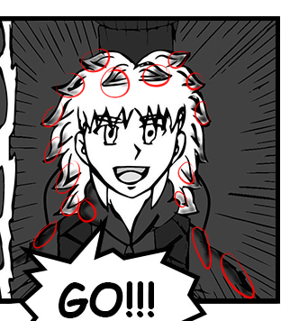
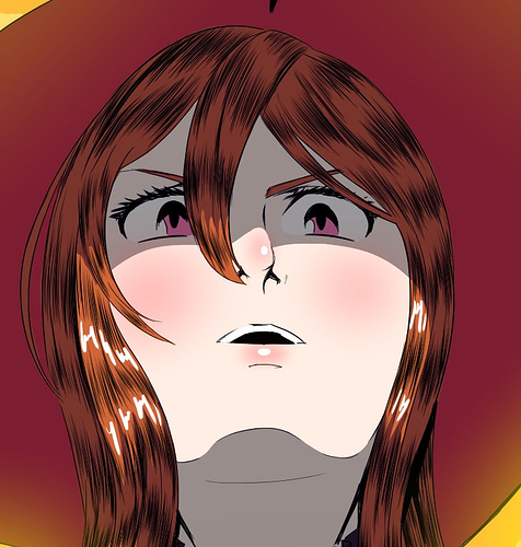
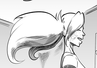
Look at this girl's hair.
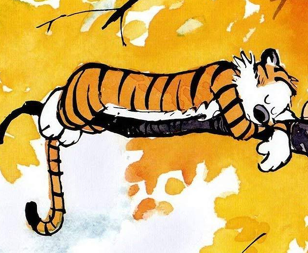
You know what this hair made me think of?
Go on, take a guess.
Did you guess Hobbes?
Because that's what I thought of.
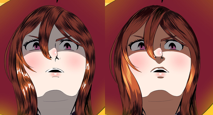
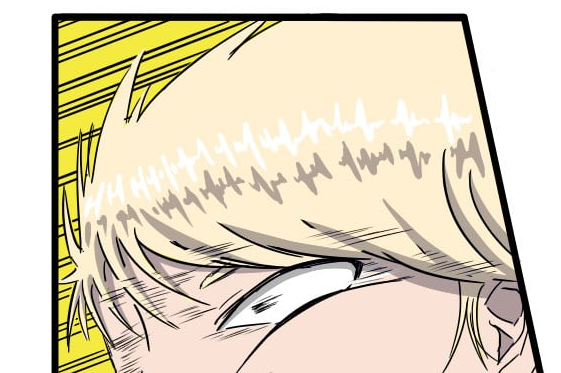
So the primary thing I did here was adjust the way those texture marks are drawn on the hair. I don't want you to get rid of them entirely, they're a great effect, but you're using them like a
pattern and not like a
texture.
Think about where light and shadow would fall, where the hair is going to be darker vs. lighter. Individual hairs are a pain in the ass to draw, so the vast majority of art styles simply exaggerate what happens in real life and make the hair 'clump' into larger, more solid masses with a hair-like texture drawn onto them.
The thing about textures, though, is that they are different ways that a surface reflects light. This means that textures will be visible when there are TRANSITIONS from light to dark. Thus, those texture marks shouldn't be spaced out in even perfect rows like that, they should follow the light and shadow.
Additionally, I looked at this and realized she's in the middle of a glowing golden sunset, yet her shadows are still grey and desaturated, and the hair highlights are perfect white. She's got golden-orange light ALL around her, which means that the shadows will be getting 'filled in' by that orange ambient light, making them tint more orange, and the light shining directly on her is a very golden yellow, so it's not going to reflect perfect white back at our eyes, so the highlights on her hair are tinted towards the color of the light source.


I noticed this all over your comic; the hair highlights are in these very even, repeating shapes that don't actually look like they're defining the form or volume of the hair, and they're always a perfect, stark white, which is rarely going to happen unless everyone has drenched their hair in grease or hair gel.
Which... I guess from some of these hairstyles, maybe, but then again my main character looks like this:
so, y'know, throwing stones in glass houses and all that.