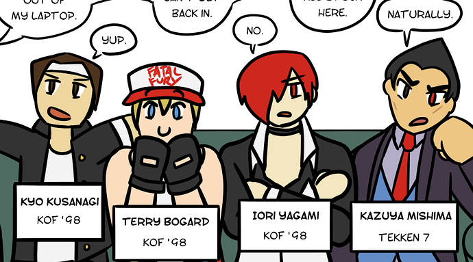
whooooookay... lotta good, lotta bad here.
You've got a solid handle on the basics. You know how to use texture to make a surface look like the material you want, you know the basics of how to construct a human body, and you've got a sense of cohesion and style in your color palettes.
You are also a complete mess when it comes to the finer details of anatomy, your color palettes are ultra-saturated, and your perspective is all over the place.
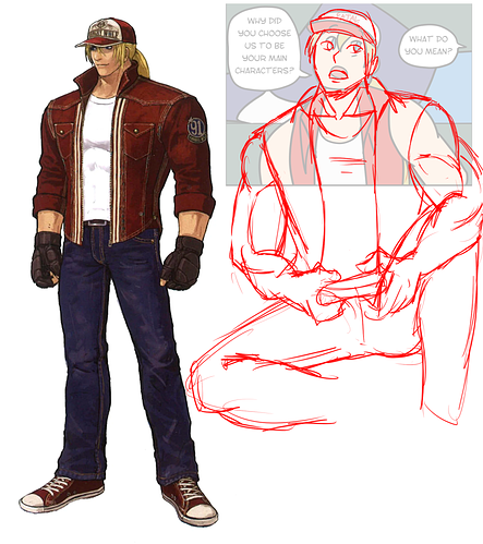
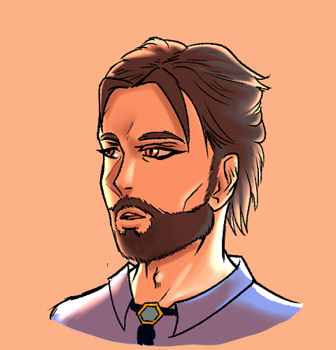
First off, this motherfucker is eating a Lil' Bits. His mouth is TINY. Not just like 'kind of a small mouth', this dude's lips are barely as wide as his nostrils. Can't eat any food wider than an inch, damn, that's gotta suck.
Okay, let's go through how you should be thinking about this...
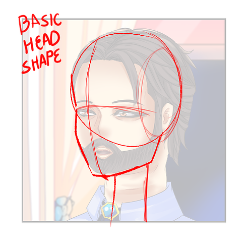
start with the basic head shape. make a sphere with the sides chopped off, and then add the jaw. There's a TON of variance in how exactly the jaw section is shaped, so I won't give any specific guidelines, but make sure you include a cheekbone and a chin. The details of the angles and arcs can vary wildly both from person to person, and from art style to art style, so experiment around see what works for you.
Draw a cross to define the middle of the face both vertically and horizontally. This will be a really important guideline later.
For now we're adding a very simple cylinder for the neck. This isn't the whole neck, just the throat, really, as that's what needs to connect down to the ribcage. We'll add more details later.
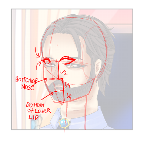
Next, we're gonna start defining facial features. Remember that eyeballs are, in fact, balls. They are spheres that are set INTO the skull, and the face curves in around the eyesocket to reflect that. Additionally, remember that the eyelids wrap around that spherical shape. There's a lot of perspective that goes into getting it exactly right, but any little bit you can improve this will help a LOT.
Now we're gonna define the rest of the face. This will, of course, be largely affected by your art style, but having that solid construction underneath really helps make sure things are placed properly on the head. Remember that everything on this head is facing mostly forward, but about 45 degrees off to one side, so the arc of his mouth is lopsided in order to reflect that, and the bridge of his nose actually overlaps a little bit of his far eye. This is the kind of shit that really helps your characters feel real and three dimensional.
Also, ears typically line up with the mouth on the bottom, and the corner of the eye on the top; the ones you have in the original are teeny tiny itty bitty.
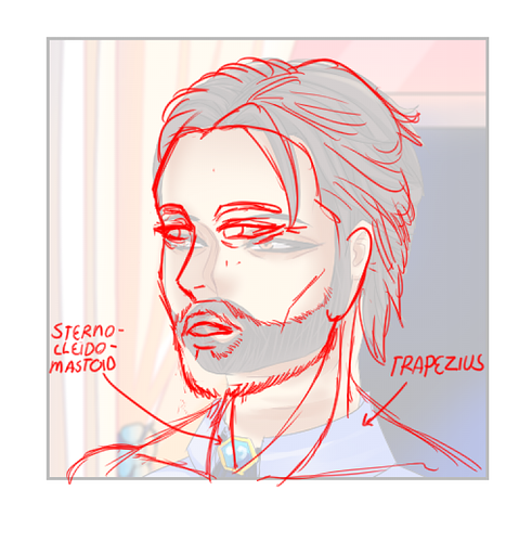
now we're gonna flesh out the neck. there's two major muscles to worry about here, the sternocleidomastoid, which forms the 'wings' that wrap up and around the throat, attaching just under the ears, and the trapezius, which is kind of a diamond-shaped muscle on the back that will form two triangular shapes slopping down towards the shoulders. Those, plus all the blood vessels, fat, and spine, will fill out the neck around the throat and make it feel like a proper neck.
Okay, so there's the basic sketch, now I'm gonna go ahead and ink and flat this whole thing so we can discuss your coloring.
Take this with a grain of salt: This is MY inking style, and yours will look different, that's fine. I don't think you should draw exactly like I do, I'm just getting some clean linework here so we can add colors more easily.
I did add a few details here, like the adam's apple, and I feathered the line on the beard: When you're up THIS close to someone, it doesn't matter how neat or tight their beard is, it's still going to have some texture to it. Making it a solid line just makes it look like the bottom of his face has been painted brown, as opposed to actually having hair growing on him.
Okay, on to color:
I just color picked from your original drawing to get the base colors for this, and all I've done here is add 2 layers, one on multiply, the other on add(glow), and used my pen to draw some simple 2-tone shading and lighting, often referred to as 'cuts' in the comics industry.
99% of comics look great if you can use this style effectively, and DO NOT NEED more complex coloring.
going back to your original...
all of these places I've circled in red are places where I can see your brush way too clearly. I'm able to make out exactly where you placed your pen, and it doesn't look like textured brushstrokes, it looks like a digital tool. You need to be able to hide your actual brush strokes more effectively if you're going to do a soft/painterly coloring style for this, and that takes up a lot of time, when simple cuts will work just fine, hence why not many comics do it.
That said, if you want to use a softer coloring style regardless, it can be done using the exact method I outlined above:
All I did here was take a watercolor brush to those hard edges I drew and smoothed them out a little. Notice how I didn't smooth out every single one, though. There will still be softer and harder edges to your shadows, even in a painterly style.
Aditionally, pay attention to your light source. This dude is primarily being lit by the sunset behind him, so really he shouldn't have this much light on his face, and we can use a second, darker color on the multiply layer to deepen some of the more intense shadows.
boom, suddenly much moodier. Using your light sources and color palettes to effectively communicate mood and tone is a MASSIVE tool when it comes to crafting a scene, so make sure they're working for you, not against you.
Honestly, most of the time, less really is more when it comes to this stuff.
Okay, all of that was a big deep dive onto a single panel to showcase all the details, but we can go through some other stuff too:
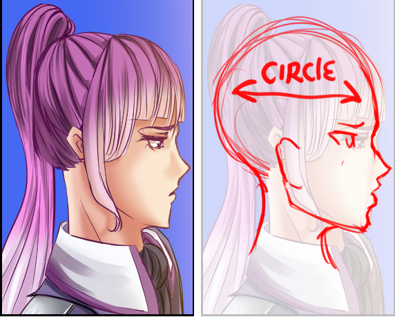
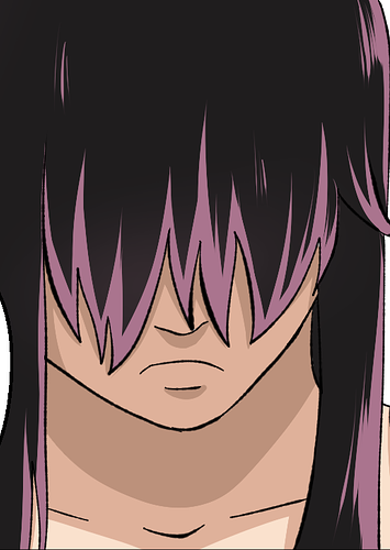
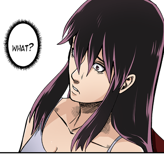
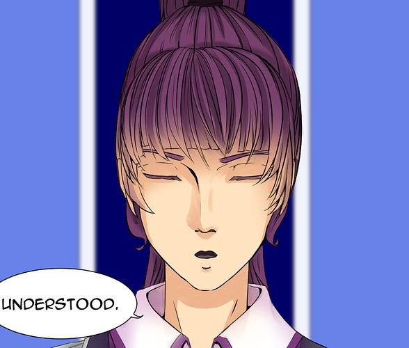
Head shape real squished here. The head is a sphere with the sides cut off, so it should actually be a little bit deeper than it is wide. Her base skull here would extend as far back as her hair, and the hair would add more volume all around that. Also tiny ears again.
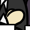
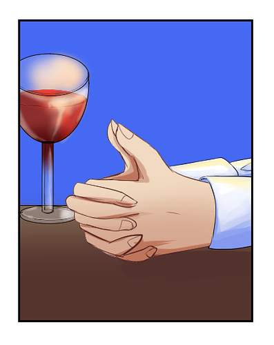
The perspective on that wine glass is absolutely killing me. The top rim should be slightly ABOVE our eye-level, yet you have it drawn as though it's further down than the base of the glass.
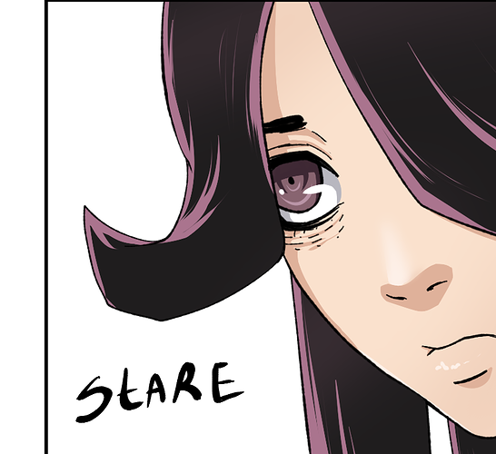
okay, so, I get what you're going for here. It's a really common effect in anime-style illustrations to tint the bangs with the skin tone to make them look translucent, but you have gone all the way to 11 and made them completely transparent here. It looks like either her bangs are straight up made of glass and I can see straight through to her forehead, or like her bangs are dyed the same color as her skin. Tone the effect down and make the skin color just a little hint, not a full-on color blast.
okay, this? this just doesn't look like you put any effort into it. I get that we're supposed to be inside this girl's imagination, but if you wanted to make it look sloppy because of that, you should go with like a crayon/pencil texture to make it look like an intentionally shitty drawing.
Even with that, she's doing what appears to be very serious introspection here, so a goofy crayon drawing doesn't feel like it's appropriate.
I feel like this is another case of 'less is more'.
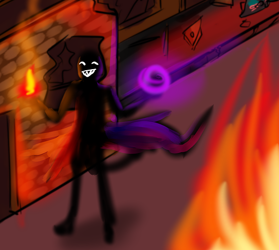
even something as simple as this looks better than what you've got here: A simple, ominous shape with glowing red eyes and sparks flying up makes it clear he's lit by fire. It keeps him completely mysterious and shows the scary, imposing impression of the dark mage, as opposed to defining anything specific, which help builds tension... and also only takes like 5 minutes to draw, and still looks nice and cohesive as part of the comic.
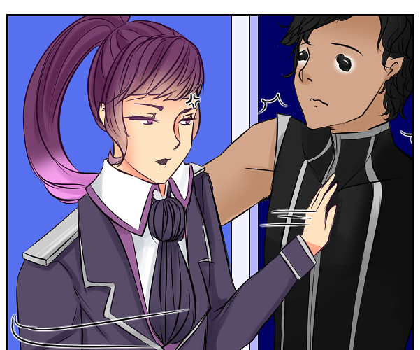
Now your whole first scene was mostly talking heads, so I couldn't say a whole lot about character acting, but this shot here tells me it's pretty lacking:
This is Erion's first interaction with Valin, so you need to put your best foot forward in terms of communicating to the reader about their personalities and relationship. As you have it, the interaction is just 'she pushes him away, and the characters are super stiff. I can't tell what sort of tone she has here.
If she's angry with Valin, then she should be putting her back into it, as they say: really make her push away from him and him from her, have the motion be swift and intense, with their bodies arching in opposite directions to show she's really
shoving him back.
Alternatively, if this is just 'something Valin does' and she's merely nonplussed about it, then having her be completely straight and stiff while whacking him with the back of her hand, only for him to be forcefully knocked back, makes her look cool and in-control, while he looks kinda pathetic and dumb.
The body language and acting your characters do lends a LOT to the more subtle nuances of character interaction. It tells you the tone, their mood, and part of their relationship with each other every time you have your characters interact, so use every tool at your disposal to give us as much information as possible. Don't rely on your dialogue, because text bubbles alone can't communicate everything.
This is an example I drew for someone a while back: The text can say the same thing over and over again, but the picture can make it mean something
completely different, so pay attention to the moods, attitudes, and body language you're drawing in conjunction with your text so that it's conveying the message as clearly and effectively as possible.
I can tell you're putting a lot of effort into your art, it's mostly in all the fiddly details: How are you proportioning your faces and bodies? How are you rendering texture and lighting? How are you using character acting to tell your story? The base foundation you've got is pretty solid, but it's being hamstrung in a lot of places by a lack of technical understanding or by over/underworking certain aspects of your process.