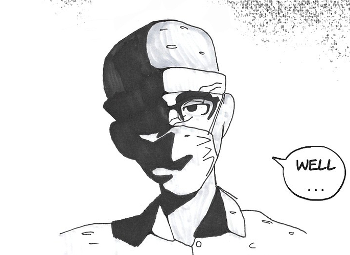
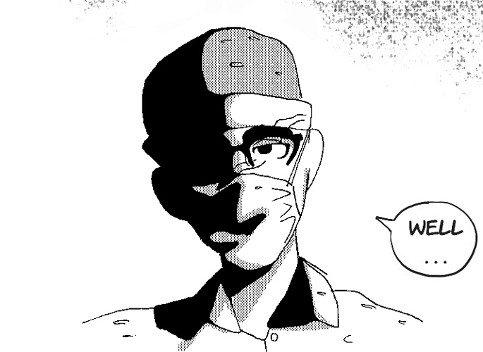
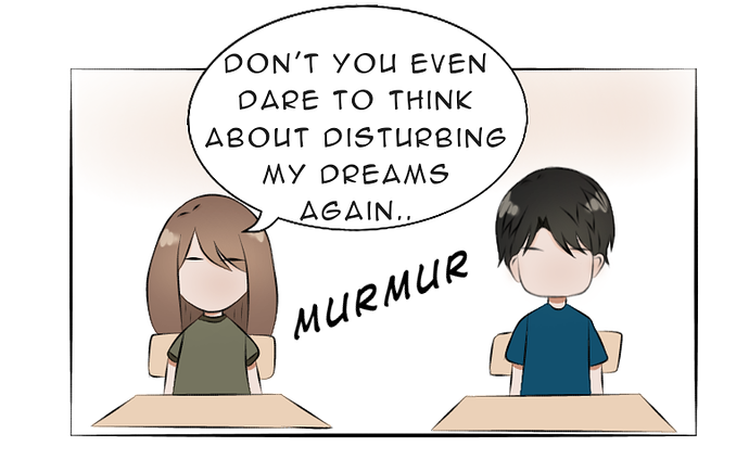
First and foremost, get a better font.
Serif fonts like this feel... I dunno, they feel really off to me. Might just be a personal preference thing, but hand-drawn art next to a very exact and precise font like this doesn't mesh well. Anime Ace is my go-to, and really common, as it's really clear, easy-to-read, and meshes well with most art styles that aren't hyper-realism. (It's also free, so that probably explains how popular it is.)
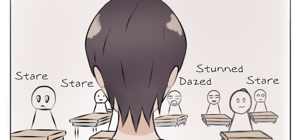
Additionally, your text bubbles are perfect ovals, which is bad. Text blocks rarely come in a perfectly rounded shape, and therefore putting a perfect oval/circle around them leaves you with a ton of empty space above, below, and to the side of your text, but very little space at the corners. It makes it just that teensy tiny bit harder to read, and that can be enough to start breaking your immersion. The primary job of lettering and text in your comic is to be completely unnoticed, and little things like your font choice and the shape of your word balloons can be enough to make the reader notice your lettering, and therefore undermine the seamless nature of comics' integration of text and images.
Onto the actual art:
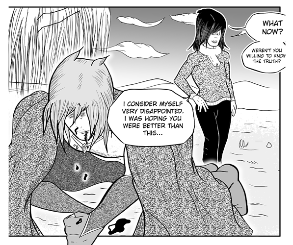
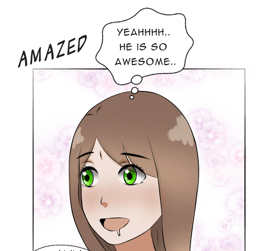
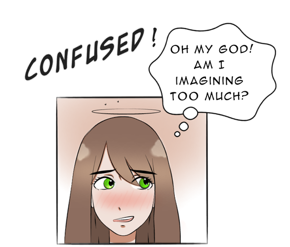
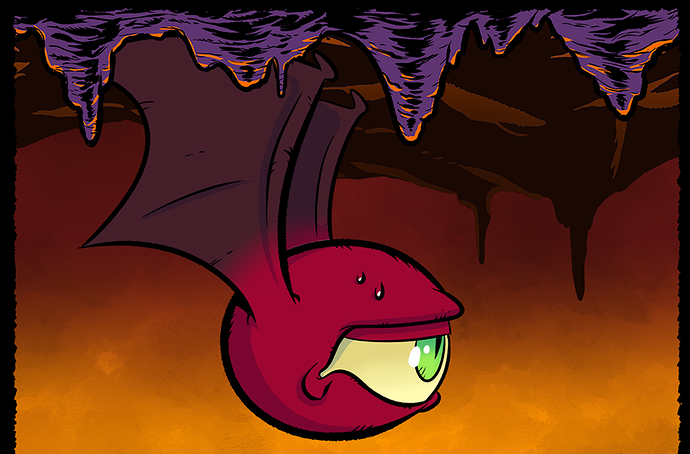
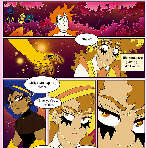
First thing that stood out to me was the incredibly bright, saturated, and primary palette you're using. Every character seems to be the same color no matter what's going on, and that leads to a more coloring-book feel that can kill a lot of your mood. Like here, look at this sequence:
They're in this neon pink/magenta forest, yet the yellow is still ultra-saturated yellow, the blue is completely blue, the orange is completely orange, like the characters aren't even remotely affected by the ambient lighting of the environment. What what happens when I throw a layer of gradients set to 'overlay' on top of it:
every color still reads as 'itself': Orange is still orange, yellow is still yellow, etc. etc., but now they're all a little bit tinted towards pink/purple, making it feel like the characters are IN the environment that we can see around them.
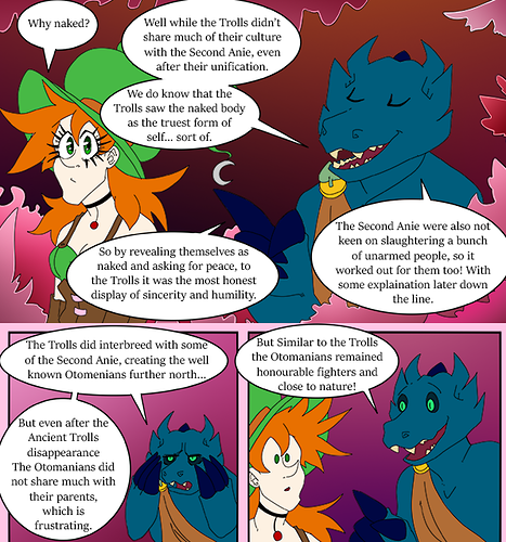
I know color is extremely important to your character designs from the little lore episodes you dropped, but those colors can still be read effectively even if they aren't 100% exactly the pure primary tone you would see under neutral white lighting.
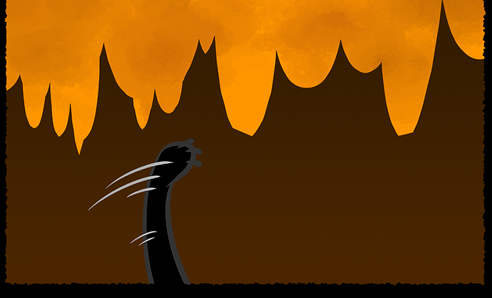
This little gradient trick also has the added effect of allowing mood to affect individual panels: In panel 2 I did a gradation from yellow to purple, moving horizontally, to show that one side of Nini is being lit by the glow of Shaki's hands. It's not a full on lighting/shading situation, and it doesn't need to be, it's just showing that the lighting of the scene has changed, and the character's color palette is changing to reflect that.
Now this one is... a little delicate, and largely up to personal preference, but the gender differentiations between your characters are... lacking.
Now this isn't necessarily a bad thing. Again, from those lore episodes, I was able to glean that witches in your story lean androgynous in general, especially in clothing, but there's a few things in the facial construction that are rubbing me the wrong way. Lemme explain.
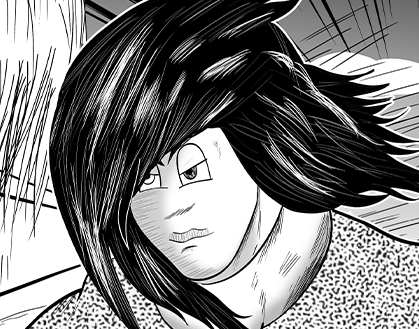
Lisana's jaw here is... enormous. Like really big. I'm not about to tell you that she has to be 'sexified' or anything, but generally speaking, comics art is about exaggeration. In real life, men have larger, more squared off chins than women, so if a character has an exaggeratedly large chin, that's a very powerful signifier of masculinity or manliness. From what I've read, I don't THINK Lisana is supposed to be giving off that vibe, so it feels very odd to me.
If you want the characters to come across as androgynous, then you'd be much better suited to downplaying the things that typically signify a character's gender (Things like boxy chin, wide shoulders, large nose, big hands for men, and slim waists, wide hips, rounded jaws, and thicker eyelashes on women), as opposed to amplifying masculine traits on female characters and vice versa.
Like I said, this one is a little delicate. I don't fully know your intentions: Lisana might be a trans woman for all I know, in which case a masculine jawline might be a subtle way to inform us of that without drawing too much undue attention to it.
If your intent is not to make Lisana look man-ish here, then I'd say just pay closer attention to which things your art style is or isn't exaggerating. If you did intend to make her look that way, then you might get better results by minimizing her feminine features as opposed to enhancing masculine ones.
Alternatively, I may have no idea what I'm talking about in this particular case, and you should disregard everything I just said.
On the more technical side, I would recommend you play around a little with line weight. Having the eyelashes on these characters be such large, bold, tapered black shapes but then all of the actual lineart defining them be a fixed-width linne claire style is a tad jarring. Especially given that you're using only flat colors, using thicker lines to help clarify how close or far things are from us, to imply how sturdy something is, and/or how shadowed something is could really help improve your depth.
Overall, you've got a great sense of character design and a fairly fun, energetic style that seems to be serving you well. Definitely improve that text situation, and use your color palettes more effectively to ground the characters in the locations more effectively, and I think you'll have something really solid on your hands.