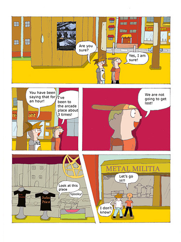
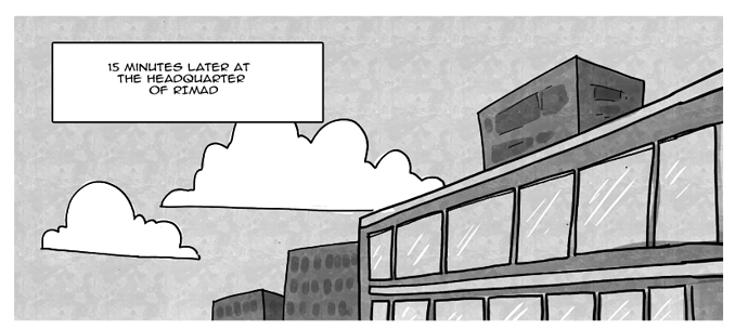
Okay, first off, I'm going to give you the same advice that was given to me: your comic will be utterly unreadable on mobile. If that's cool with you, then that's fine, but just be aware. Lots of readers nowadays are specifically reading comics on their phones, and on a phone screen, that text is going to be absolutely impossible to make out.
Not something you necessarily have to change, but something to be aware of, since it might be something stifling your potential growth.
Now, as for the actual art, I'm gonna go out on a limb here and say you are pretty new to this. I can see a lot of 'beginner' style mistakes littering the whole comic from start to finish.
Honestly, there's like a bajillion things I could point out, but I'm gonna focus on some of the basics.
First off, from what I can gather, this is meant to be a pretty serious, gritty type story with heavy action and character drama. This is most effectively facilitated by a somewhat grounded, realistic art style with a lot of dense and complex inking.
This, unfortunately, means that you have farther to go than most other artists.
That style is far less forgiving of mistakes than something more cartoony and less detailed, and requires a lot more knowledge of anatomy and form than most others, as well as just requiring a lot of time due to the density and number of marks you have to make in order to convey that serious and dark atmosphere.
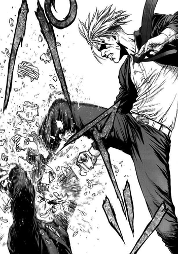
I recommend you go read Boichi's (artist of Dr. Stone) comic Sun Ken Rock.
if you ask me, this is the absolute best example of the type of art style you're going for.
Pay attention to the use of dense, repeated lines and shapes in the shirt and pants, the densely layered hatching to really SELL the motion of his foot coming down. Solid, heavy shapes with a lot of black shadows and a consideration of 3-dimensional form behind every single one.
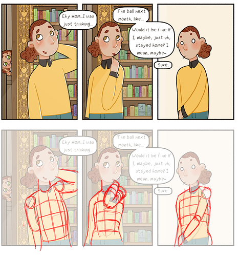
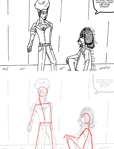
so let's take a panel from your comic and walk through what you should be doing.
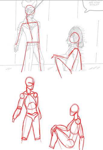
Step one is just stick figures. Always start with a stick figure. It gives you a very simple, straightforward, and easy-to-understand method of visualizing the characters' basic placements. It's as simplistic as it gets, aside from adding a 'crossbar' for the shoulders and hips.
now we're going to take that stick figure and add 3-dimensional form to it. This is very rough and quick, but you can immediately feel, even from this, a sense of form and structure to the drawing. Now they aren't just lines on a page, they're actual objects taking up 3-d space. Use simple geometric shapes: Spheres, cylinders, and boxes. Don't overcomplicate this, you're just looking to put the characters into the environment.
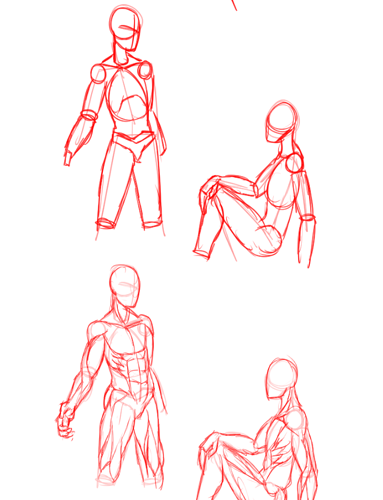
now this is the big step that you're going to need to do that a more simplistic style won't have to go as in-depth on: Anatomy and musculature. Everyone needs to generally know how this works, but the more realistic and detailed your art style is aiming to be, the more crucial this step is.
I know this looks intimidating. There's a LOT going on here. You don't need to understand anatomy like a doctor does, you're just looking to understand how muscles and bones affect the body visually as opposed to internally, but it's still a huge amount to know and understand.
This is a big step, it's hard to do, and simpler art styles can get away with a simpler understanding, but the better you get at this, the more seriously readers will be able to take your art. Just keep at it, keep practicing, and eventually you'll be able to do something like this in your sleep.
https://twitter.com/kato_anatomy I don't know if you use twitter, but here is one of my favorite resources for muscle studies: This guy does phenomenal references and is great for learning which muscles go where.
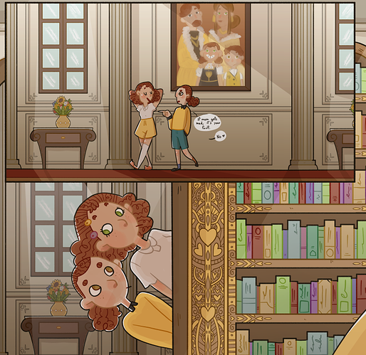
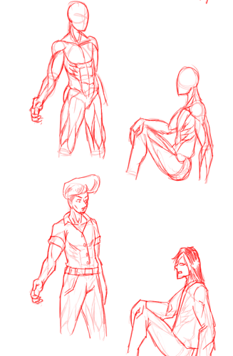
okay, we have the characters and their shape defined in the space and their proportions and musculature figured out, only
now can we start adding character details.
Obviously, a lot of those muscles and anatomy things I drew are getting covered up here; you don't have to define the musculature THAT in-depth for every single panel, but you should be
capable of doing it if you need to. The more you do this, the better you'll get at knowing how much of the underlying skeletal structure and musculature you'll need for any given pose, but you should be able to whip out a body like that on the fly at a moment's notice if it becomes necessary.
That middle step, with the simple geometric shapes, is the most important one to have for making your characters feel like they're taking up real space, the latter one is mostly for making them feel like they're real people, which applies to different styles and tones to different degrees.
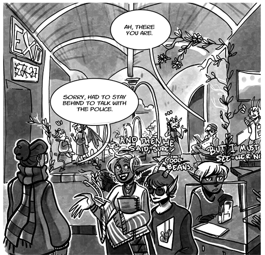
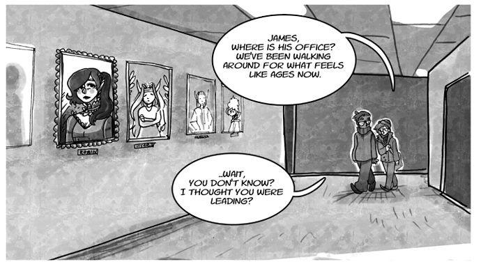
Like I said, TONS of things I could go into here: your line weight and use of blacks could use some work, your environments are really minimal and not giving me a strong sense of place, and your paneling and bubble placement could definitely stand to improve, but the sense of weight and form on the figures is probably the most important thing to nail down first. Making characters look real and believable is a very difficult hurdle to overcome, and it's one of the biggest starting points for improving the overall immersion of your comic. Keep at it, and you'll eventually wonder why you ever struggled with this sort of stuff at all.