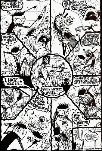
Okay, first and foremost, your lettering needs work. A lot of work.
Point 1: rounded text bubbles and centered text.
You absolutely need to center your text and encapsulate them with a simple, straightforward shape. Making your bubbles into these blocky shapes to wrap tightly around your text just draws attention to those bubbles, which is not what you want at all.
See, in comics, text bubbles are an artifice: they're a thing we add on top of the art to make the reader understand what's happening in the story. They are not a part of the artwork itself. Only in very rare instances do you want to incorporate the text into the actual artwork. The vast majority of the time, what you want is for the lettering to go completely unnoticed and for the reader to seamlessly transition from art to text and back again.
The best way to facilitate this is to have a very simple, un-intrusive shape that neatly contains the text but can otherwise be ignored. Hence why the vast majority of comics use simple, rounded bubbles. Centering your text also just makes it easier on the eyes. When it's a full page of text, it can all be aligned to the left side of the page, but in comics, your lettering is integrated into the artwork wherever it can fit, and is broken down into discrete little chunks. For that sort of situation, having the text centered makes it much easier to take in and then move on for the reader.
Point 2: Better font, better spacing
The font you're using to write your dialogue is unique, but it's also very hard to read.
In general, less is more when it comes to this kind of stuff. a simple font that looks like clean, neat, even handwriting is really all you need for about 90% of dialogue. Using a serif and 'designed' (the one you have would be described in Graphic design terms as 'gothic' in style) font usually just ends up being distracting.
Again, serif fonts (ones with the little pointy bits at the edges of letters) are used for large blocks of text like an entire page, and make those a little easier to read. For small snippets like a dialogue bubble, they simply become distracting.
We'll touch more on spacing later when I look at your panel layouts, but generally speaking, your panels are extremely densely packed with very little space between them. This leads to your text bubbles being very cramped and you needing to use a very small font size as well as contorting your bubbles into these crazy shapes just to be able to see the artwork. Plan out your text in the sketch stage, and make sure you leave enough room for the word bubbles to fit comfortably.
Additionally, you aren't constrained by the limits of a physical page when publishing online like this, so feel free to use the spaces between your panels to allow your bubbles more room to breathe without stepping over your art.
I get that you are making these in traditional page format, but we're publishing online here, so we can get a little wacky with it. In addition, even within a standard page format, you can leave more space for your bubbles and utilize the gutters between panels to give yourself more room.
Okay, with my critiques about lettering out of the way, let's look at the panel layouts and page composition:
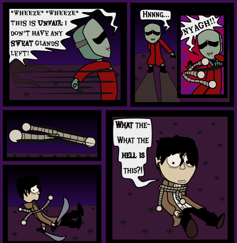
So I only made a few minor tweaks here, but you can see how the lettering really feeds into this: using an easier-to-read font and regularly-shaped text bubbles works much better as long as you're willing to make the space for them. I also think you should ditch the extremely fat borders you're using for your panels and allow more open space in those gutters so you can move and adjust your text more easily to accommodate your art.
The actual layouts of your pages are fine, but that's sort of the issue: they're
just fine, and not adding anything to the story.
There's a bunch of very flat and straight-on shots that don't really
do all that much except straightforwardly convey the information at hand. There's nothing necessarily wrong with panels like this, but there's significantly more that can be done with moving your camera up closer, farther out, higher, lower, etc. etc. Really use the viewing angle to enhance whatever element of the story you want to be the focus.
Now, onto the actual artwork itself:
I don't think it's going to be particularly revolutionary to claim that you're taking a lot of inspiration from Jhonen Vasqez's comics, specifically Johnny the Homicidal Maniac, in your art style. So let's take a look at how he draws his characters and environments, shall we?
There's obviously a lot different between your art and his, but one thing that stands out to me is
texture.
Your art looks a lot more like the Invader Zim cartoon; clean lines, flat colors, and simple shapes, while Jhonen's actual comic work is far more detailed and textured, with tons of lines, shapes, and marks defining all sorts of things from wrinkles in clothing to dirt on the walls. He's also using a lot more dynamic and variable lines that change in width depending on what kind of shape they need to define. The use of contrast in JHTM is really well-done too, with lots of dark, bold shapes against bright flat whites to make sure it's extremely easy to read who is where and what they're doing.
By contrast, your pages are actually being HURT by being in full color: everything is muddy and difficult to read because there's so many dark colors. Donnie himself is pretty visible here, but everything else is a mess, especially the differentiation between the dark purple night sky and the dark purple ground.
Obviously this is easier to achieve in black and white, but let's take a look at the Invader Zim comics: they're based on the show, which has simpler designs and is full color, so it's a much better comparison to your comic:
Even here, though, you can clearly see a lot more variety and thought went into the contrast between the colors. Shapes are far more readable, despite the environment being all purple just like in yours. This is because there's more light and dark variation to make the different elements easier to distinguish from one another.
In general, your art is pretty amateurish, but you have at least got a stable grasp on how to convey character actions and keep things consistent from panel to panel, so that's a good starting point. I would focus the most on improving your lettering and making things easier to read first. Then start working on ways to make your pages more dynamic and interesting just in terms of layout and design. Only once you've got a solid grasp on those would I really worry about things like your anatomy and construction drawing (which are definitely lacking at the moment) and technical details like line weight.
Whenever you're working on a page, come at it from the reader's perspective and try to ask yourself 'If I wasn't the creator of this comic, would I easily and without thinking about it be able to tell what is going on here?'. If not, then rework it until you can.