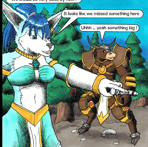
okay, I'm pretty sure the first thing you know I'm gonna pick on is your construction and three-dimensional form. Especially doing furry characters like this, muzzles are extremely important to get right, and while I can see you trying in some places, you're not doing a particularly great job.

panels like this are really showcasing what I mean: the face of the girl on the left looks like it's pointed almost straight towards us, while the muzzle looks almost like a profile side view with how elongated it is.
Generally speaking, your angled and 3/4 views are where this is showing up the most, and that's a huge problem because those are what you want to be using the most often.
See, in normal everyday conversation, it is very rare for someone to face you 100% head-on, or for you to be totally perpendicular to them and see a perfect profile view. There's almost always at least a teensy little bit of an angle, so when you see someone pointed 100% perfectly straight at the reader, it feels odd. It works really well for characters who are being confrontational or overly dramatic, and for intense scenes where, say, one character wants to kill another or is confessing their love or something, that 100% front view can work in your favor.
Most of the time, however, you want the poses and angles in your comic to feel candid: like the characters aren't acknowledging the 'camera' you're viewing them from, so they need to be viewed at more natural angles.
This is an extremely rough and quick example of what I think you should be practicing: try drawing your characters more like they're a 3-d wireframe mesh. Focus on planes and angles and the 3-dimensional shape they're taking up. It will help you both in how to handle your general shapes and construction to feel more solid, but it will also help you know where to place your shadows.
Speaking of shadows, let's talk about those for a second.
You are almost exclusively using perpendicular cross-hatching, where one set of lines is (roughly) perpendicular to the other. This gives you all these neat lined-up little square shapes.
It's unique, I'll give you that, and there are some ways to use it effectively in a broad set of circumstances. American comic style tends to lean more in that direction, but if you look at those artists, one of the things you'll find much more commonly is that they use a lot more line weight. This causes those squares to go from larger to smaller as you get deeper into the shadows, giving the illusion of gradation, like this:
See how the lines getting thicker as they move towards the black keeps those rows of squares from feeling too uniform or repetitive?
Now I can see you attempting to do that in some of your illustration, but generally speaking it's just not working for you, largely because you're using such a fine, fixed-width pen for your linework. When the cross-hatching is done in such a uniform way, it looks less like you're creating a shadow, and more like you put chicken-wire over your characters.
Here I've linked a cool page I found that has a quick-and-dirty breakdown of common inking techniques for using hatching and mark-making to give texture and form. Specifically stuff like the 'shingles' technique, and the type of cross-hatching they show in the example here, which I call 'oblique' cross-hatching.
Additionally, do not be afraid of simple unidirectional hatching. Lots of Manga get by on nothing BUT unidirectional hatching, and it works exceedingly well for them.
Just look at how much texture and personality Eichiro Oda is able to give to the art in One Piece by almost never relying on cross-hatching. Nearly all of the mark-making is 'picket-fence' style or simple unidirectional hatching, and it never feels lacking.
Definitely experiment with what kind of mark-making you're using to give different surfaces form and texture, find out what works for you, and don't be afraid to use every technique at your disposal to accomplish it.
One final note, because that scene you're currently drawing is set in a pine forest and it sticks out like a sore thumb to me.
This is how you draw a bunch of pine trees:
And this is what comes up on google when I search 'pine forest':
Notice anything?
Now obviously I'm not telling you to start drawing photorealistic shots of entire forests at the drop of a hat, that would be ridiculous, but you should be able to tell by looking up what actual pine trees look like that what you've drawn here doesn't really match up.
Pine trees aren't perfectly regular, repeating shapes of the exact same triangles all lined up like that: they're irregular, the branches actually kinda point up. There's outcroppings and dips and pits that catch light and shadow in big bunches all at once. Your panel doesn't look like a forest, it looks like someone knocked over a fucking car air freshener display.
The same goes for any environment, too. Here's how you drew a castle hallway:

and here's what comes up when I google 'castle hall':

My point is, do not just assume you know how to draw something from memory. Look up reference for everything. because what's in your head, unless it's something you are VERY intimately familiar with, is going to be a simplified, cartoony representation of that thing which is going to feel like a cheap plastic toy version instead of the real deal.


