1 / 11
Jun 2020

Hi everyone, I'm currently working on the practical part of my thesis and I'm struggling because my advisor seems to keep forgetting about me, so I thought about asking for things to improve here.
The topic of my thesis was about how we read online applied to webtoons, and what can designers do to improve it. So I'm working on a one-shot webtoon for the Novel Persuasion by Jane Austen (like a lot of webnovels have one-shots to publicize said webnovel) and I'm trying things out I theorize in my thesis to see if they could be actually applied or not.
Now, I'm not an illustrator, so I struggle a lot with this (specially when it comes to backgrounds)
So if you have any tips or things you thing should be improve let me know.
I'm currently struggling a lot on drawing the face in a certain panel, you'll see which one I mean, so if you have any ideas on how to fix it also let me know.
Is not currently finished, and it will also have a printed version.

Thank you!

  • created

    Jun '20
  • last reply

    Jun '20
  • 10

    replies

  • 745

    views

  • 4

    users

  • 12

    likes

  • 1

    link

Right now it's only showing two panels--but I can tell there's more in the preview. Is the link working right?

Yes, you just need to scroll down, is it not allowing you to scroll down?

So I took a quick look. I've never read anything form Jane, so I'm totally blind in the story, but I think you're handling the expression well enough to make a distinctive expression and feeling they're having. (Mostly I think you're having problem from waist down but that's not what you're asking, so ignore this.)

You do well on the panels, but when the dad talking about how she's gonna go to take care of her sis, that's kind of many speech bubbles with two empty long panels Kind of a miss for me. I would suggest having at least one or two panels of the daughter or father in between the speech to make the pacing more smooth.

I kind of taken aback by the realistic looking background lol, but thats actually fine. If you want it to look more like illustration, I think there's a lot of program or apps that'll let pictures into illustration like for free. One free app (foe phone or tablet) I know can do that is ibis paint X, so maybe try tat it you like.

I'm not particularly good at making critique and improvement but I hope this is good enough?
(:з」∠)

Yeah, I'm looking at it on a browser and for some reason the page disabled the scroll bar (at least on firefox). I can still scroll if I use my tablet but uh, that's kind of odd. I wonder what happened there.

anyway, I adore Persuasion, and like you, I took a class in college, where paper at the end of the semester was on Persuasion, too. Fun idea to turn it into a comic, so I was interested in seeing what you had there just from the title alone.

Vertical scroll comics like pacing their script and panels out like you've done here, so that's nice--and I like how you used text bubbles in the second one to show her thoughts vs text just hanging out in the void (although it doesn't need to be that fancy. With text bubbles simpler is usually the best option since legibility is the most important thing for a story comic). But, you want to avoid using multiple fonts as much as possible, unless the story needs it. So I like the font you use most of the time, but it changed once and it was very obvious. Makes it look like someone else is talking.

I think you need to have more panels to fill out that dialogue, though. Once he starts talking, it cuts away to some filler images, and it would be better to see him acting. Since we can't hear him speak, and since there's no narrative text, the only way a reader will know how he is speaking if we can see what's happening--is he mad? Ambivalent? Happy? that type of thing. Those expressions give the dialogue more life.

Also, I don't know how you're gonna pace out your comic and much you'd like to draw or what is required for your assignment--but you can take more panels to introduce the magnificence of Kyllench and the vain mannerisms of Sir Elliot and how it contrasts with Anne's (because right now we don't know much about what Anne is like). A lot of Webtoon episodes are long. Some are even 30+ panels an episode (though that is not required), so you can flesh it out more, so we feel more like we're there. Right now we have the bare-bones of what happened, and it's being told to us instead of us getting to watch it happen, if that makes sense.

But, I think you have a good start and a good instinct for what you want it to be, despite not being an illustrator. Like, you've clearly drawn before. As for the technique and the anatomy, I think it helps to look at reference. So take a selfie in the pose you're doing and that helps a ton when translating it to the screen. Everyone's style of drawing is different, so how I'd draw them is not necessarily how it would jive for you, but here's my five cents on how to draw an angry old man (I have no idea which scene was the one you were worried about, so I'm gonna take a guess and say...maybe Sir Elliot's angry face?)

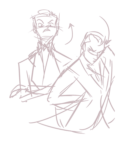
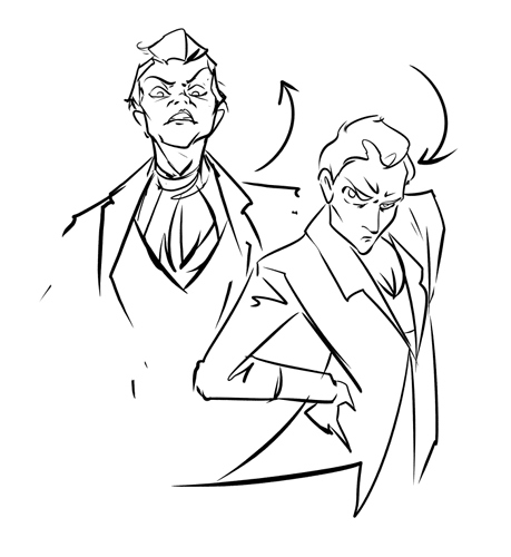
First off, with illustration you have to exaggerate your expression about 150%. As you color in your drawing and polish it, you will loose a lot of expression naturally in each pass, so just always go more ham, and then, in the end it will look normal. So instead of just giving Sir Elliot angry eyes--give him an angry pose. Think about his whole body. Think in broad terms, and then sketch out what you think is going on...like this


This is the thumbnail phase where we don't care about details, but we care more about gesture. Like you want to think of how you would stage an actor, but mid-movement. I put those arrows in to show the overall gestures of the character--that it's the whole figure moving, and not just the eyes or the mouth. And then, take a selfie of yourself in that weird position to see what is actually going on -- and then exaggerate it somewhat. Like I'm not an old man but a young woman but hey, the proportions are similar enough to fit (forgive the clothes, I'm leaving those a sketch but you get the idea)

And like I've been drawing many, many years so it's easier said than done, but looking at cartoons in the style you want, and seeing how they do different expressions can give you ideas of how you would do it for your own comic.

Really though, I think the way you're doing it is fine for a thesis, and honestly fine for a lot of stuff on Webtoons, you just need more panels of it.

As for backgrounds--they just take a really long time. Luckily, you can opt out of having a background in every panel, and so you only need a background like once a page -- and for vertical scrolling episodes you only need a background when...you need it. When it starts feeling empty, basically. You can instead just have a gradient hanging out behind your characters with a subtle texture, you don't have to draw Kyllench every scene.

Thank you very much for your input, I can definitely see what you mean, and I'll add something in the middle of the dialog, maybe him letting the tea in the table, or something like that.
It will only be one-shot, so I have to cover a lot of ground and finished in a cliffhanger that connects to the real novel. Because of the corona situation we don't have as much time as previous semesters, and less time that we had for the written part, so I'm trying to cover as much as I can in a little time, the next scene I'm drawing is Anne meeting Wentworth, and then finish it in Bath when Walter, Anne and Wentworth meet and finish it there.
The scene I'm having trouble putting a face on is when she opens the door, the reference I picked is in a weird angle and a the faces I place keep looking off, probably this wouldn't be a problem for someone more experienced but perspective is always my achilles heel, for now I added a shadow and thinking about either draw it again a different angle or put her further away so drawing the face is not necessary (that's what I saw in webtoons with similar angles).
Also thank you so much for the drawings you made, they look great, I'll try to change his pose to show more his angry attitude.
This was super helpful!

Yes, this is definitely helpful, thank you for taking your time to look at it. I see that that part is a problem, so I'm thinking of having one more panel of him letting the tea down while he keeps talking.
And I'll give it a shot to the program you recommend, thanks!
Any tips on how to improve the waist down?

Mostly I said to look for a model (like, Someone you know is fine),photos on Google (searching for a keywords bit they might took a frustratingly long time to find the right pose), looking at yourself on the mirror, or some free program or apps for 3d human model.

The one I'm recommending is magic poser or easy pose. I'm currently only having the former cause I like them better, and easy poser is on the expensive side for attachments but I don't think you'll need it. And they're an app on both iOS and android, so it's pretty cool to have them.

I just, I don't know how to thank you with the app recommendation. I got the feedback back from my advisor early this morning and he really disliked the backgrounds, and I tried the app you mentioned and in just one button and it was fixed! It looks so much more fitting to the aesthetic of the webtoon! thank you thankyou!

oh yeah, that scene--I can see how that would be tricky. For a beginner, I would recommend taking advantage of things like hair or hats--sometimes an angle is really tricky and it's like--jk I covered up her eyes with beautiful flowing hair ringlets or a wonderful bonnet with a deep shadow lollll. Like it still has to look natural and it can't cover her entire face or something--but most people wouldn't even know. Foreground elements like houseplants and chandeliers, chairs, sometimes even things that they are carrying can cover a multitude of stuff proving too much of a hassle to draw.

Good luck with your project though! I hope they like it!

I think there are too many characters and places mentioned in the first panels and only 3 of them are actually in panels - too many information for me.