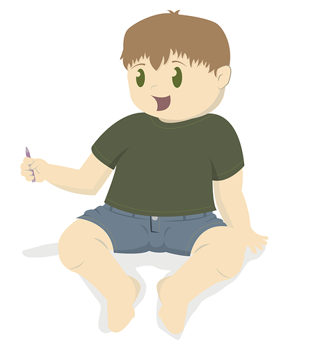
He's cute and well-drawn and everything, but in my opinion he looks... a little bland? I'm not sure how to explain it, but he looks a bit like the background character is a panel. The one that's just there but not supposed to attract the main attention. For a main character, I would try to make a bolder design that's more eye-catching. Make the eyes pop a lot more with a high contrast (add eye white and maybe some dark pupils, a little gradient in there maybe). Put some variety in the proportions, right now everything is kind of all roughly the same size which isn't very eyecatching. Since this is a child you can play with the proportions by having a bigger head, larger forehead, smaller limbs. You can make the clothes brighter and more saturated instead of this dull green. Basically this is a beautiful drawing, but not an exciting character design. You can do it though! Good luck!