I was going to suggest that you pick a more appropriate font... but you already did! Your comic looks way more polished already just from changing the lettering. I think you could adjust your speech bubbles still. They feel a bit off to me, but I can't quite put my finger on it - might be that there's too much space between lines of text vs. how much space is between the text and bubble.
I'm not a great person to give feedback since I don't read almost any slice of life and I think it tends to have a different aesthetic. But for readability, I think the biggest thing that throws me off is that your backgrounds compete with your characters a bit - same saturation, brightness, line weights makes it a bit hard to let the eyes focus. I think in some cases it gives a sort of flat feel to things/calls attention to perspective or environment elements that are distracting from your story and characters.
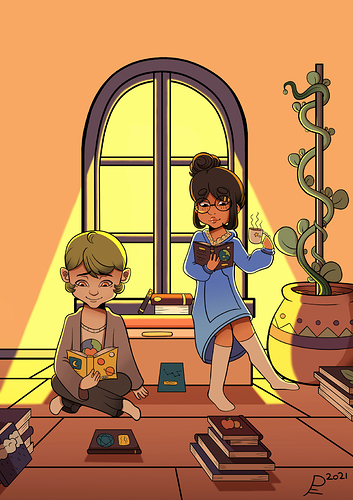
Looks like you have nice colors and sweetly cute characters  . Traditional pages are going to be slower than something mobile friendly but I assume you're already aware of that! Eight episodes is of course a lot of work but isn't very far in the world of getting subs I think so just keep it up.