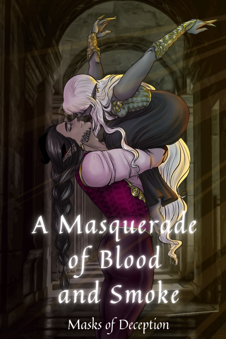
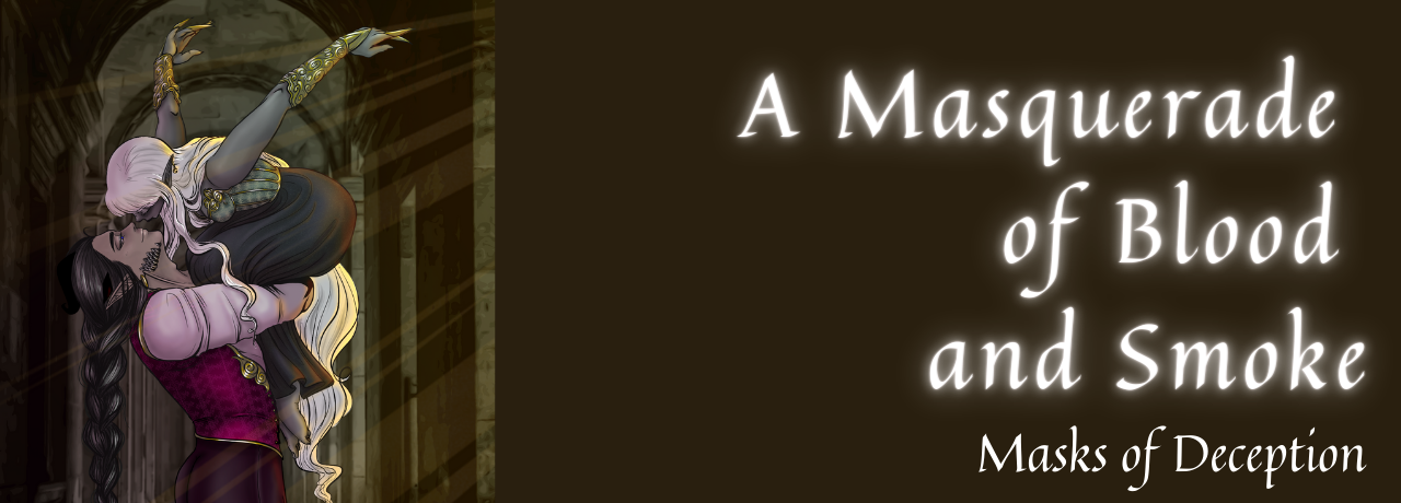
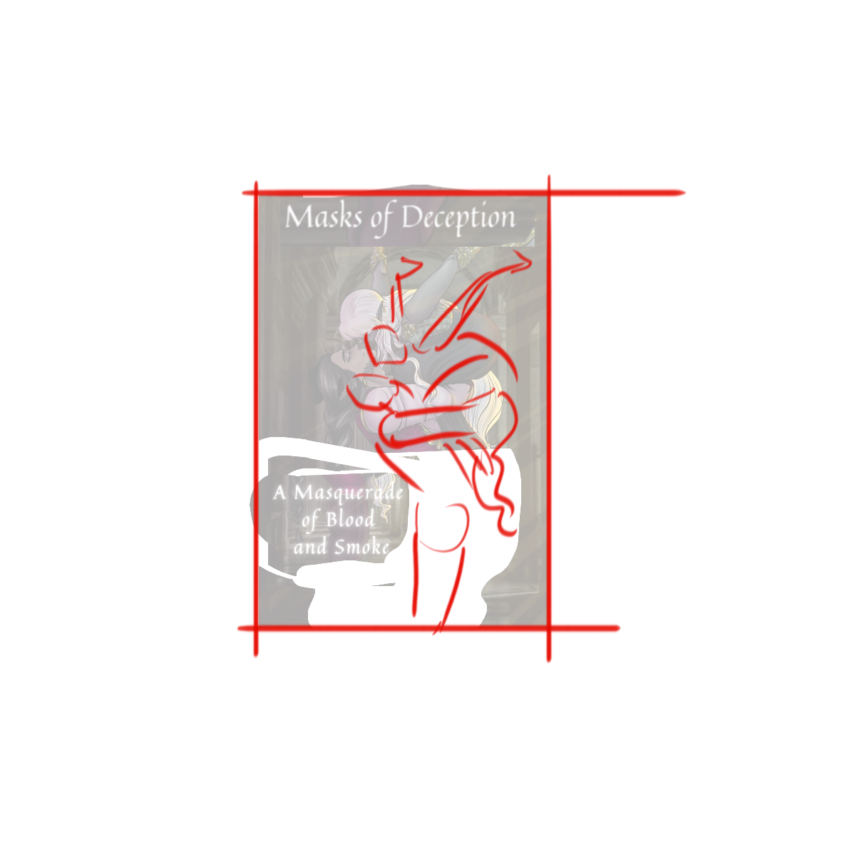
The artwork is really nice, but because the background is so dark it kind of all blends and becomes a bit harder to take in. Some contrast to draw focus to the characters would be good.
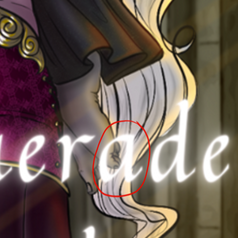
The font definitely needs some work, but it doesn't necessarily have to be super fancy. One thing about the font is that the letters feel very crowded, maybe try a more open font, and play around with different sizing and better positioning of words. Like maybe of" and "and" could be smaller to take up less space and keep the title to two lines. Masks of deception can be kept under the title in a smaller and more plain font. Also, you can maybe add a gradient or some other effect to make it more interesting. Look at books of similar genres to get some ideas.
And don't forget to add the author's name!