
created
 May '21
last reply
 May '21
- 14
replies
- 788
views
- 13
users
- 30
likes


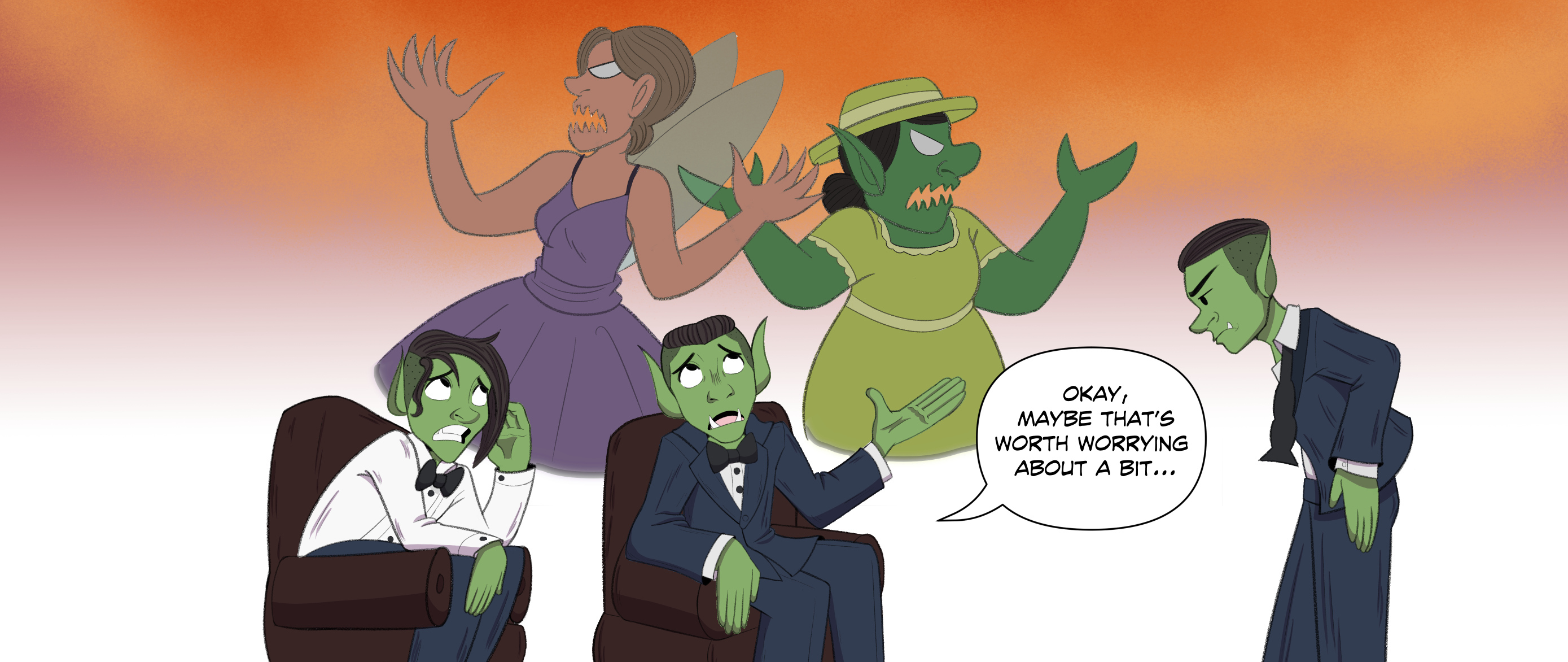
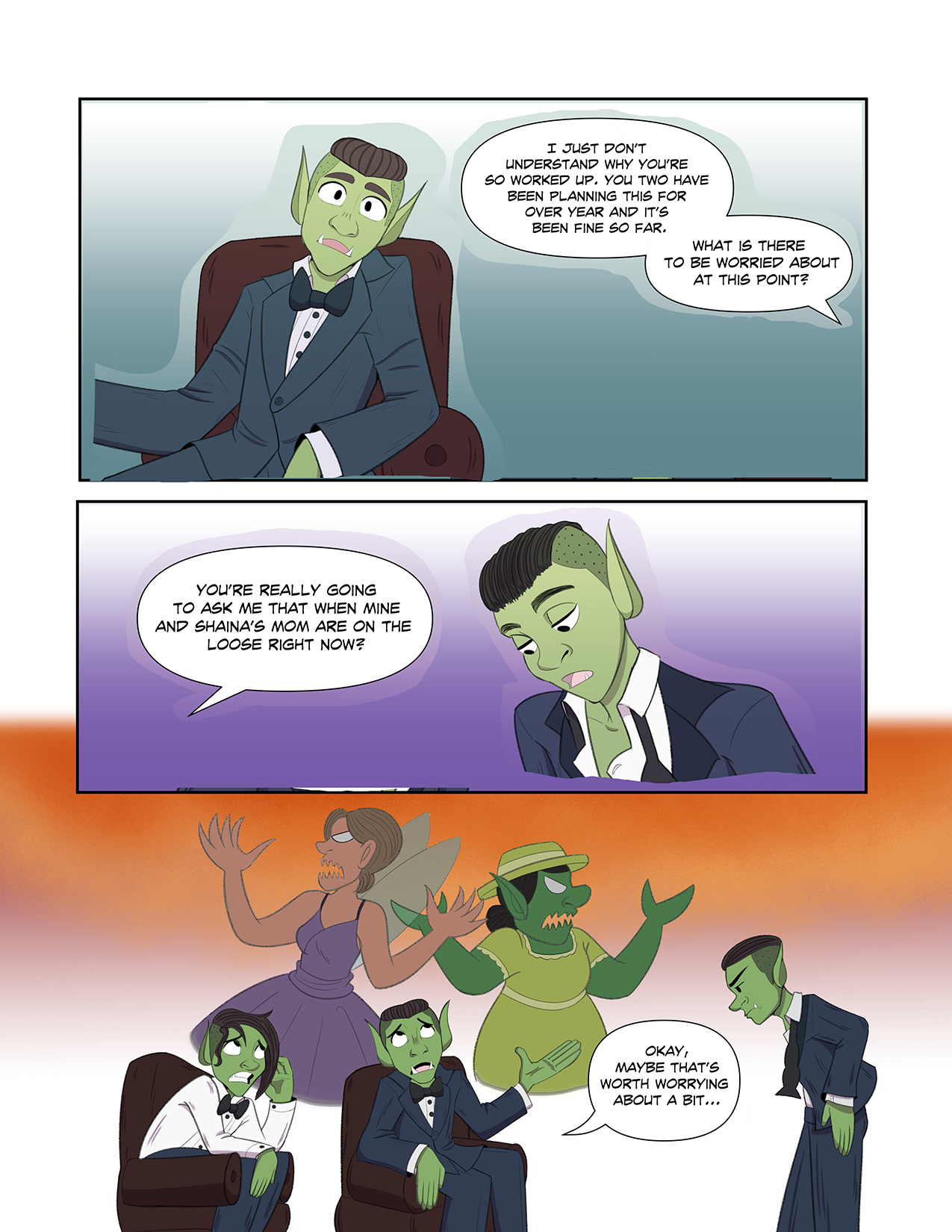
can you post the whole page? I am trying to understand the situation a bit. This certainly isn't bad at all.
I personally think it looks very good and attracts readers quite well. As an illiustrator I have no word because I can't draw for the life of me. I recommend making them a bit lighter, more visible and attracting. Perhaps to draw the readers attention towards them.
To be honest the joke was lost on me the first time I read it. I got the characters confused at first, I'm so sorry  , so they're reactions didn't make sense to me, but I do get what the joke is.
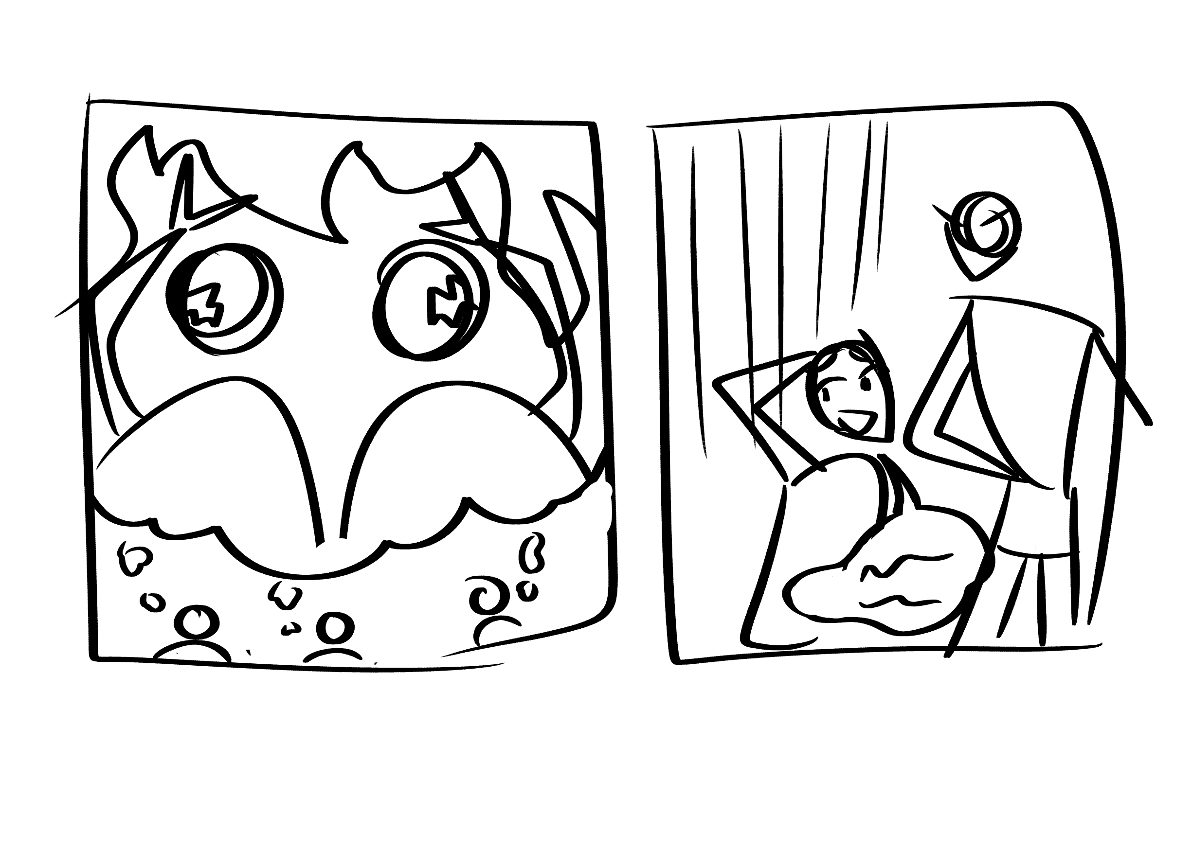
Honestly, I'm not the best at humor, but the changes I would make is splitting the last panel into two. The three of them thinking about the mothers that are on the loose and then the second shows the reaction and has the speech bubble. Like this (sorry it's so rough  ):
):
I think you could also stand to reduce the text in the last bubble slightly to make it punchier. Instead of what's being said maybe have him say: "Okay, maybe that is worth worrying about..."
That's just how I would handle it and I hope that gives you a new perspective consider. And I hope this helps!
I'd make them lighter in colour, then pull down the opacity in order to make them see-through. That's a common visual shorthand for something which is being imagined.
Also, maybe a thought bubble around them, or a white bubble with soft edges?
Maybe you can add fire below the mothers and dramatic lightning in the background to convey how scared they are about them......
My first thought was that at first glance there was a bit of a lack of clarity with all the characters. I didn’t immediately see that they weren’t physical characters in the scene and that they were just in the thoughts of the one character.
Coloring them differently would really help. I would desaturate the two imagined figures and lighten them up a bit. I also think DiegoPalacio ‘s suggestion is good. Flames would illustrate the idea and also look cool. You could also push the humor exaggerating the imagined figures a lil more maybe making them take up even more space in conjunction w desaturating em and whatnot.
It´s personal preference but I like extreme / exaggerated poses in funny comics, the pose already has to be funny,
the poses are not expressive enough for my taste
The mothers do not look scary or intimidating, IMO. They just look like they are about to recite a poem (or sing a song), and they hate doing so.
Their expressions need to be more angry and furious - and their features could do with some more demoni-fication ^^.
Looking at the full page, I kind of want the imagined mothers looming larger and more intimidating over their children. Maybe with added flames, lightning, what have you? Or maybe try to draw them even more like kaiju on a rampage? Like, if you can add more space, draw a tiny cityscape that they are destroying? And the punchline needs to be shorter.
If nothing else, please consider visually separating the present and imagined characters, because currently the distinction is not entirely clear. Others have mentioned how to do that already, so not reiterating here.
Also, I realized that the character in the second panel is the one on the far right only after a third re-read? In cinematography there is a rule about keeping the "camera" within 180 degrees (180 degree rule), i.e. if you want to keep the last panel as is, you would need to flip the first two panels so that characters keep facing each other the same way all the time, which makes things easier to parse for an audience.
You got this 
Overall, loving the joke. You have a really nice art style too. But here's a few suggestions...
You could push the pose for the guy in the middle a bit farther. Maybe make him shuttering more, moving his body away from the moms.
Also, the moms' hands feel a bit too symmetrical and unclear what they're doing.
Finally, like others said, making the moms a bit transparent/desaturated/or in a bubble would help to show that they're being imagined.
Again, great job!
Besides everything said, work on your 180 rule. The first panel should be on the left side, and the next one should be on the right, so when in the final third panel we see the whole scene, we know where the characters are located. The second panel would had to be mirrored though.
Something like this (sorry for editing the strip)
Okay, this was originally going to be just a quick redline to showcase a couple things, but it quickly turned into me brainstorming a thumbnail all on my own. I hope it's not a problem for me to do this; I really don't mean to draw your comic for you, I just do much better communicating with visual examples, so this was the best way I could come up with to communicate my advice.

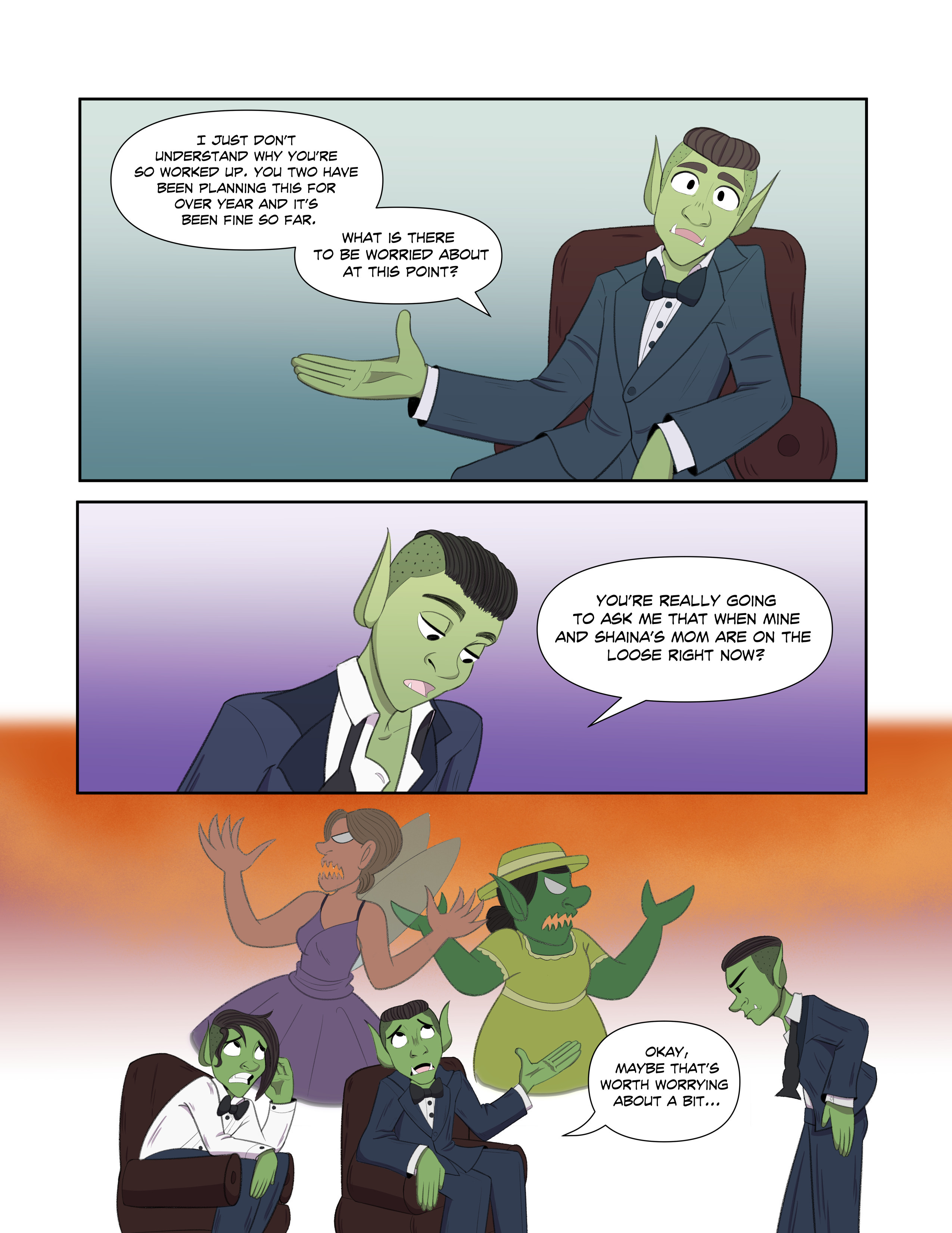
So, 2 things that are working in tandem here. 1: in Comics, time and space (physical space on the page) are intrinsically linked, and 2: in comedy, timing is very important.
Thus, when it comes to making a comedic moment in a comic, panel size and placement plays a HUGE role in how funny your joke is.
In your original setup, all three panels are roughly the same size, which subtly tells the reader that they take roughly the same amount of time. However, that third panel is supposed to be a sort of dramatic pause where the characters imagine the horrors of 'mothers on the loose'.
Just like there would be a pause in dialogue and movement, there should also be a 'pause' in the panels: make the reader take just that fraction of a second longer to observe the art itself, and it will come across as a moment of silence as the terror of their situation settles in.
I also shrunk the characters down and kept them more consistent with how they're placed in the scene; when I first read the page I legitimately thought it was the same guy saying both lines and it confused me. I don't know these characters so I don't know if they're supposed to look identical, but they're both the same race, both in the same outfit, and both have the same hairstyle. the only difference between them is the un-done tie and shirt button on one. Keeping them on the same side of the conversation (literally) throughout their exchange will make it harder for readers to mix them up.
As far as the comedy goes, though, timing is probably the biggest factor, but additionally, exaggeration (or lack thereof) can be a big part of making comedy work. This being the case, go wild with the mother's designs. In your version they come across as ever-so-slightly monsterized versions of what I presume they normally look like, but we're in these character's heads, imagining what their mothers would look like with their FULL RAGE unleashed. Make them ACTUAL monsters, make them breathe fire and wreak havoc and look terrifying. Hell, maybe even switch up art styles and go for something more realistic with heavy shadows (maybe look up how good action/horror manga like Berserk handle drawing monsters for reference) to really sell the sudden tone shift.
I added a classic cityscape in silhouette so that I could
A: Have the mothers destroying something directly (to help emphasize their imagined power)
B: Give a sense of scale: it's hard to understand how big and scary the kids are imagining the mothers if we can't see how big they are in comparison to something else within said imagination, and
C: create a nice framing device for the characters at the bottom; having the city in silhouette means the characters having the conversation can pop forward really clearly, making it easier to communicate that the city-destroying kaiju versions of the moms in the background are just the kids' imaginations.
Like I said at the top, this is merely one suggestion. I don't by any means want to draw your comic for you or decide how you place your panels, This was just a good way for me to illustrate my thought process and how I would approach a scene like this to give you some ideas. Feel free to take this one directly if it vibes with you, but those core principles of timing and exaggeration are really the important things to get down. From there, the world's your oyster: there's TONS of ways to amp up this gag, I just went with one of them to illustrate which aspects can be amped up.
Suggested Topics
| Topic | Category | Replies | Views | Activity |
|---|---|---|---|---|
| Drawing on a very limited time | Art | Comics | 11 | 618 | May '24 |
| Comic and Novel appreciation thread | Art | Comics | 2 | 130 | Dec '24 |
| Art Fight 2024! Who’s joining? | Art | Comics | 17 | 793 | Jul '24 |
| Today i found a one-shot comic I made 10 years ago on the web | Art | Comics | 0 | 151 | Sep '24 |
| Are you a cartoonist at heart? Show me your art | Art | Comics | 8 | 269 | Dec '24 |