So I think a lot of character design does depend on fashion of the time period, so it's hard to say "good" or "bad" based on fashion because--fashion changes a lot, but I define character design as good when it knows it's function, and then becomes a really wonderful tool for composition within the medium that it's a part of.
So what I mean by that, is that the pieces of the design have a purpose--not as a functional piece of clothing necessarily, but as like a toolbelt for the artist to use when they're putting the character in a scene.
So I'll take two designs that are known as "bad" and describe why one is actually pretty kick-ass and the other is...yeah it's straight up bad, although both are victims of 2000's fashion and neither are...fashionable anymore. Both of these will be Final Fantasy X-2 Nomura because youknow what? He's a mess.
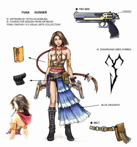
First off we got Yuna, better known as "Yo, this dress dress is just a belt"

At first it looks like a whole ton of fashion pieces that I swear to you, used to be very very pretty (I was a teen when layered patchwork skirts like that was real pretty although...usually they covered both legs. We also liked barely there strappy halters but I was not allowed to wear them for obvious reasons.) but all these random pieces have a purpose.
There are so many parts of this character design that are really light and fun when they animate, the skirt, the hair, the belts, and the laces--and you can see at least one thing flowing in the wind from any angle (although the game engine didn't always take advantage of that.) Since Yuna dances as her fight moves--it's really important that she has clothes that will show a lot of movement.
Also, Yuna has a lot of loops in her design that tell us what angle her body is at--at her arms, at her waist, at her neck, and at her boots. You'll see horizontal stripes used like this a lot, because it really helps clarify for-shortening and adds a lot of volume and appeal to the character overall.
Asymetric designs are also really great for making a character design unique--you never have to go as far as Nomura does, but it's really effective. We would all know this is Yuna from sillhouette alone.
She's a main character who also has a lot of crops from weird angles when she fights, so there's a lot of pieces on her so that if her face is cut off and we only see a leg, or an arm, or a part of her hair, or even just her neck--we'll have something there to compose the scene with. Yeah, it's too overdesigned for 2020, but it wasn't really meant to be always seen at once. Back in 2003 we didn't have games that could do details like this before, and so they really wanted to show off what this engine could do.
Which might be how we got Nooj, who is a nightmare
I don't know what possessed Nomura to do this.
Nooj is a character that doesn't seem to move a lot, if I remember correctly, he mostly just stands and talks to you. So, the only moving part is his weird hair that has a crinkyness that does not flow the way hair should flow. For a video game, it's uh...pretty boring. I imagine if I were the animators I'd have a hell of a time trying to make him look cool, becuase the character design doesn't give us enough tools at our disposal. The belts are overpowered by the vertical design so they just disappear. There's some stripes to show us volume, but the blue leg turns into abstract nonsense. The power boots are a clashing shade of purple and would rarely be in the scene anyway.
This character design would just fight you the entire time you'd use it. It would have very little to offer for interest except for one top pony.
So for me, when creating a design, I think about function first on a page and what functions I need for the story that I am trying to tell. So for my current project, I felt like I really needed more levity and humor to balance out the heavy subject matter I was writing--so I made character designs that had a lot of flow and simplicity to their designs and big range of expressions that can stretch and squash. Other elements, like meaning to their clothes and researching what they would enjoy came second. Firstly, was always the function and the mood of the story overall.