1 / 26
May 2020

So here’s a controversial topic. What makes a character design good, and a design bad? I’ll use an example of a fandom where this is most relevant.

The Gacha Life community has evolved from having eye bleeding designs to what is considered more “aesthetic” and “appealing designs.” Though with this going on I find majority of the “good” designs, kind of boring. Maybe this is because teens have to make due with the options they got but I must say when every character now shares this look, it gets boring seeing the other thing. Like readers to cliches.

Now back to the original question. What makes a design “good” and a design “bad.” What makes a design “original” and “memorable” vs a design that is “common” and “lazy?”

Summary of what I got: Designs that are memorable tend to be unique and recognizable when blacked out. Appealing designs are also easy to draw and remember when they’re simple, but interesting to look at.

  • created

    May '20
  • last reply

    May '20
  • 25

    replies

  • 8.5k

    views

  • 16

    users

  • 69

    likes

  • 9

    links

Do you mean gacha life designs or just character designs in general?

In my opinion, a charcter's design is good if it contains one of the following things.

  1. Does the character wear something I would wear IRL?
  2. When the character is first revealed. Does he/she make me say "Damn they look cool".
  3. Does the character have a unique hairstyle/hair color?

These are examples of good male and female character designs in my opinion.

Charlotte Katakuri and Azazel Ameri


Charlotte Katakuri is from the manga One Piece.

While the girl is from an anime called "Welcome to Demon School Iruma-kun!"

Hmmm, to actually get to your question...

I think there is a difference between oc's and characters in a story. For story characters you need to make sure that their designs actually match the tone and worldbuilding of the story and world they are in. For example, if the story is realistic medieval it would be very out of place to have the main character have blue hair and high tech gear or headphones. For oc's it's a bit harder to say what works and what doesn't.

I recommend to atleast pick the colours carefully. And try to experiment with them. Something I would consider common and cliche are characters that use a lot of black and white. That's playing it safe. Experiment with colour combinations! One of the things that attract me the most to a character is their colour scheme. A interesting colour scheme can make me fall in love with the design. A "bad" or boring colour scheme on the other hand can make me roll my eyes at a character design though.

I also very much recommend experimenting with different facial shapes and body types. Having a character with a not so strong jawline or different eyes than the usual cutesy anime eyes can make them stand out from the plethora of oc's.

Character design has a lot of different elements, but none of them are concrete rules. You just have to kind of.... feel it? Things I take into account are:

  • Distinctive silhouette, especially as part of a lineup of characters from the same work.
  • The overall shapes and colours of the character and their clothing and accessories should tell you something about the character at a glance. ie. rounded shapes feel gentle, sort, nurturing and bouncy, Pointy shapes feel threatening, dynamic and "angry", square ones feel grounded, reliable, heavy. Colours and overall "value" (light, dark and midtones) also come with meanings or an overall impression. Even if my plan is to deliberately subvert these assumptions later, it's still vital that the reader's first glance at the character has them making assumptions based on how they look.
  • Clothing tells you something about that character's place in the world they live in. Often this may involve evoking cultural ideas from our own world, so if a character wears something that looks a bit like a leather biker jacket, for example, even if it's a Fantasy world with no concept of a biker, to the audience the cultural significance makes us recognise "this character is tough and a rebel".
  • Appropriate detail level for purpose. You don't want a character so complex that they're hard to read, and you definitely don't one one who is a pain to draw repeatedly.
  • Looks good in the context you designed it for. If your character runs a lot, you want a design that looks good when they're running. If they need to loom threateningly, you want a design that looks good for that.

My overall approach is often to think of a "big theme" or "core idea" I want the character to evoke. It might be something like "Fire" or "A flower" or "A snake" or "A prisoner". I try to always make my choices about characters very deliberate, so you'll rarely see me fall back on stuff like "I dunno, I just put her in a low-cut top because it's sexy". If a character is dressed in a seductive way in my work, it's usually very deliberate so you feel like the character chose to wear that; not me.
So with Subo, a character we're following in Errant right now, I wanted the assumptions you make about him on looking to be things like: Relaxed, doesn't care about looking neat, maybe kinda lazy, a hippy, sturdy and planted, evokes the idea of a tree. He has soft, natural sort of fabrics in browns and greens, he wears sandals and baggy pants, he's a fairly big, square guy, he has shaggy hair and he's unshaven and he has gentle eyes. He probably at least subconsciously evokes Shaggy from Scooby-doo via cultural osmosis, so you'll immediately start making assumptions like "this guy is a coward", "this guy is lazy" without maybe even thinking.

Okay those are some good things to go by. Thought personally I never understood the silhouette rule, since in a lot of styles, it’s hard to make silhouettes look different, so posing would be more relevant in that situation. But apply that silhouette thing to humans, and it just doesn’t work. A lot of people have the same silhouette so I personally never found a purpose in it.

Aside from all the rules, it really depends on the context the character is in.

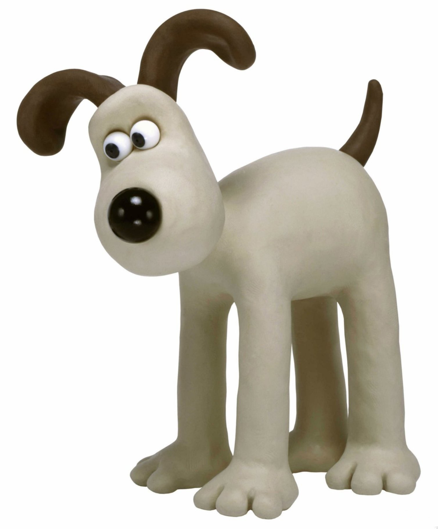
For example, Gromit is one of my favorite character designs out there. He's so simple! But SO MUCH or his character shines through in the way he's animated! And his simple design really complements that. There's nothing distracting the watcher from his very subtle expressions and body language. Also, he has a recognizable silhouette which definitely helps.
5

In my own comic though, A design this simple would probably not work (even if I love it a lot), Because I'm confided to a different medium, without moving image. Even though body language is important for comics too, I simply cannot recreate in a comic the same amount of subtle changes in expression and posture.

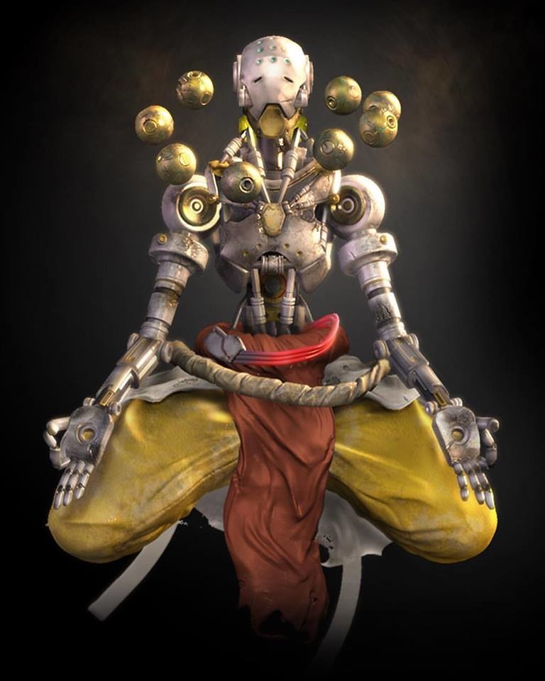
If I'm playing a video game though, I have different expectations on the character designs. I had a game art teacher that talked about something he called 'cosplay factor', which he saw was similar to 'appeal' in animation. The cosplay factor was about how cool the character was percieved, how likely you were to see someone cosplay them, as well as how memorable the character design was. I wouldn't say that Gromit has a strong Cosplay Factor, but that a lot of anime and game characters do. The context makes the viewers accept things like, a single very spiky pauldron, or crazy hair, because it's part of the genres. Once again gonna use a fav of mine as an example. I think Zenyatta has a strong 'cosplay factor'. He's recognizable and he fits into the genre. I would not expect him in Wallace and Gromit or Disney, however, and probably would not like him in those scenarios.
10

But then, if I'm watching a Disney movie, I expect neither a Gromit kind of design, or a Zenyatta design! My favorite character designs from disney come from the emperor's new groove!

2

They're appealing in a different way from Gromit or Zenyatta. It's a different context again, and what the viewers will accept is different. Not so say that all of these genres can have bad character designs, for example, while Coco is a great movie, the main character didn't have as strong of a character design as kuzco in my opinion, for several reasons. It's not just because it's a different genre, but the silhouette is less recognizable, and even less memorable in contrast to some of the same movie's stronger character designs, like the other main characer Hector. Like just looking at this image I KNOW I'll remember the skeleton dude for longer than the human kid:
2

So uhhh, TLDR: Genre and context is important before deciding if a character is a good or bad design. Design choices should be based on the target audience, genre, and limitations of the medium.

There's a lot of ways to answer this question! I don't think there can be a difinitive "right" and "wrong" way. But here's my immediate reaction (please feel free to question or disagree!)

Characters should look unique. As in, they shouldn't look identical to each other. One piece is a fantastic example for this. Everyone is so different, but they all fit together in their crazy and magical world. Sometimes, this is hard to achieve if the characters don't match the world they inhabit however. For example, a character could have too many belts in a world drawn simply, but in the world of Final Fantasy - the sky's the limit!

In the case of twins or the like, you can still accomplish this with poses and facial expressions. Take Mr Osomatsu for example:

6

You can see right away there are personality differences, within a simple style! A character should be more than their appearence. Expression and gesture is equally apart of it, meaning that if all your characters are posed the same with the same smile, it's hard to tell what they're like just from looking at them.

I think the combination of these points are part of what makes characters memorable!

My main issue is over-designing. Like Omega Shenron from Dragon Ball GT.


Look at all those spikes.

Additionally I have issues with design that are uncomfortable, like a chain thong or somethin’.
At the end of the day it’s all subjective. I know some people who are fine with a bad design long as it has a good origin/inspiration, while I’m pickier.

I have heard some people say that you should be able to tell something about a character by just looking at them. However, I feel this has lead a lot of Western media to rely on stereotypes.

I think it is more important to make a character unique enough that it can be identified outside of it’s work.

I think stuff like Gacha Life runs the risk of over designing. Yet it is also very limited when it comes to body types. I think it, like other character creator can help get you an idea of a character just be careful not to over do it. Unless they are over the top in a world where everyone looks over the top.

I think a character design is good as long as it delivers the correct message.

What do you want people to think when they see this character? What do you want them to expect, if anything? The most important part of any character design is making sure it fulfills its goal, whether that's preparing the viewer for a subversion, or even just expressing the character's sense of style.

There are a lot of things that go into that...I tend to focus on color techniques. Like, what colors make someone look like a hero? Or a villain? A soothing character, an exciting character?? How can you push the boundaries of accepted color theory to create new and different messages...?

One of my favorite techniques is something I call 'color balancing'. I don't like to have a blob of color in one spot and nowhere else, unless that spot is in the center. ^^ I like to sprinkle the same color around the design as much as I can, give it a good spread. Example:

The orange of her shorts repeats throughout the outfit: on her gloves, the cuffs of her sleeves, the bow on her head and the bottoms of her shoes.
Here's another example on a different design:


You'll notice that the green of her dress is nowhere else on the outfit...but because it's split in the middle with the blue corset, it's considered balanced. The sections of color are larger on this outfit, so less spread is necessary...or, possible. ^^;

...Damn, this was one of my favorite design series, and now I want to go back and finish it...but anyway, as you can see, there are a lot of things to think about when it comes to character design. 'Balancing' won't solve every problem, and neither will my precious colors...sometimes you actually have to go back in and draw extra things to save a weak design. >_<

Character design is my life; I could talk about techniques and strategies for days...but to keep this short, I'll conclude with this: approach a bad design like you would an unknown illness. Try your best to alleviate the symptoms you can understand. If you go to doctors for help, get second or even third opinions. Compare with similarly "sick" designs to get a better idea of what's wrong. And most importantly, trust your gut. It may not be correct, but if you have a gut feeling about what a design needs to have, you shouldn't ignore it. The least you can do is try it out.

I think some audiences will appreciate more detailed and some with appreciate a more simple design. There is of course always a risk of going too detailed or too generic, but in my opinion, there aren't any rules that will apply to every story over every genre, which is why I think it's important to know who you want your character to appeal to.

I think a good character design is marked for its remarkability. Every good design has to have something remarkable about it, something you could tell from far away. Be that body shape, hair, clothes, anything!
The thing I like to refer most to when talking about good character design is what I call "the silhouette test". If your design is remarkable and easily identifiable, you'll be able to tell which character is which simply by their silhouette! Here's my favorite example: The Team Fortress 2 mercenaries!


See how each one of them has an identifiable silhouette? I personally think this is peak character design. This also works with more realistic styles! Check out some anime silhouettes from Steins; Gate that are easily identifiable:
12
4
See how even though their shapes aren't exaggerated, you can tell who is who? That is the magic of character design.
Another last thing: Do not confuse uniqueness and remarkability with details. Another important part of character design is to not make your character look "cluttered" with too many details. Make it simple enough for it to be easily identifiable and easily replicable (that last one applies mostly if you're working with a repeat drawing medium such as a comic or a 2D animation).

Well, I think that's it! Ta-da!