12 / 14
Dec 2018

Yo guys, Nite's IN DA HOUSEEEE!!!

1st, Happy holidays

2nd: I wan't to bring my artstyle to the next level, so I want to know what I'm missing, slacking and how to improve what I'm lacking. Sooo Below I'll attach a link to my comic and few pages for you to check out and give me your word.

Thanks a lot for your help bros and sis. Don't be ho's nor D*cks and Merry Christmass to everybody!!

  • created

    Dec '18
  • last reply

    Dec '18
  • 13

    replies

  • 1.3k

    views

  • 7

    users

  • 4

    likes

  • 8

    links

Can’t help. I only do stickmen. But as a reader I’ll love to see some colors?

1 2

My final goal is to achieve such skills as Davide Gianfelice has, but theres still a lot of practice to do to achieve that!! the issues is, dunno were to start, a thing is to practice a lot, other is to practice smart.

You're not "missing" anything. The arts pretty good, and there's a nice sense of movement in many panels. You could work on your text bubbles so the text makes the classic diamond shape, and first a bit better, but thats a small fix, not really a matter of skill. If I was going to pick on anything, I'd say your profiles could be better. The first one the woman's face is flat, and the second the man's jaw is a little too far forward. Profiles are challenging, but practicing that a bit might be a place to start. ^^

Anatomy and gesture drawing would be a good place to start if this is your goal? It's kind of also just always a good place to start, no matter where one is at. =)

Already on that, do little sesions of gesture drawing everyday. Dropped anatomy a while ago cause felt overwhelmed, you can see even thou anatomy and proportions are sloppy there can be sense of notion.

Right off the bat I'd say use white lines to shade the black hair areas, or dark and light grays. Or put the hair as a really dark gray.
Also shade the skin with some tone textures. It'll add depth.

I'd say with your line art to get it more to the product you said you're aiming for you'd need to loosen up a bit and start using more variety on line weights. It looks like you're inking digitally, you could try printing out your roughs and inking them with a brush to get more variety, work more from the elbow/shoulder for the looseness. Or digitally experiment with different inking brushes to see if you can get more dynamic lines.

Looks pretty good so far though, keep it up!

From brief looking & comparing to your ultimate goals:

  • learn anatomy. It's overwhelming but worth branching into. I still struggle but take it a piece at a time.
  • Gestures are important but what are you wanting to achieve out of them? Find a focus.
  • learn composition and how to frame shots. What helps me was to study my favorite films alongside comics. This will help make things more dynamic!
  • blackspotting & line weight. This is the biggest i see out of everything. Your values and lines are very muddy and dull. This can distract from what you want to achieve and underwhelm the scene.

Here is a rundown i already wrote up prior on inking.
-

line weight depends on

  • fluid vs stiff
  • direct exposure to light source
  • Foreground vs Mid vs backdrop
  • importance of detail
  • stylizations vs realism

fluidity can stem from longer natural strokes.
"Use your arm, boyo!" Move the entire arm to make a stroke instead of flicking the wrist.

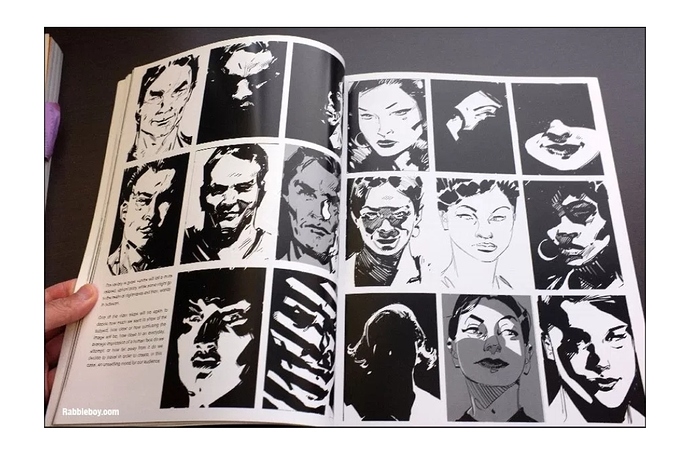
This guy helps demonstrate:

It can be harder to make long motions with a digital tablet but it is doable. Push to see what is manageable.

Your light source will determine your line width!
The more exposed to light, the less width. It helps create a depth without relying on color. Black spotting is your best friend when there is meant to be intense shadows. As well, defining the light source will help garner mood and attention.
A method i was taught and loosely keep is the 80/20 rule. If you have 80% black/dark then you need 20% light/white and vice versa.

For work that involves backdrops. Keep in mind that an object in the direct foreground of a frame will appear heavier than the dude standing on the hill way in the backdrop.

Detail will also play a large factor. If something is meant to stand out, make it so. Keeping everything the same width can make it feel “busy” or cluttered. It forces the eye to not be able to find what is needed and short circuit. Don’t be responsible for broken eyes!

Lastly, stylization does not always equal up to realism [obvs]. It’s okay to experiment and break things. See what works for you. Realism relies more on value vs contours. Inking sometimes requires a suspension of belief!

-

Godspeed and hope you find what you want/need

Edit: i noticed you do use some black spotting but i feel it's still very mismatched and blurrs into the other values.

I do, but my sketches are done in pencil, since I lack the gear to deliver traditional art on the web platform(let's say scanner) wouldn't be an option, to do that, but for practice purpose actually sounds very appealing

Very good advice, just today saw a video were they give exactly this same advice.


Wanting to achieve the sensation of motion and be abble to get an overall shape quickly, as I said earlier often do little figure drawing sessions and been trying to apply the Force method developed by Mike Mattesi.

THIS!!! man I studied composition quite some time ago (only theory) but couldn't figure out a way to apply it and get more visual references into ma head, thanks a lot.

I always had the line weight in consideraton but it seems I've been aplying it wrong, kinda halfassing it here xD. I've been afraid of using BlackSpotting in the past, the times I've tried to achieve a tone it felt outta place.

I'm really thankfull you took the time to writte this down, quite cleared some doubts and gave very good advice and techniques to apply in the future!

DONT BE AFRAID! Make mistakes and trash art! It's how you learn!

May I give some book recommendations/ resources/advice on the composition front at least?

Also! Proud to hear why you are doing gestures! That is great! I may have advice on that too actually

You should check your local library. In college, my library on-campus had a scanner we could use. Then just email the files to yourself if you don't have a USB drive. It was a two-birds with one stone deal because I could scan and print for free there.

Hahah, you're right, actually to try to achieve stilization I took the brusshes and ink and did few quck portraits

And recomendations/resources and advice on the composition subject are verywelcome, of course one differente from Framed Ink, cause I already got that one xD

Went to an art academy, have few studies on the subject, any advice is welcome

It still cost to get a scan of a paper page, this ppl here's cheap (not sure if used the right term xD) they fee you everysingle thing. I won't fumble the idea, because it's good (God i'd love to work traditional instead of digital) but gotta hold on on that.

Alright! Keep in mind a LOT of my own art takes a lot from film and animations so I tend to approach composition in similar methods of cinematography. This can help a LOT with panels within comics, trust me!

Here are books I've personally leafed through:


And this is a great inspiration/look through to help with breaking down composition:

Here is a a small tutorial I made on how to approach posing characters. I think it might be useful for how to handle gestures and dynamics as well?
link in case the forum eats it:

edit: it ate it omg