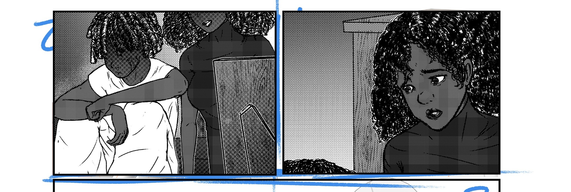
Hi! I really need an honest opinion on whether I'm doing this screen tone thing right.
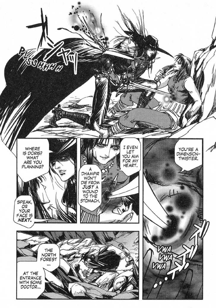
For context, I'm working on another comic with my sister, and it's looking great so far! The problem is that everytime we screentone it, it looks weird. It doesn't look like the screen tone that I see in other Manga I read online. Is there a reason for this?
Note: I'm using clip studio paint ex
This is mine:

Compared to this:

And this
