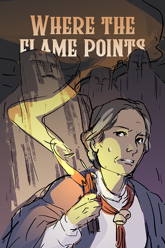
Lots of folks are pointing out color advice and all of that-- which is great! And some others lightly touched on this issue, but I think that your cover isn't properly conveying what your story is about?
Like, it STARTS TO, we know as readers and watchers of media that someone holding a candle in the dark = horror, mystery, etc. But, it seems here your comic is about... a scary doctor? Mysterious illnesses? (You may want to re-write your summary too! It's good that it's short, but it doesn't have a hook. Summaries are hard!)
I think something that showcases the type of trouble or atmosphere that your characters deal with would be good. Covers with characters interacting or reacting are supposed to be especially good!
Been thinking about this a lot with my own comic, as I'm always trying to improve the cover and thumbnail. It's really tough! But, all the advice I've seen and the covers that seem to work are ones that spoil the story JUST a little bit and are a teaser in their own right.
Like, it's so close, it's almost there! It just needs a bit more! I think if even just the expression was pushed into something a bit more like "scared" or "curious" or something more clear than just "blank" would be awesome! GOOD LUCK!