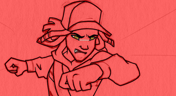
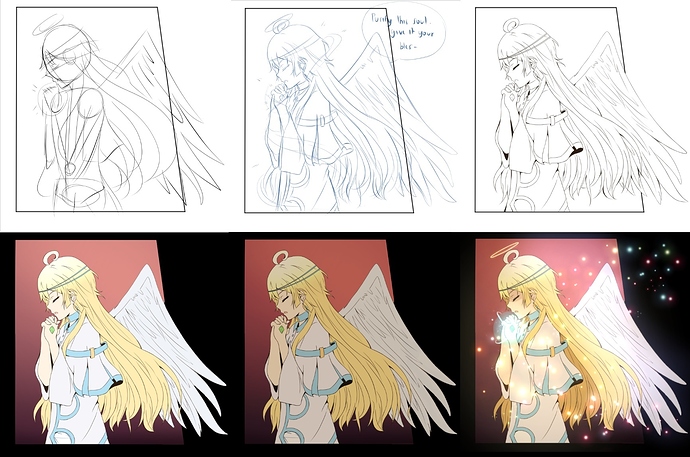
I do everything cell shade style so it's pretty cut and dry. I start by making sure my inks are clean and the eyes are done. I actually paint the eyes on their own layers so I can move each iris independently (a trick I learned from animation). This allows me to change where the character is looking, which has saved my butt multiple times and added more nuance to the storytelling.
For reference the background on that is an obnoxious red color because it helps me see the anchor tools better when I ink. 
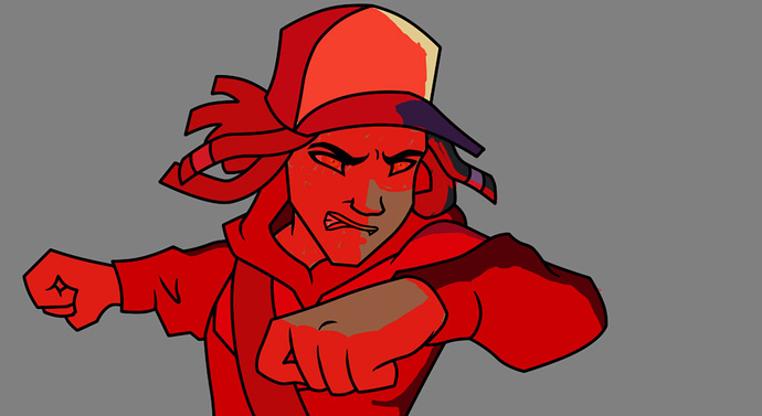
From there I use the magic wand in photoshop, and do the flats. Tip: Go to selection -> modify -> expand and put in anywhere from 1 to 3 pixels in the box. This allows your fills to go just past the inks so there's no weird anti aliasing lines (white lines around the inks).
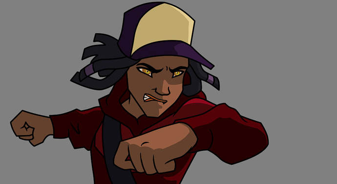
Okay so this ugliness is something I don't do much anymore, but it's really helpful when you're starting out. To begin the shades I'd paint the figure in solid with an obnoxious color and lower the opacity so I could see the line art. This allowed me to erase where I though the light would be hitting my figure. The only time I've done this recently is when the lighting is really complex.
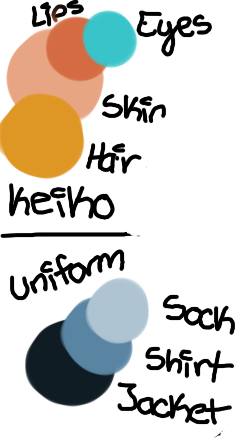
Now I sorta just jump to this instead. I'll use another obnoxious color, so they don't blend in to the character art. These are my guides. They allow me once again to lay down super clean fills on the character art. I used to have a specific color for each characters shading reference but that got so tedious I scrapped it. Instead I just do a single layer fill of black, and set the layer to Overlay. I'll lower the opacity on that around 30% to 50% depending on what I'm shading.
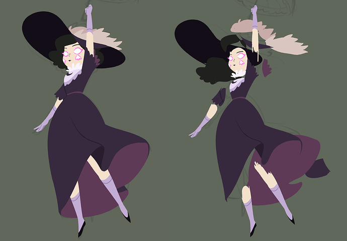
Once the shading is finished I blow away the ugly guidelines to get this vvvvvvvv
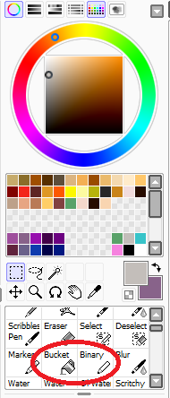
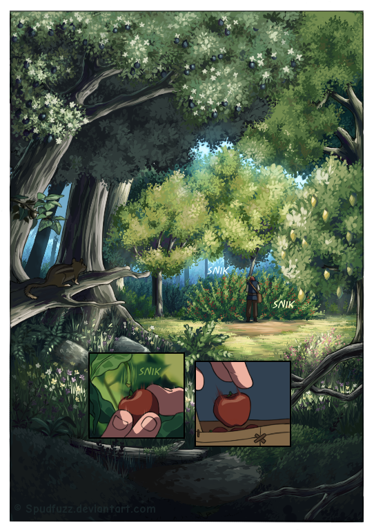
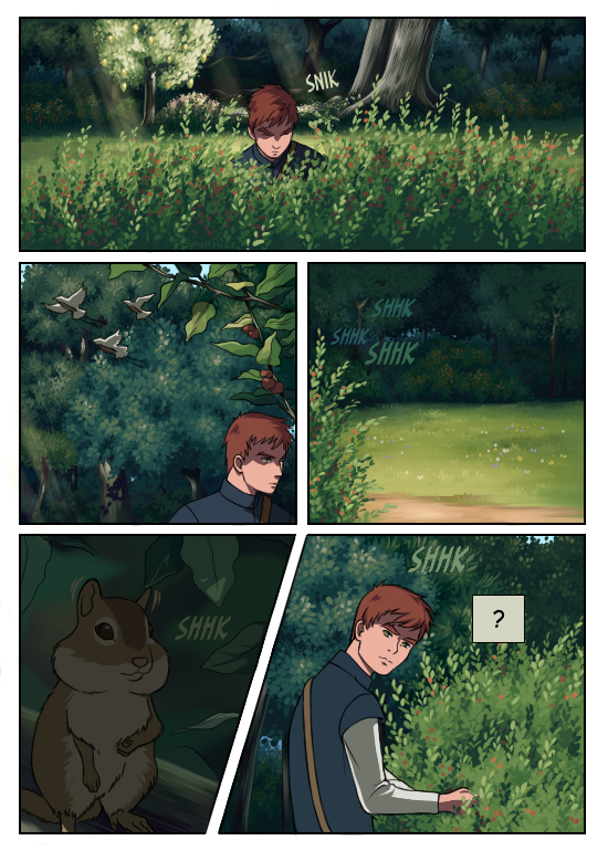
The backgrounds are done by my hubby. They greyscaled in illustrator, colored in photoshop and then composited together with the art work and final touches. Here's the full process for anyone wanting to check it out ->