20 / 37
Feb 2021

Hello everyone!
I was looking at my series recently and saw how much my artstyle/quality had evolved.
I'm really curious to see how everybody elses artstyles have evolved over time.
So put a before and after image and maybe a reason for the change.
I'll start off by showing the change in my series...
how it started :


How it has evolved :

Also post a link to your series like so

  • created

    Feb '21
  • last reply

    Feb '21
  • 36

    replies

  • 1.6k

    views

  • 29

    users

  • 135

    likes

  • 15

    links

Oh man.

I absolutely hate my old art so I try to avoid it lol, but here we go.

This was drawn some time before May 23, 2019.
I didn't format my pages whatsoever, so it was really hard to follow at times. The faces looked kinda gross and why the hell did I make his hair that color? The proportions are way off and I'd apparently never heard of backgrounds.
Edit: I just noticed the comic sans! That makes it so much worse ;-;
And also! I'd never use pure white or black, so all the lines are this icky dark teal which really doesn't go with the rest of the colors at all.


This next one was drawn some time before August 24, 2020. (yes, that was when the last episode was uploaded)
Hallelujah, the invention of backgrounds! Also, I feel like it overall flows a lot better than the old version. That first page was a nightmare, though. I really feel like I've improved a lot, and I'm excited to see where I'll be in the future!


First I Love My Yandere Neko Girlfriend
Old Art


New Art


Next Is Cheat Master

Old Art


New Art


I'm loving all these improving art styles!

This is episode 1 of my comic. showing the MC Valerie:


(I didn't post my comic until 2020 but I probably drew that panel in 2019)

And here is Valerie from the episode before the most recent one! (I'm not gonna show the most recent one, because she's not in it, and I wanna show the comparison with her)

The most evolution I've had so far are probably in the areas that are my biggest weak points. I'm faceblind, so I've had a lot of trouble with managing to make my faces look consistent and not have weird proportions, and I find figuring out shading and where shadows fall similarly challenging. When I first started I was doing a lot of rushed, vague, airbrushy shading, just kind of applying messy shadow areas trying to make the art not look completely flat.

After my first story arc, I was getting frustrated with how that looked, so I started trying a bit harder to make my shading more precise. I also started playing around with how I stylized my faces, trying to find a look I liked.

Most recently, I've been on a hiatus preparing my next story arc. I've been taking some time as well to do studies and more deliberately develop my style, especially in terms of how I draw hair. I'm pretty happy with how it's going so far!


I wouldn't say my art style has changed, more that my general skill level has increased.
Here's a panel from my first page (drawn summer of 2019):


And here's one from this week's page:


Well I guess I'll start with the original version of Uber Upgrades.

This one is not the same one that got published on Tapas but this is a prototype of it.

Here's a redrawn panel from this page.

Now as for the version that got released on Tapas.

This is the first page of chapter 1.

Here's a drawing I did (this isn't from the series but it probably counts)

Hmm, here's a comparison from an earlyish page of my first comic, vs. a snippet of the first episode of my upcoming new project:

I don't think my style (especially the way I draw human characters) has changed too too much, but the change to digital line art rather than traditional and my increasing experience using digital art effects definitely shine through.

Admittedly the top old comic example isn't as representative as it could be, because I didn't skimp on backgrounds as much as it might suggest, but I've also been trying to flesh out my backgrounds more as well. When applicable, a little texture goes a long way. Or even on simple backgrounds, a little gradient or accent color goes a long way vs, flat color areas like in the top example lol.

I've also been trying to simplify the way I shade lately. In my first comic I remember I would intricately shade every little piece of every panel, even in mid or far shots. I still spend the time to shade everything in close ups, but try to leave things a little simpler otherwise. The time savings from that I like to reinvest into lighting layers~

I love how absolutely dumb Shilo looks in the old versions. Also he looks so big like, c'mon, lil man's only 2'9" :joy:

He went to acting school in between the old and new versions.

(Can;t wait to see how gloriously fluffy Shade looks in this new style as well.)

2019 (before uploading comic)

2020 (starting comic):

2021 (reuploading comic):

I really started to do digital on a regular basis on 2018. I think I'm still ignorant of paint tool sai2 but I dig how the style has evolved to look more of an hybrid between anime and cartoon, as well as the color choices and how much detail I want for the characters to make them simple but interesting as well.

Basically I went from this (January 2020):

To this (Latest published page):

I'm hoping to get even better in the future! Here's the manga if you want to witness the evolution:

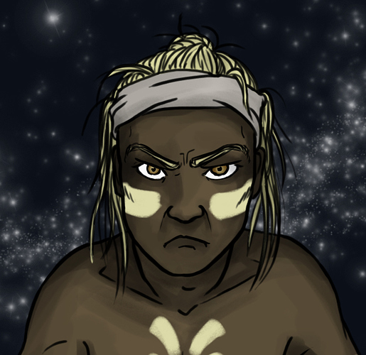
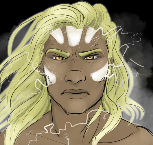
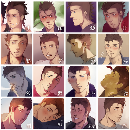
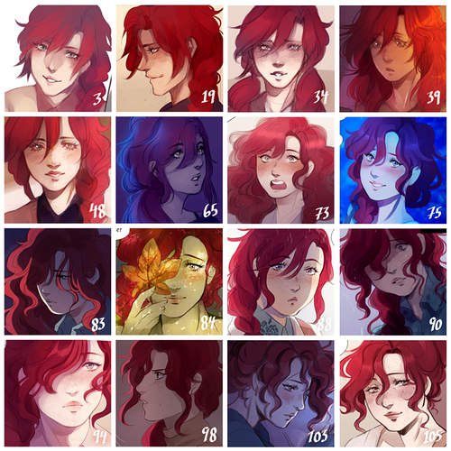
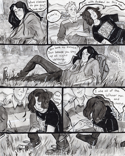
At the end of last year I made a compilation of how my 2 main characters look throughout the series and it really shows the art development!

I didn't realise their facial features changed? Like i think especially Mihai since I wasn't actually used to drawing the type of face I wanted to give him back when I started my comic. His nose shape is very different now compared to before.

Aside from the art development Adilene facial features look about the same but a bit softer than before?

I don't know if my style has progressed HUGELY in my actual comic... there's little details which have changed.... But it's certainly gotten better since my old concept art!

My comic is IN THE WOODS SOMEWHERE

Also I switched from entirely pencil/brush-pen shading, to watercolour!

Old....

New.........

On my serie

One Poem a day:

I went from B&W to colorful poster