7 / 9
Oct 2021

Hi all, I'm just deciding to delve into the world of comic making, and want to ask about formatting.

Brief backstory: I'm primarily a novelist, or, at least, I was over fifteen years ago when I used to get excited about creating. I've recently become excited again, and picked up writing an old story idea I had a while ago. However, here's the kicker: I actually don't like reading novels. I prefer reading comics! I draw short comics for a writer (Just Jon Comics on Instagram) so I've been getting some practice.... and I decided, rather than using words to explain my story and expecting people to read when I probably wouldn't even read it, maybe I should do it in comic form!

That said, I'm not sure I'm a big fan of the webtoon format--endless and constant scrolling. But, since the width limit on Tapas is 940px, I'm worried about crowding the screen with too much information, or even not enough. Based on what you've read and created, what is the most comfortable format for making comics to be read on the internet? Is it a hybrid from of comic (webtoon+traditional), with 2-3 frames per width and saving big single frames for big moments?

I'm honestly terrified of trying this. I have serious anxiety over my art skills and story telling abilities. I know I write well and verbally describe scenes well, but I often think many of the scenes in my story would be best depicted through visuals, despite my lack of confidence in visual conveyance.

That was rambly... any tips/advice are much appreciated!

  • created

    Oct '21
  • last reply

    Oct '21
  • 8

    replies

  • 1.9k

    views

  • 5

    users

  • 9

    likes

  • 1

    link

Congrats on trying new things! Honestly long scrolling format comics are a little hard to gauge at the beginning.

To be honest I think 2 frames is kind of pushing it on readability. I don't think I've seen a lot of people put 3 panels at once with a decent amount of text, it'll be really hard to read.

I think going infinite scrolling format is the most mobile friendly option. When you stack panels on this format you worry about vertical space not horizontal, so it's usually one panel on the width and another or maybe 2 panels visible below/above it.

Honestly I highly recommend making mock pages and then porting them on your phone and seeing how they read. Trial and error will help a lot.

Hey! a great question to take into consideration! I've been writing and drawing traditional page-format style comics on tapas and webtoon for years and it is indeed a challenge to find a nice hybrid to account for readability on mobile.
Easy answer is: Three panel width maximum... Two is the most comfy, and sometimes you can get away with four, but anything else would be pushing it for image clarity. (though there are likely exceptions)
If you want to get more into it though, the most important factor to consider for mobile reading would be text size and image crowding. Tapas has a handy feature that lets you preview pages before you post them for mobile and desktop viewing. It might be a good idea to draft up a page with a bunch of font sizes and check them out inorder to decide your minimum font size (my working files are 3114 pixels wide at 300dpi and I find that font sizes 16-18 work best for normal text)
As for images, as long as the action within the panels is readable then you're good, but as stated before, I've found that things start to get cramped after 3 panels.
If you want to check out some examples of page formatted comics, there was a forum thread a little while ago with links: https://forums.tapas.io/t/lets-have-some-appreciation-for-traditional-page-comics/6359116
As for worrying about not enough information in a frame... just be sure to keep your compositions strong and account for how much space your text will take when laying pages out. Its much easier to add more to a scene visually if you find it lacking.
I'm sure there was a time when you were less confident in your ability to write well, as I was with my ability to draw aahah! We all get anxious about testing our skills early days, but to practice you've gotta do! Best of luck on your future project, and I hope you have fun with it!

I'd encourage you to lean into the vertical style, unless you're absolutely dead-set on printing your work one day. It's vastly more popular, and you'll have a far easier time acquiring readers with a vertical format. I started off working in page format, and switched to vertical after a couple of months. It made a huge difference, both to the quality of my work, and to the reception it was met with.

That said, if you are certain you'd prefer a hybrid style, just don't go more than two panels side-by-side. Anything smaller will sacrifice readability on mobile screens.

The idea of webcomics being on the vertical format is because people scroll, with the mouse wheel or with their thumb from their phones.

The easiest thing to do is this think about the following:
- Where are you posting? Is it a site known for it's app (Cellphones, ipads) or it's a website (computers, notebooks)
- What is the type the site recommends? Which format is popular in said site?
- Read their guidelines and indications, watch how others make webcomics to have clear ideas about what to do
- Make your comic on the traditional format, then cut and paste for the vertical format, that way you can adapt your work for digital reading and at the same time you can print it. (Work on bubble speech and SFX separately from the page/panels so you can properly arrange them later)

Thank you so much for your input! With the link you sent me, couldn't those more traditional style pages be stacked into a single file as well to be scroll-friendly? I'm not sure if the file would then be too big (Tapas says max 2MB but other forums said it's 20MB so uhhh)

Wait, I'm confused on how you manage to keep your font readable after you resize the 3114px width! Wouldn't 16 size font shrink too much? I tried it with a 2400px wide canvas, (published to 800) and tried 3 different texts, and the 30 wasn't readable when I sent the shrunk file to my phone to test it. I went to your published comic and I can see the font is totally readable... but the images look large as well. I'm so confused by Tapas (and Webtoons) size restrictions since I keep seeing these full-screen, sharp quality panels on both my 4k monitor as well as my 1664px iPad Pro. But if it were being scaled up to fit each screen it's on, wouldn't it lose quality since the file has to be no wider than 800/940 pixels?

I'm not sure why this is confusing me, sorry. I'm not computer illiterate. I understand pixels... are you doing vector fonts instead of raster? (is that even possible?)

Oh, thanks for your advice! I can see very clearly that the longform scrolling style is most popular on Webtoon, but on Tapas, a lot of my favorite comics don't feel as scroll-intensive. They're very detailed and fill the screen, but they're still not super traditional, just two frames per row usually... but these are the only two places I plan to post, as I don't plan to ever publish physical copies (it's the digital age after all). So I guess to accommodate both I should stick to Webtoon. Gotta go with what most people are going to prefer to read, after all.

You make an excellent point: if the people want to read vertical scrolling, I must abide. I definitely do not plan to ever publish in print. If for some reason a comic I make kicks off, I'll worry about it then, and maybe do what Mongie is doing with "Let's Play". It looks stiff once it's in book form and rearranged, cause basically every panel is the same shape, but I don't want to sacrifice readability for a maybe, like printed books. Thanks for your input!

all good! you can cut up comics and stack the panels, but there are numerous reasons an artist might choose to lay them side-by-side. I guess the question you have to ask yourself as an artist, is how would you best like to format your comic. as for filesize, tapas lets you upload multiple images, so most verticle-scroll comic artists will export several images and upload them in the proper order onto tapas(i don't have to do this with my page-format cause it's just one short image). these are just good examples of how other people layout their panels horizontally, since traditional page-format more often relies on this its not a bad way to study that particular technique.
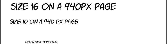
with fonts, the size 16 font I use takes into account the shrinkage, if i were working with a 940px canvas for example, size 16 would appear larger than on a 1334 page because there are less pixels across. the difference would look something like this:


I think most fonts are vector automatically but if you export the larger canvas to a smaller image everything gets rasterized down proportionally, so yeah, my size 16 is getting shrunk but a lot of artists like to work on a bigger canvas for image quality sake. Kind of a brute force answer but keep doing testing on your phone to see how big a font you are comfortable using with the size canvas you are normally working on.
If your text is shrinking to be too small it may be a matter of the program you are drawing in(i am using clip studio paint on a desktop), meaning you will need to still increase your size and find the number that works in your device and program. It could also be a difference in fonts, since some fonts are naturally just smaller than others. Don't know what kind of font you are using but things like style of font could also be contributing, which is why simple sans-serif, comic-style fonts are most popular but any style could theoretically be manageable with the right sizing. I would make things easily read on mobile, cause it sure doesn't hurt to have big font on a larger screen but small text on a small screen kinda sucks aahaha!
as for the shrunken image size: i believe 940px is meant to be viewed on desktop so it looks alright, I assume that tapas/webtoon are both resizing the images on mobile. i'll often notice the quality of my webtoon uploads will look real crunchy when I'm on my mobile reader on my ipad with a bigger screen. It's one of my major complaints with the service.
A bit of a rambly answer, but I hope it can be of some use. And don't worry about being confused, it takes a bit to get into the swing of things and find the process you work best with, with practice these things become routine. keep at it and don't sweat it, especially in the beginning!