
Oooooh, I see; and I'll check out the video. A friend of mine also mentioned about the saturation; so I'll be be both fixing and looking out for that. Thank you ^__^.
Well, I'm not very good with novels, because I need to use my time for my projects and work and stuff, but at least I'm going to tell you what I think about the synopsis and the cover. So, the cover gives me vibes of a solo character, like a warrior, a traveler, even a mercenary, she feels mysterious and kind of threatening, I don't see any weapons but she looks like someone who should be treated carefully.
The description is unnecessarily long, you should introduce me to the story, not tell me the story, I want to read a synopsis, not a prologue, why I need to know about the death murderer of a dead princess? What I know is both characters are dead and they are not relevant to even mention here, tell me only the plot and nothing else, here is my character and this is the situation in this world, if your story is about multiple characters you can mention the group, but it is a big mistake to shove the story in the description.
 (especially for the latest chapters)
 Thank you for the opportunity! If you would like, you can check out my webcomic Hetero Sakura. It is a post-apocalyptic story set in a nuclear winter, and it updates every two weeks
Alright, first impressions on your cover and synopsis! I like your cover and couldn't help but notice that the red cloak matched the red on what looks like a banner caught on a stone. Since it looks like this person is coming fresh off a battlefield, it definitely made me wonder what the symbolism of that connection might be. Your synopsis supports that conflict is imminent, so it seems to me that the cover is foreshadowing things to come.
I also read through the first chapter and really enjoyed the worldbuilding, setup, and characters. (I definitely felt for Novus, trapped in a situation he can't avoid!)
Subbed to your story. I'm a slow reader, so will catch up as I can. Looking forward to seeing how your story unfolds!
I like the cover, but the font seems a bit too busy, like you're using two wildly different fonts (Even if you aren't) the logo in-between the two words is also kinda distracting, combined with the geometrical shape in the middle it kinda makes the cover look a bit asymetrical.
The only thing I can comment about the description is the "power combinations" part, which sounds off.
I don't like first chapters/prologues being an info dump about the world, you should try to add that information organically into the dialogue, rather than unloading a ton of exposition from the get-go.
I really like the cover. No more notes to that subject.
The description could use a bit of work, you start by focusing on "Magic as a corrupting influence" but then you move to your main character and his ability to "Trial Run" which I suppose is more or less time rewind to a previous point while keeping his experiences about it.
Writing wise you mix up points of view, as chapter 1 starts with an omniscient point of view and then jumps to Ivan's first person narration. I'm not a fan of putting the names of the characters in brackets after the dialogue, you should give context clues for the reader to realize who is talking or add a bit of prose that also talks about the character mental state.
Hey,
Zenex here
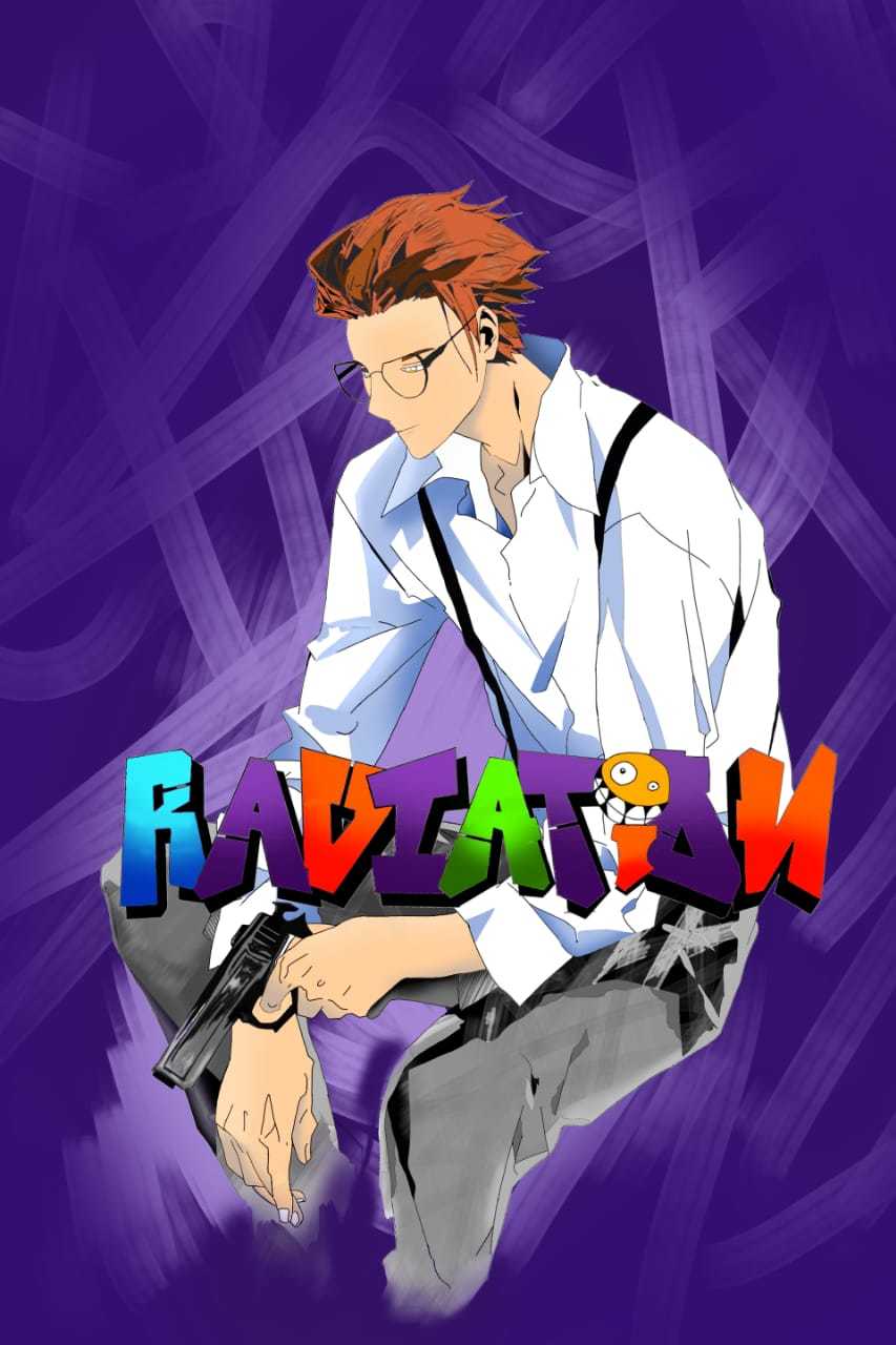
I am the author of RADIATION on TAPAS. I publish weekly to make sure that my reader gets their dose regularly. I will appreciate it if you will support me, to give you your weekly dose of excitement.
With love,
Zx
I feel there is no hook to the description. It seems like a story I have read before. I think there is some issue with the commas in the first sentence (I'm not a native speaker of english, but there is an issue there)
I wouldn't start with a link to your webpage, I would rather put it below the description
I'm not an artist, so my comments will be less professional here. I feel like you excel at close-ups, while your full body shots could use some work, there is some issue with the anatomy of the character, you could consider using 3D models as base to sketch over.
The noses of your characters kinda remind me of Araki's later work (Maybe the line shading also gives that Jojoesque feel)
I like the cover art. It took me a while to get the name, but it clears up after reading the description.
The description is solid, I don't like putting links over it, I would put it at the bottom.
Even if I'm not in love with the concept, the execution is relatively solid, the speech as a vehicle of exposition is pretty good, it dips into exposition dump a couple of times, but it mostly works. Maybe I would've used a different word for the people with Heterochromia if they do have the power to absorb radiation, and leave the Heterochromia as just a symptom of it, rather than being the classification.
I love the artistic choice to only color her eyes.
I'm doing just the first one.
I feel like I'm not the target audience, but I'll do my best.
The cover looks pretty cool, my first thought about "Purple Shades of Blood" was that the story might involve royalty or nobility, as purple is usually associated with those groups.
The description didn't give any evidence to my theory and I felt like it was a bit vague. The only hook I see is finding out why is there Purple Blood. (Unless the one bleeding is a diehard Prince fan)
I'm more on the "wordier" side of the writing spectrum, but I like your writing style, is easy to follow.
I'm doing just the first one.
The cover is kind of generic, not much to comment on or criticize about. It's serviceable for the story but doesn't have anything that pops out.
The description is also generic, I feel like you could change the name of the main character and it could work for a thousand other stories.
The art is solid but unremarkable, the characters clash a little bit too much with the traced backgrounds, you should try to make both a bit more cohesive.
Thank you for your feedback!
I have received mixed reviews about the dialogue tags so I am currently considering whether I should keep them or not.
Thanks for your opinion on the description too. I will be changing it sometime soon to make it fit more with the vibe of the story.
"Ravished with hunger, the world was preparing the devouring of the world."
The whole description is a bit rambling and cryptic. I had to read it multiple times to get an idea of the story.
The art is pretty good, you might want to invest in getting a font that makes more sense with the story.
You have a bunch of grammar mistakes here and there, you might wanna do a check-up.
The cover looks to be traced from other work. I'm always against tracing, you should try to invest in getting proper art. The font used for the title sells me a wacky fun world, but the description kinda goes against that impression.
The description is okay, nothing revolutionary, no notable hooks.
When it comes to writing I don't know why you use FULL CAPS for words. There are better ways to attract attention without going full caps, you never go FULL CAPS.