11 / 80
Aug 2024

I would make the skin a little bit lighter and work with light and shadow.
I like white highlights on dark hair, I don´t have much time but here is a hint
what I mean

They key to coloring is never go completely black or completely white as you have no way to shadow or highlight it. Color theory is using the surrounding colors to make the black seem darker than it is. If you color pic most blacks in pictures, it's not truly black.

I'd pretty much just do something like this.

Or alternatively, you can play around with the color of your outlines. I used white in this draw over example, but it doesn't have to be white, could be any contrasting color.

I think you can leave the skintone as is, but like others have mentioned highlights will add a lot of the dimension. I’m not sure exactly where the light would fall on her face but I hope it gives you an idea of what can help her features stand out more. I’d also recommend looking at pictures/photographs/real life of people with this deep of a skintone to see how the light reflects off their skin.

I followed the contours of the face with a line of highlight but also darker backgrounds will make the skintone also really pop, a blank white background can be cool for a statement piece but the details do get lost, unless I were to maybe boost the contrast more between the highlight by making in lighter. But I think the softer highlight looks a bit more natural!

So definitely the darker background is my secret tip to making the details in the face show a lot more readable :slight_smile: you can also add texture to the hair with the same paler line, but also if you like the hair solid for a simpler style it could work too.

Hope this helps! It’s fun to see your progress with the new digital paintings ^_^!

I think it will, but i'll have to improve to be able to follow your suggestion at the level you can do it at lol

Yeah, but lightening their skin would mean losing the essence of the characters

Thank you, and yeah, that's a good suggestion since I really don't want to lighten my characters' skin to make their features stand out. and yeah, adding details in the hair is definitely a goal because I want it to have more detail as I improve lol. I need to watch some dark-skinned makeup tutorials or something.

It's kinda the trade-off you gotta make with that sort of flat style. You could also design the rest of the characters with a much lighter skin to keep the contrast between her and the rest, keeping that 'essence' intact.

Either that or you learn how to render light and shadows. And then I would suggest following @beebutterbee 's example, since theirs is the most legible.

the goal is to improve my art, and no, the essence still isn't the same even by lightening other characters' complexions. It's still changing the OCs, and I don't intend to settle, just improve.

Yes, I do intend to learn to use lighting and shadows, i'm simply still learning. I have only been drawing digitally for less than a month after all.

The main thing to focus on are highlights.

But also willing to find a medium between how dark their skin is and what is going to be visible.

I like Rainbow High so am going to use them as an example because it's easier to visualize.

Ayesha (right) is the doll with the darkest natural complexion in the series. You can seen how the highlights in her face is what makes her pop. Her skin color is dark but her brows and eye liner are much darker.

Shanelle, who has more of a fantasy skincolor, her skin is more just a dark grey than a pure black.

I would recommend slightly lightening her skin and putting a dark shadow on it.

If you really want to learn, I'd suggest to stop trying to draw your characters in a stylized way for a while and start building the fundamentals. Google image search an entire folder full of reference material of the stuff you want to improve upon and try to just replicate that. The sort of stuff you see @Lensing doing in his studies. Try to understand the underlying construction for anatomy. Try copy a photo as closely as you can by painting it. You'll learn a lot faster and better that way.

Also another thing that helped me when I starting out drawing in color, and I still use this to help me today, is to look at how other artists render what I want to draw. Of course, don’t let it discourage you, this is just meant to inspire. Doing studies of old paintings really helped me learn things that were difficult to draw at first.

This blog has some really get resources for darker skintones btw so I’ll link it to you, I hope you find it inspiring. I certainly use a lot of inspirations from other artists, there’s just so much cool art out there.

I used this old painting and broke it down to take away the colors he used for the skintone. He uses actually just straight up black it looks like for some of the darkest colors. But there’s also a great deal of highlighting, but just have fun with your art right now! You’re starting out with digital so just experimenting helps the most. Sometimes the things turn out and sometimes they don’t but that’s just the learning process :’) Still, it’s really fun to get our characters down on paper … or tablet :joy:

I apologize for always writing novels :v::pensive:

https://blkwomen.art/post/677389093139791872/nubian-beauty-tobias-andreae-german-182318732

also learning values first is extremely important!

it can help you with shading and finding light sources! ill use my fanart as an example hope you dont mind 🥹 @abigaillmartin

i started off with grayscale because doing so makes it easier to think critically

after that i add the color but because i used grayscale theres not one set color if that makes sense :cry_02:

no need to apologize lol, those are all really good suggestions XD.

@daeygurart that makes a lot of sense, thanks

I don’t mind at all @daeygurart

Hmmmmm. The only characters I have with darker skin is Pujita from Cracking Eggs. I honestly don’t know how I do it.

(Ignore how bad the art looks) T-T

Also I have a new character who is going to be introduced as the new doctor in Smelton Oliver Greenwood

Just like with the rest of my characters I try to give them distinguished noses, eye color, etc.

But unfortunately I don’t have any more examples. I wish I did.

It's fine lol. Complexions of this darkness I don't have much trouble with, I can go all the way up to dark chocolate and I can still see the features, though I do still have to learn more about highlighting, it's when I get into the carob/molasses range that I get lost XD

I disagree with lightening her skin as a stylistic trade off. It's common for black people to not be captured well in photos, but that's an issue with the photographer's skills, not the subject. In that sense, you should consider how you render.

Since you're working with a tone that's deeper, you might want to go about building her up with additive colors as opposed to subtractive colors, which is what we'd typically do.


This is how iridescence works. It's a diffusion of light on deeper surfaces.

Personally, when I want to convey depth among darker colors, I usually erase the ink and color in that area.


I like to shade/highlight with colors that compliment the character's undertone. I feel what user @beebutterbee suggested is an achievable balance.

With love, saying "I'm still learning" is a crutch. You're always learning, and will always be no matter what you do. You just need to hoan your artistic discipline. That will happen with the willingness to experiment and see what works/doesn't work.

Good luck with your art! <3

So the biggest thing I've learned when it comes to brown skin and especially darker skintones is that it falls between undertones and highlights. I'm still learning the best ways to render these kind of tones for my own art style which is also flat but references and tutorials have helped so I'll just drop some that I've gone back to often here:


https://www.deviantart.com/lurrkingly/art/TUTORIAL-How-I-Color-Dark-Skin-867708572
https://www.deviantart.com/puppsicle/art/Skin-Tone-Cubes-Free-to-Use-842445436

as for your case it may be useful to find a nearest neighbor shade when looking at some of these dark skin tone palettes and build from that, so maybe red or purple undertones like this small edit i did to the base tones and then picking highlights

another thing might be changing the color of the hair a bit so that the lines can read better and so there's clearer contrast like some of these samples i threw together here

obviously it takes a lotta playing around with (these took me a couple hours or so to play around w tones) but it is possible to get deep skintones without sacrificing shades.

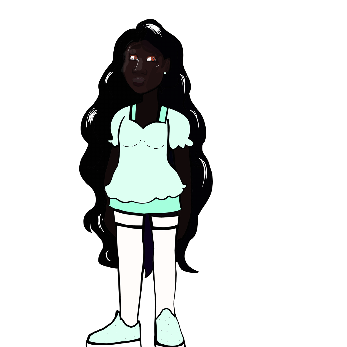
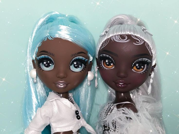
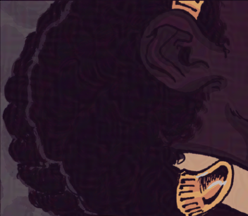
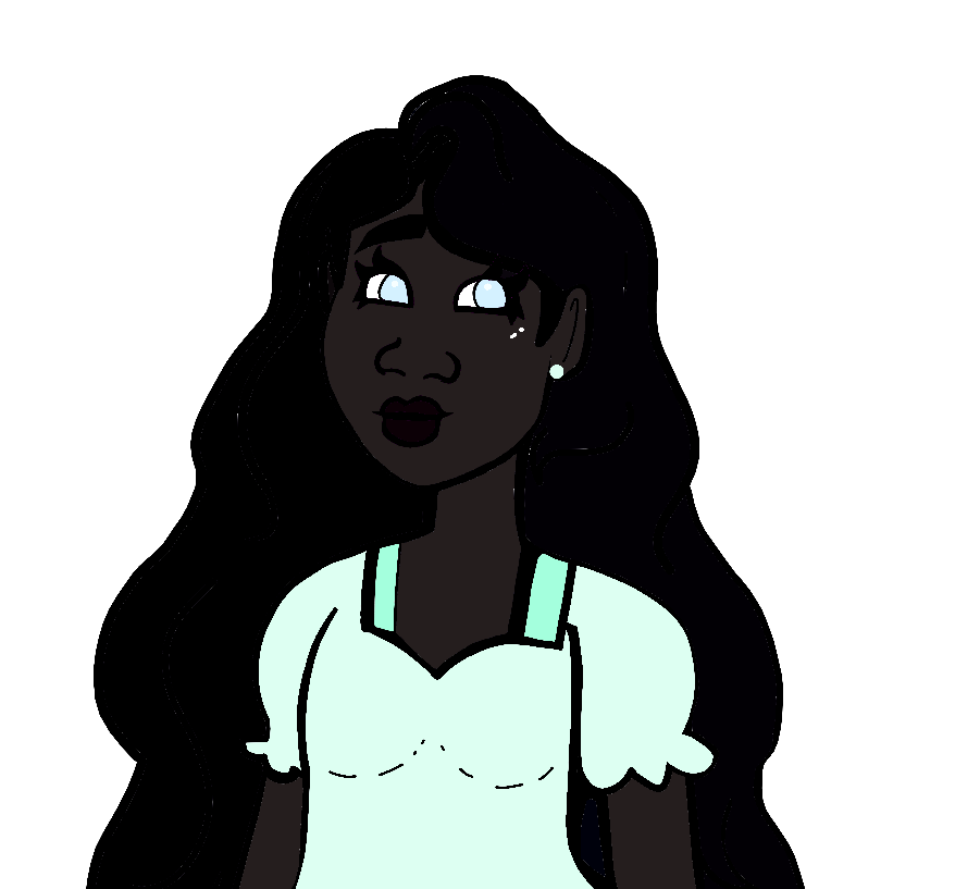
There's a lot of good advice in this thread, but I don't think anyone's addressed the most obvious issue: I'm sorry, but that skin color is just too dark for its context. =/ There's no way around it.

Like everything else in art, color is a representation of a concept. Never have I ever seen someone with such dark skin that their facial features are indistinguishable...so by giving a character a skin color that's so dark you can barely see their face, you are not actually representing anyone. On the contrary, it looks lazy; like your only concept of dark skin is that it should be "dark"...meanwhile, making sure that it still looks like skin and not just a void doesn't factor into your thinking.

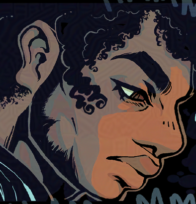
Now in a different context, like a different art style with a greater level of detail, that color might work. For example, in the Houseki no Kuni manga, there is a (non-human) character whose skin is straight-up black, and they still look beautiful and have readable expressions, thanks to the artist's skillful use of white highlights and linework.
But if you're not using highlights, or shading, or color grading, or any kind of detailed technique that will bring life to an extremely/unrealistically dark color-- and it seems like you aren't-- the unfortunate truth is that you simply cannot get away with it. It's gonna look confusing at best and like an offensive caricature at worst; you need to use a different color.

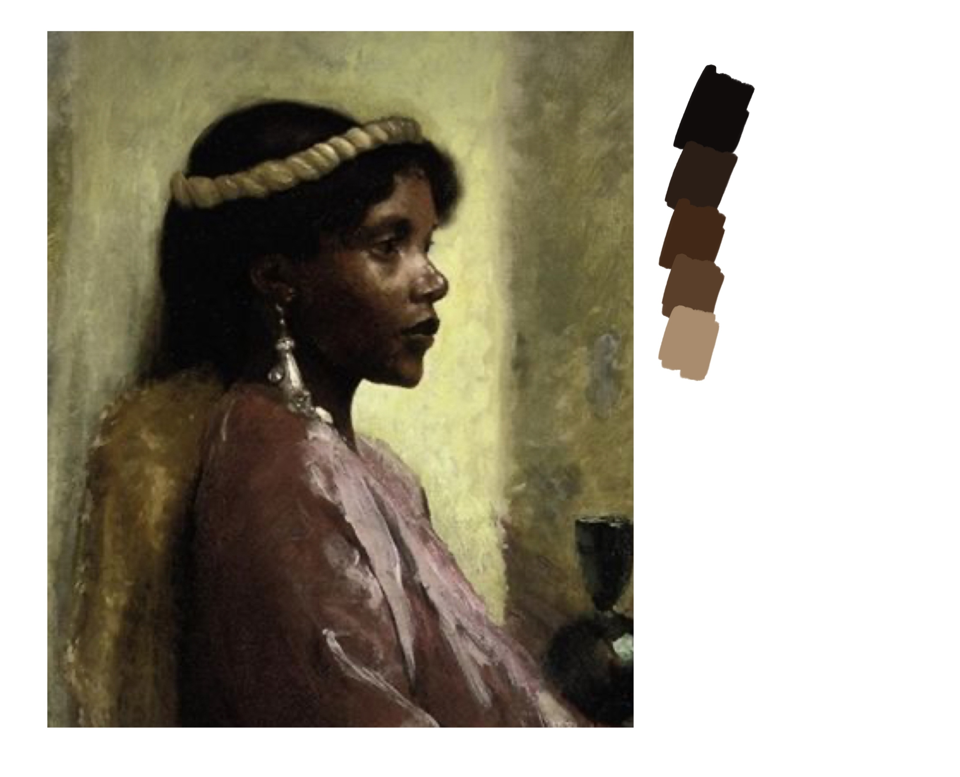
The new color you should pick depends on the skintone aspect that you want to emphasize for the character. For example, if the darkness of the skin is the most important aspect, you want a very dark and desaturated brown-- notice how I said dark AND desaturated, not just dark.
Taking saturation away will help the skintone "feel" darker while still being readable, and in my experience it's more realistic anyway. Never have I ever seen a real person with that eye-blindingly saturated "deep brown" that a lot of amateur artists come up with when they color POC for the first time. To me that's the equivalent of giving a white character neon pink skin-- it doesn't look natural, it looks abstracted.
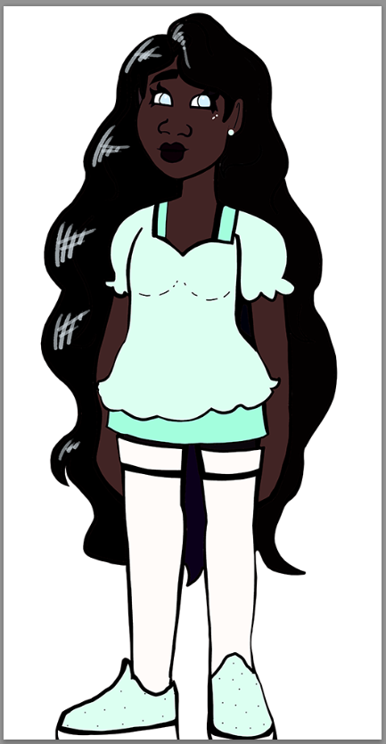
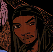
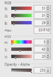
Anyway, here's an example of a 'dark' correction (Lightness +8).

In Paint.NET, 'Lightness' tends to add value while decreasing saturation, making it an easy fix for this. You just need to be careful not to go crazy with it and give the character gray skin (another pet peeve of mine...); red hue should dominate in whatever color you end up with.

Now if saturation is the aspect of the skintone that you want to emphasize; you want a brown with middling saturation and a slightly higher dose of green hue. Red should still dominate, but the green will make the brown feel 'warm' and lifelike as you carefully climb that saturation ladder.

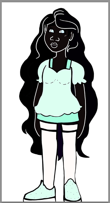
This is a harder type of skintone to get right, so let me just show you the example first:

Yes, although this is much lighter and brighter than the 'dark' correction, this is still a very dark skintone. One of the things you have to recognize as you learn this is that skin colors are not a numbers game (which is why relying on 'set-it-and-forget-it' blending modes often sets artists up for eventual embarrassment); the perceptual saturation of melanin is more of an S-curve than a straight-line trend. This is why you will learn more through reference than by trying to just guess.

Anyway, what I like to do when creating skin tones like this is to first pull up the saturation a lot to make sure I have the 'color tone' I want (in this case, a slightly-reddish brown based on what I saw in the original image) then lower saturation and raise value until I get a 'calmer' brown that looks more like a skin tone.

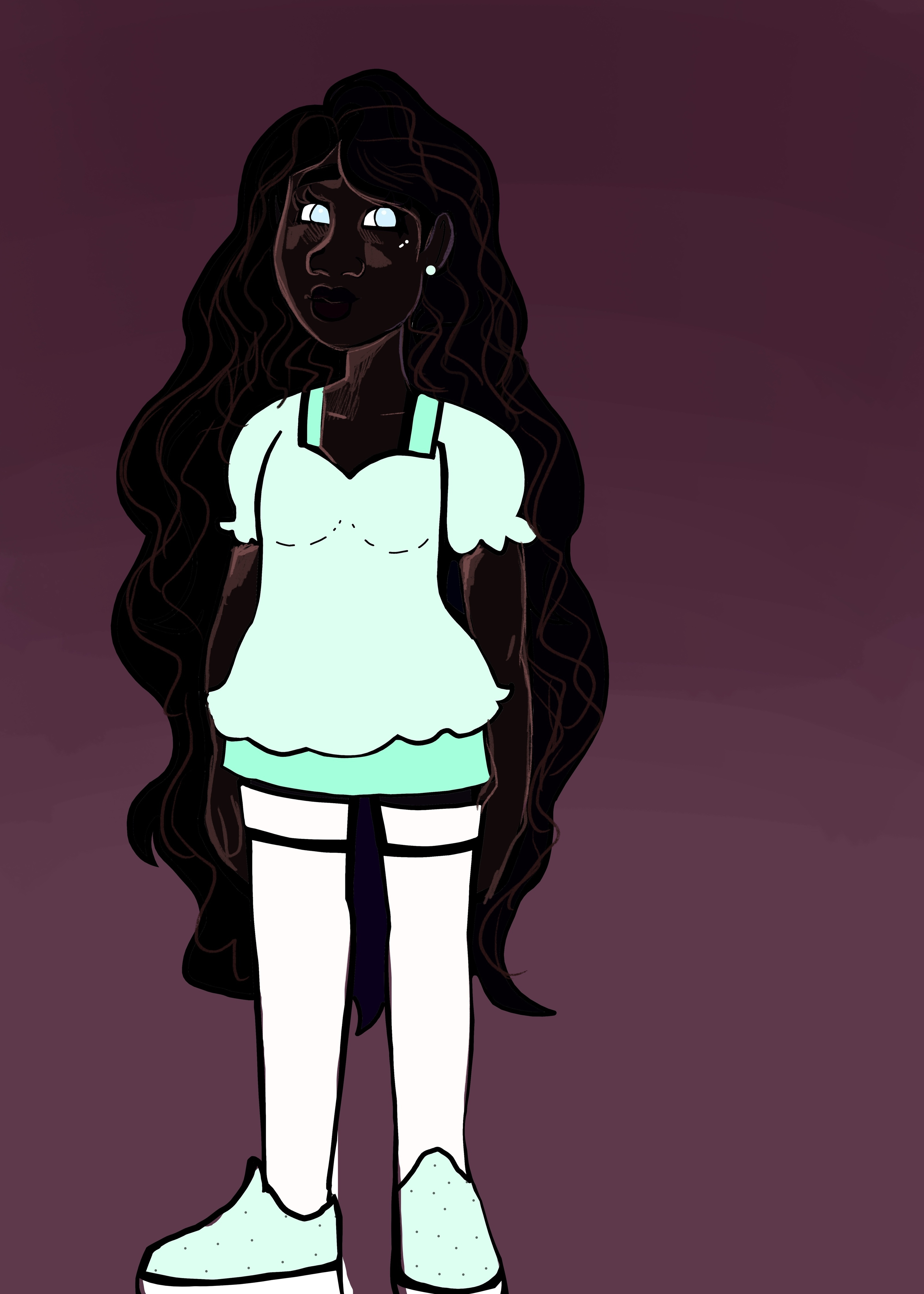
If comparing numbers helps, here's the data on this 'saturated' correction. The numbers on the color you use don't have to match, but its RGB and Saturation/Value ratios should look something like this:

To conclude, I think anyone trying to get better at depicting dark skin should remember two things:

1) Always keep YOUR artstyle in mind. If you are drawing cartoons, do not reference from painters/photos, especially if you're a novice and you don't yet understand how lighting affects dark skin. Simplifying the complexity of a skin tone to a single flat color is a SKILL, and if you haven't learned it yet it's okay to just let other artists do it for you. Cartoons with characters of color exist; study their character sheets! And tons of artists of color have made up palettes you can pick from, find one that matches the palette of your comic and just use it.

2) Your POC viewers will not care that you picked the dramatically darkest skin tone you could imagine, they will care that the character looks good. Don't try to impress people, don't try to prove a point; just learn how to color a character's skin believably. It's art, not a contest; effective communication of the concept is the most important thing.

Adding onto what @DokiDokiTsuna said, I just want to point out that the majority of the edits of your character's image I'm seeing in this thread are borderline unseeable on my monitor. I keep my screen brightness pretty low, and as soon as I turn on my nighttime filter, I'm not going to be able to see anything at all.

There's a similar concept with nighttime scenes (one I had to learn myself), where artists will desaturate and/or blue tint the scene instead of actually making the colors super dark, because it's an effective way to convey darkness while still letting the reader be able to actually see what's going on. There's a lower threshold on the brightness slider where colors will get lost on certain monitors, and the color you've picked for this character is way past it. It either needs some very strong highlights, or you need to use a different color.