
Alright here's mine. It's my fist comic, so I'm by no means an expert.
Okay! Now that I got time and ample internet...
Very charming, very atmospheric! Has a rough around the edges aesthetic that really compliments the fantasy elements of the story (I read through a good portion of the beginning and skimmed through the rest so I could see how your art progressed. I will read it all later!). Huge improvements in not only the art style but in your composition techniques. The panels and frames just blend together but aren't usually hard to distinguish.
I really gotta nitpick with this one, but I'd suggest keeping an eye on your typesetting, making sure that some letters don't overlap or connect weirdly with others. It didn't happen too often, but I did notice it from time to time. Also, rarely but still there, and I'm way more guilty of this, but your characters sometimes go a bit off model. Usually I found it's when they're turned at a strange or hard to draw angle.
Other than that I love it so far, your intro was very gripping (despite the dated art, which had its own sort of charm) and I can't wait to read the rest when I can!
Bonus Round: What I'd think would really elevate your work and help it stand out even more than it already does, would be to implement more depth and perspective, especially with your backgrounds but even with your characters. Experiment with foreshortening and placing things int he foreground and background, using shifts in brightness and saturation to imply depth. I understand you might be going for a more 'painted' look, but even simply layering elements more frequently can add a lot of intrigue to your art!
(My class was boring and we watched a video about milk)
Now, I'm definitely not as versed with novels as I am comics, but I'm not opposed to reviewing some good ole' literature every now and then. Since your story pretty much hasn't even begun yet, I'll mostly focus on your techniques.
Starting with repetition can work, but only if it's really done well (in my opinion). The first two sentences, while poetic sounding, don't make much sense in regards to what follows. Even if they are alluding to something that either has occurred, or will occur, or otherwise, cutting from these seemingly unrelated imagery to the protagonist in a different setting without warning was a bit jarring and confusing. If you really want to implement this, have those first two sentences lead into at least some sort of explanation or context. I like to think that the first thing the audience reads should be gripping, eye-catching - which what you have written certainly is - but it should also make sense.
As for the rest of this scene, it has a nice flow, with characters 'characterized' by their actions as well as words, which is very good. There's certainly a level of mystery and intrigue surrounding Indigo, mainly how he turns his freaking secret home invisible!
As for your newest scene, it didn't really do much for me, but understandably it is more of an exposition kind of thing. We do learn a bit about the world these characters live in, but only a little. Indigo obviously is being paired with some stranger against his will, it's a trope we've seen before...... at least, I'd say that had I not retroactively read the description of your novel. Knowing that Indigo was born a girl and thus is expected to fulfill a certain role in his society pertaining to that is certainly a very cool topic to play with, and I'm excited to see where you take this.
That being said, the fact that I got this from the description and not the novel itself isn't very good. I understand you literally have only two pages out, so you'll get to that eventually, but my thought process of "this is just another one of those stories" might be what other people see, and they may never read the description. Just something to keep in mind.
Something I think you should work on is really taking the readers into the protagonist's head. What is he thinking, what is he seeing, what does he think about what he sees? I want to know more about this person and his ideologies!
Bonus Round: Let's get some more imagery! Sights, smells, tastes! Water trickling over rocks, its sound carried by a breeze. Birds frantically chattering, hopping from branch to branch in the trees above. Immerse the reader in their environment so they won't want to stop reading.
Here's mine. I'd love to hear what you think. Also, Season 3 is right around the corner with a big overhaul in terms of style, so if you want I can also share some Season 3 strips when the come out in a few weeks for you to compare and contrast.
(Milk??? WHY? 🤣)
I'm loving these illustrations. 

Thanks a lot for that long review and your feedback, for someone who doesn't read that many novels you give some great tips! I agree with what you've said, the story does start moving much faster starting from chapter 4 however, so if you're willing to stick around until then I hope it will answer your expections/questions and fix the issues you've spoken of in your critique!
Thanks again for taking the time to read my work, and for writing such a useful and constructive critique, cheers!! 
Ehhhh, I usually don't do these but, hey, why not. I'll put my comic up for some reading/critiquing >_<
I have a not so scientifically accurate fantasy comic xD
I'm actually very scared of asking for critique (especially since I couldn't explain most of the things happening yet) but I really need some constructive judgement on my comic in order to get better. So don't hold back
(I know there are a lot of updates so if it's too much I understand
 )
)
Ps. Checking your comics out right now
Hokaaay!
Right of the bat I like the mix of humor and grit. That whole prologue with the boy and that nasty shard of glass was really poignant and aids the development and overall feel of what that character might be about. Contrasting this with the slapstick humor of the aliens and that masked guy, it's so separate (nearly different genres) but it works!
Admittedly, I was really confused as to how the boy from the prologue just was suddenly there in the first chapter with no explanation. I assume the first chapter takes place some time in the future after the prologue, and there's a story yet to be told pertaining to that. (Also as a aside note the design on the boy is so simple yet appealing).
Art wise there can be some improvements I would like to touch on. At first I was gonna suggest shading, but then you eventually had that, and then I was gonna suggest color... but then you had that too - but maybe you're not going with color since you reverted back to black and white? Either way is fine. If you do go with black and white, I'd really focus on the shading and polish that up. As of now it looks like you're shading freestyle with a blurred brush, which is good for laying down foundation shading, but if you introduce some hard edged shadows I think that would really sell your art, and bring it on par with the great humor and character design.
Here's a quick and dirty example of what I mean with the last panel you've posted:

Just by using the lasso tool (or the equivalent in whatever program you use) and a soft brush to fill in the selections, you can really sculpt surfaces and make them pop more.
Other than all that, I'm pretty intrigued with the world you have set up, lots of questions as to why things are happening, but you keep the reader entertained with your humor and your more dramatic moments.
Keep up the good work!
Bonus Round: Line width. Experiment with thick and thin lines rather than have everything be the same width for the most part. OH also, double bonus round: Find a new font, there's plenty of free fonts that emulate the comic book style. Having a straight, almost robotic font for dialogue generally doesn't look too good. You actually had a more loose font for one of your updates (I think you mentioned it was an older drawing). Maybe use that font again?
Pshh, come on, man. You don't need my advice XD. You got this.
Beautiful art, really stellar! No big notes from me in this department, I just got one suggestion. Nearly every single panel is drawn from eye level, with a select few which are pulled back to view the entire room having a sort of birds eye view. But never during close ups. Playing with angles can add an extra layer of character dynamics during conversations or really anywhere in the story. View a character from below and they seem massive, powerful, in control. View them from above and they look powerless, subordinate... That's really all I have to say on that.
Story. You're characters are very well developed, and we've only seen so little of them! That's good writing! I honestly can't say much more!
Bonus Round: I dunno. I can't wait for some real action scenes! Mess around with foreshortening and angles, really spice up those motions!

OH! I nearly forgot!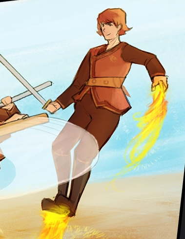
How are his boots not burning??????? (or do they just have holes in the bottom...)
Thank you! lol If I had a penny for every time someone compared Traveler to Zelda...
I think, and no offense to any of the comics I've already reviewed, I loved those too, but I think yours is my favorite so far. It's just got so much personality and I absolutely love the crazy design of the world these characters reside in. Especially when they get to Phobos, I just really really dig it.
At first the pacing was a bit... excruciating. I nearly resorted to just skimming and giving a review that way, but I decided to push a bit more and I'm glad I did! I think the main thing that swayed me over was your dialog. It's a very dialog heavy comic, which works in this case since the art isn't supposed to be the main spectacle. You build up these character's motivations so well in the first portion that their actions (and how their absolute laziness and carelessness landed them in that situation) fit their characters perfectly. Also the subversion of audience expectations in the most recent gag is just downright hilarious (the chocolate fingers vs cocaine bit).
The art style honestly isn't my cup of tea, but that didn't keep me from enjoying it. You're very creative with how you use your panels. This particular one was good:
He's just upside down because they're in space. Brilliant. Like I mentioned before as well, your backgrounds are so detailed and interesting and full of things to look at, it's great!
Things to improve... The pacing does drag at some portions, I think this is in fact due to the dialog heavy aspect. Sometimes the dialog is too heavy, if you get my meaning. Some scenes took longer than I think they should have, but the pace seems to be picking up the farther along we get, so you're improving!
I don't know your process of getting your hand drawn art onto the computer, but maybe do a digital pass to clean up any small errors. Most notably, I can see the edge of the paper on each page. Some simple cropping can fix this.
I don't really have much else to say other than people should check it out! 20 subs is way under what you deserve!
Here's the link, people! https://tapas.io/series/Carlas-Adventures2
Bonus round: Spend those extra minutes when you're typesetting to really make the text fit the word bubble. Sometimes the words aren't too even in the bubble, and I imagine this is even harder to do since you draw the bubble traditionally. Generally, as much space on all sides as possible is what you want to go for. Uneven text looks sloppy, and lots of people notice without even thinking about it. And you've got some whacky looking speech bubbles (which I love) so I bet it's even even harder!
Single gag comics aren't my forte so I probably won't go too deep with this review.
Story. I see you're building a simple story around all these separate gags, which is a good way to keep a reader coming back for more. It makes me wonder where you want to take this, if any more recurring characters will be revealed. Maybe a foil to Dr. Devilish that's not his minion?
Many of the jokes didn't land for me, especially some of the early ones. They were generally predictable and I think that's the main issue. I can see you following the format of trying to lead the audience to expect one outcome, but then subverting to some absurd outcome instead, but a lot of these jokes have been done before or simply don't have a satisfying punchline. The best joke for me was the one explaining the revamp of the art style, I thought that was quite clever! I think what you should try to focus on is elevating the absurdity of everything like you did for the art change gag. Dr. Devilish building and failing at a reality altering machine is much more interesting and funny punchline than him buying sharks and pirahna's from eBay.
For the art, I was actually kinda sad that you switched away from the more hand drawn aesthetic. The new digital look, while more streamlined and I'm sure easier to use (many panels and poses were simply copy pasted I noticed), lacks the heart and style of the first few updates. I think this is simply something all artists experience, and it's good that you're experimenting and finding what's right for you. I'm not saying change back to the original style, but consider what you want from your comic and what you want to give your readers. If the time saved utilizing the digital technique works better for you, than keep doing it!
Dems are my notes!
Bonus Round: Backgrounds! Use them again! You had them, but then you didn't! Also I want to see your characters go outside, maybe interact with and weird out the people in town.
Ah, the burning boots question.
That is Anthis, who is Novaborn, and therefore can control and create fire. Another part of being Novaborn is that they have a protective invisible shield around their bodies that protect them from fire, energy weapons, and allow them to be in space for short periods of time. So the shield is in between his boots and the flame.
Also, when your society uses a lot of fire, you make a lot of fire resistant things.
Hope that clears things up!

Wow, thank you! That's the most thought through review I've ever received, I'm so glad you enjoyed it! Since I have a lot of buffer, it may not show for some time, but I do take your very valid criticisms about pacing and dialog into account. Something that's easy to fix, however, is the edge of the paper being visible. I will get to this as soon as I stop procrastinating, thanks for pointing it out! The problem with the speech bubbles is that I write the text by hand in Swedish on the original page, because somehow I irrationally prefer to do it that way and then translate it in Photoshop. So the bubbles are made for dialog in another language.
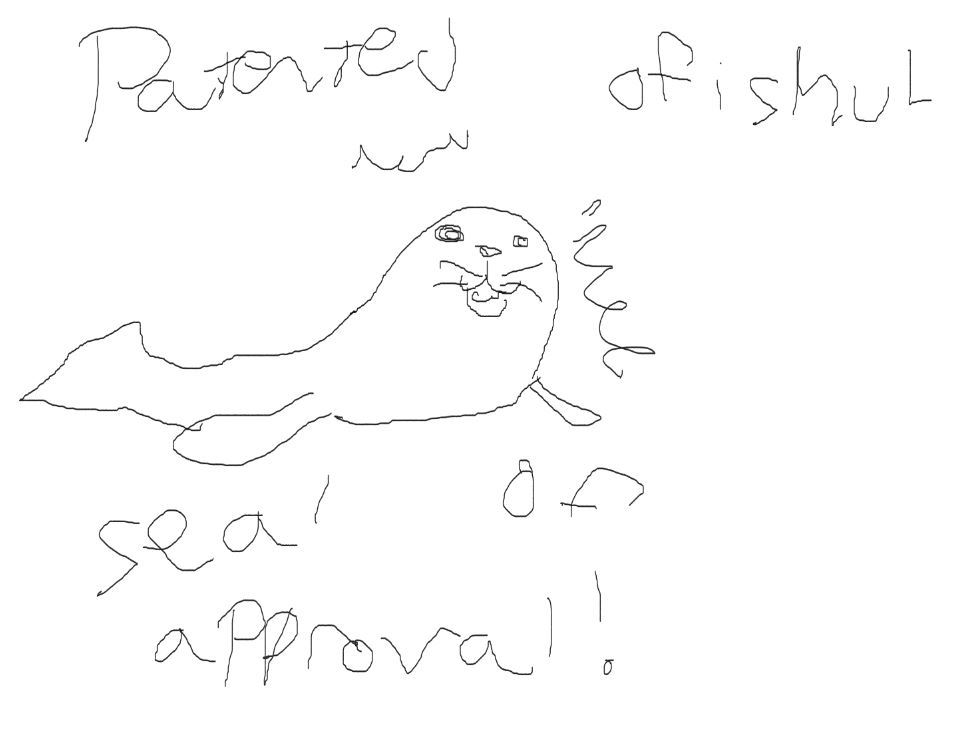
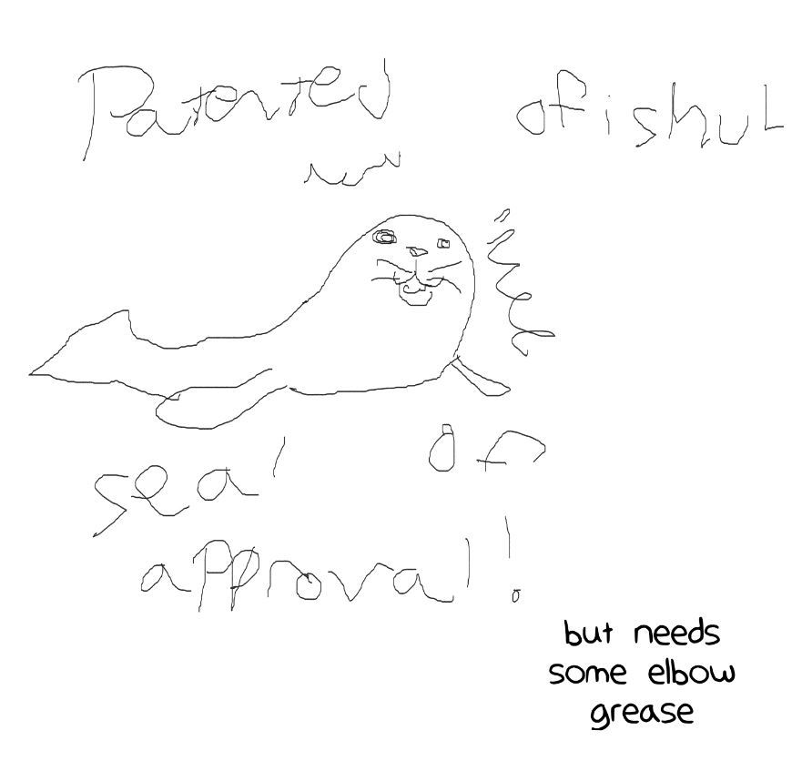
Also: "Seal of approval". Puntastic.
Thank you. I started the comics wanting to do it 90% old school with the new design, but alas time, desire to do more artsy things and orthopedic issue, had other plans. so I'm trying to circumvent it all, and buy one of wacom's screen tablets, for more tridigital work.
the first comic was like establishing the story, and the jokes were old style already done kind of jokes. when I started I had 30 stories written, I'm at comic 14 and 3 or 4 of them came to me while drawing other strips.
the backgrounds will be back as needed or inspiration hit me with an RPG.
It's going to be more zany and more other. people.
Thanks again.