Warm vs. Cool refers to the colours that things are, so that's not going to be an element of style, but of scene. Warm colours lean more towards the red side of the colour wheel, while Cool colours lean towards the blue side. A "warm" purple is going to have more red in it, and a "cool" purple is going to have more blue in it.
So, a warm and cozy scene might use more warm colours, while a spooky cave might use more cool colours. The same person's skintone might appear orange in the cozy scene, with the warm lighting, but seem more greyish and dull in the cave's cool lighting.
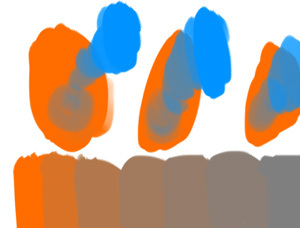
The specific samples you've linked -- despite the fact that it looks painted (it reminds me a lot of ti-ri's watercolour work, and I'm not sure but wouldn't be surprised if it's watercolours or gouache) I wouldn't call it "painterly," because that word usually describes works with less flat cell-style colour, and more visible brushstrokes (I'd say Pest Caravan is an example of a painterly style)
It's most visible in that first page you posted -- the girl's cloak is a single field of green, (with slight variations in colour that make it look like real media), and the shadow is similarly a single shape of a darker and more blue colour. I wouldn't quite say cell-shaded, but it's a lot closer to that style.
This varies! The girl's hair and cape are more saturated than her surroundings, for instance. Saturation is basically just..... on one end of the scale, the most saturated, you have The Most Hazard-Orange Orange You Can Make, and on the other end, the least saturated, you have a warm grey. Desaturate that hazard-orange a little and you have the colour of a natural red-head. Desaturate it more and you have kind of a brown colour. (If you want to play around with this on your own, in my colour theory class we desaturated a colour by mixing it with its opposite -- so 80% orange and 20% blue is gonna make a less saturated orange. When you have 50% Orange and 50% Blue, that's supposedly going to be a sort of grey colour, the most desaturated you can get.)
Blend modes aren't a colour theory thing --it's a tool in a colouring program that changes how colours that you put down interact with other colours -- it basically makes the computer mix the colours a certain way. Anything that's painted using blend modes, you could also paint without using blend modes, just by knowing what colours to choose, but blend modes can make it easier and faster to figure out.
So for example, "multiply" is a common blend mode in a lot of programs. If you have a bunch of flat colours, and you paint over them with a blue on a brush set to multiply, it will automatically turn that into a blue shadow -- a darker and slightly bluer green over the green areas; a darker and slightly bluer brown over the brown areas. You could also sit down and figure out those darker and slightly bluer colours yourself, and paint them in yourself -- and in some cases, that does give you a little more freedom -- the blend mode just makes it easier.
Honestly though, I think you might get some really useful information from just trying to replicate this colouring style and then looking for differences between your attempt and the real thing!


