Took a scheduled break for most of last week to get some personal stuffs done.
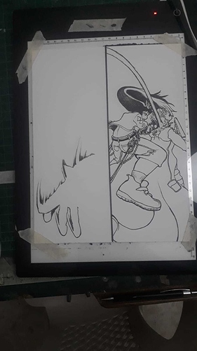
Last weekend we finished planning activities for Aug and spent some time re-examining our already released episodes. In each released episode, we've been testing different fonts, effects, drawing styles and various layouts to make converting scrolling format to social media posts easier. Now that we've got a hang on what works, time to standardize future eps and decide when to redraw/touch up old ones.
What seemed to be working
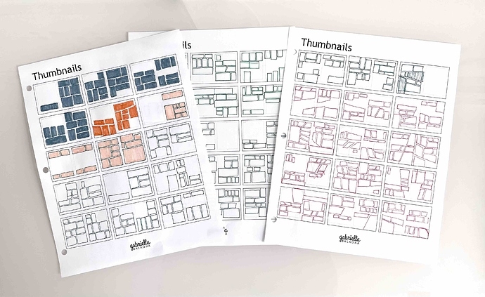
Limit blank spaces to 10 "pages" max first to match Instagram limit & layout (what works for Insta is reader-friendly for most other social media too without any further modification - except Twitter)
-> plan 1 "mini-hook" per page i.e. every 1-3 frames
-> add panels to each page like with scrolling format but ignore spacing between panels
-> adjust frame sizes & spacing after test reading in PC & mobile separately.
Episode thumbnail (for Tapas vs. social media) should be different & should be decided before inking. Else details may be lost during cropping later.
Repeated sounds like rain or footsteps are great SFXs for panel-to-panel transition, and should be planned with the images before inking.
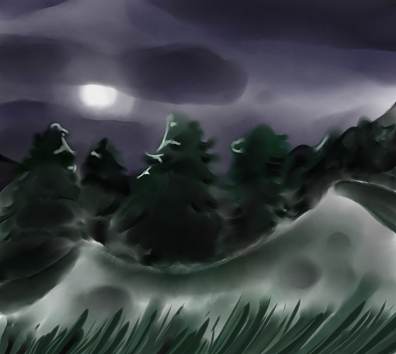
Add the full background to panels before inking, for now, since most things just take place in one room. And selectively reduce glares on glossy plastic surfaces from CAD renders.
EDIT: Sorry for the long post. Somehow the formatting for summary didn't work for me