33 / 56
Feb 2021

Yoooo Offbased you got a gal over here blushing haha! Though I'm so glad you enjoy what I post bc I just love being able to talk with other folks entrenched in the creative side of life and hearing about all the ways in which folks tackle subjects regarding creating is just :heart_03: for me!

I think it worked out fantastically! Your dragons in Night Riders have so much life in them due to how expressionate their body language is and them faceeeessss (gyahhh) and I feel like as whimsical of a choice that it was, it was definitely a complementing choice for your style and characters :purple_heart: I also think it says something for your skill as a character designer when you can have colors that are very similar in your cast yet still be able to distinguish each character apart from the other :D!

Looking forward to meeting them! I love their character portraits!! So much personality from those little pics!

High-Fives on the Gurney Jurney yo! The dude knows what he is talking about and I tell folks to check it out whenever they ask about colors.

Ok then! It's never to late to learn something new Miss and thank you for sharing links and tips to what's been helping you on your journey with colors!!

Yassss transitional colors! I love the inclusion of that tip over just color picking from your canvas to blend colors. I also super love that it's a makeup tip!! Goes to show how there is inspiration and things we can learn from all around us :purple_heart:

That's what's up! Color is really a whole nother world with all the nuances and complexities it can add. Not to say that grayscale and black and white don't have these complexities bc they do, but not having to worry about hue and focus on contrast and value narrows the focus a bit, or so I like to think, but not everyone has the same thoughts on that so neat hearing that color is more natural to you!

Oh I'm loving the individual goals you have set for your color evolution journey too! I think that's super helpful for making process that's easy to see and keeps goals obtainable.

Yooooo I feel you there. I love seeing how artist are able to use layer modes to impact the feel of a page, but it doesn't work the same for all styles for sure. That's something I want to play with more, but haven't had much luck so far, but there are tons of more things to consider that i can play with and see how it looks when it comes to that though. Yeah, if somethings confusing, start from the basics, that's pretty good advice to follow.

I see exactly what you mean for your character designs at the bottom. They all look like they come from the same world! Though they all have different colors, they have that unifying coolness about them that brings them together in a line up (also baller shoe designs) so your color exercises are definitely showing through! :purple_heart: (defiantly and definitely are just two of my many English grammar banes).

Thanks for sharing!!

You have a fantastic grip on working with a limited color palette that works for you and not against you! I love how in synch and well planned out your work looks from sticking to a limited palette where all the colors compliment each other. You ain't lying about how too many colors can overwhelm and cause one to take way more time than they have to complete a comic lol.

I love the control you exercise in your colors and yet it doesn't limit any of the emotion or atmospheric shifts in your work. Yeah painterly comics are gorgeous to behold. I freaking love Fiona Staples approach to digital painting when making the art for the Saga comic, but Yowza is that a level of color and form mastery something to marvel at. Painting and blending without making mud is that looming fear DX!

Thanks for sharing examples of your work and jus how much can be achieved through limiting your color choices :purple_heart:

That’s what’s up!! I know about that trouble with Grayscale. Like the most limited color palette there is and yet the shifts in contrast and values can totally make or break work done in black white and gray D:. I do love how in your comic Netvor, color is used to convey something important happening or a shift from the normal that’s done in grayscale. Clever A-F!

Yasssss I’m all about that!! Tools that make doing comics easier on us and fits with our styles is my jam!! I drag and drop my colors in Procreate by setting my line layer to reference and making sure I don’t have gaps in the line work. That lets me lay down flat colors pretty easy. I then use a brush to do my bubbly highlights and shadows. For any spots that were missed by the color fill I make a layer under the base and fill it in :D!

Ty for your insights Roses!!
:purple_heart:

The base colors all the remain the same and the colors I change are the ones in the multiply (shading) and Overlay (lighting) layers. Changing and constantly color picking base colors is time consuming and I only do it when I'm not getting the desired effect from the below technique and even when I do I just adjust the colors in the different color adjustment settings.

I had the process for this panel already saved to show a friend so I just added some notes to it, (hope you understand my handwriting lmao) but yeah my process is super simple mainly because I just can't spend that much time rendering, i love working more painterly too but it's not realistic for my comic.


Many of my comic episodes a scene based, so like every scene is an episode and I try to keep the color palette consistent throughout the scene and having the multiply + Overlay colors consistent really helps with that.

I made this ages ago but I think it's a good example of how different Mutiply/Overlay combos look (the base colors is the same in all of them):

It's just really simple and versatile, I often find myself being bored if the scene I'm drawing is in a well-lit room, like no dramatic shadows lol.

Thank you so much! Great suggestions! I can picture very well how adding more darkness in the corner in the fireplace panel could make everything more unified. It would also be good both for realism and composition of the panel itself.

This is such a nice thing to hear :slight_smile:
Thank you!

Ahhhh :heart_01: Ty for breaking it down into steps! I can read your writing just fine, I've seen far worse (mine lol).

Totally makes sense where you're coming from with the scene lighting too!

Gorgeous work and lovely examples. I really love the dramatic shift a shadow/light source can make,

I love talking about color and seeing what others do! I personally lean towards red color palettes myself because my story is dark and industrial. Red just feels correct.


...But I also really love color palettes that lean towards intense, deep blue feat. the sky or ocean!


...So yeah, I pick colors based on the mood of the scene! Simple but effective in my own art.

That cityscape painting is such mood. It's industrial, fast-paced, and you just know there is something going on that just ain't right. You can feel it in your bones. They are beautiful paintings and the contrast between the red and blue combined with the subject matter is such a shift in feeling and so dang neat.

Thank you for sharing!!
:purple_heart:

I love vibrant colors! That's why I usually pick mostly saturated hues for both coloring and shading. When it comes to shading I tend to use cyan at full saturation cause it leads to quite beautiful contrasts, specially when the characters have a warmer palette overall.


If cyan doesn't work too well with the piece I resort to either magenta or yellow, always lowering the opacity if it's the first.

Then I always take a lighter color and add highlights with a pencil like brush and the add layer mode. It really makes the details pop :yellow_heart:

Yasss I love the vibrancy in your color selections and the overlay of cool shadows or warm tones that have a hue to them depending on the colors present in each composition!

Totally feeling that method for highlighting details. Really brings depth to that cute sweater! I'm totally digging your character designs too. Lovely work :purple_heart:

Colors come to me really easily. I would say that it's one of my biggest strengths, as it is something I can talk about for hours. When it comes to color, I always pick colors that show the mood or personality of my characters. For example, my story is about two brothers with different personalities. The brothers are always in a row with each other as one is more depressive (Jung) and the other is Panglossian (Jong-ho). Because of this, they are unable to understand one another and respond appropriately to each other's feelings.


So, I used contrasting colors to illustrate the relationship between the brothers, with blue representing dulled emotions and the red showing Jong-ho's stress and exhaustion since he doesn't know how to help his brother.

In another scene, I also experimented with color to show the unpleasantness of the apartment flat the brothers are living in. The apartments are very small with everything being in one room, and only one bedroom, and the apartment complex is called "Anarchy Apartments".


For this panel I got inspiration from Vincent Van Gogh's "The Night Cafe" with the pool table being slime green, and the walls being blood red. The owner also looks pissed. My panel (above) has sharp walls that slice at you, crazy wallpaper, with a lava floor, and poison green walls. There is also a bit of a brown stain on the walls. I wanted to create the feeling that you're not welcome here and also chose colors to compliment the room with the yellow doors, and dark blue table.

I always get inspiration from other artists, especially Rembrandt and his color palette.


This panel got more experimental with the symbolism (the snake showing the fragility in the relationship) and the bears (family, courage, and strength). I chose Rembrandt's muddy color palette to show darkness as there isn't a lot of light in the room, and everything is still dark. There is also a coldness in the atmosphere, with Jong-ho looking at his phone and not talking to Jung during breakfast.

If you are struggling with color, I highly recommend these books. They have helped me a lot in color:


Enjoy!

Yo Dog (heh)!

I love how deeply ingrained color theory is embedded into your work and the use of color science to further depict mood, theme, and personality traits. That's really cool and defo shows a deep understanding of how color can work for you as an artist. The colors in that apartment just give such a sense of dullness that makes things feel destitute too, so nice job on toning the vibrancy down to achieve that feeling of melancholy :purple_heart:

Van Gogh is such a fantastic point of reference for making surreal scenes, but also ones that give a feeling of unrest and even unwell like in particular with "The Night Cafe" as the colors aren't welcoming and even feel a bit sickly. The inclusion of classical artists in inspiration for modern artist is something I always encourage and am a huge fan of!!

How renaissance of you to depict the art of absolute truths in your modern settings in a way that totally nods to art history.

Thank you for sharing your process and for including the links!!

I guess the only way to describe my coloring is “experimental”. I like to try with both vivid and monochrome colors, but I also dabble a bit with just black and white. Overall, I’d say I use different colors for different highlights and shadings. My overall goal is to make my art look less muddled.

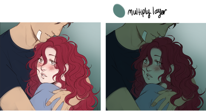
Initially, I would shade with purple and set it to multiply:

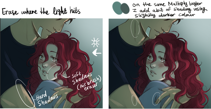
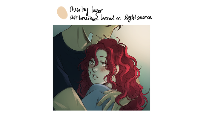
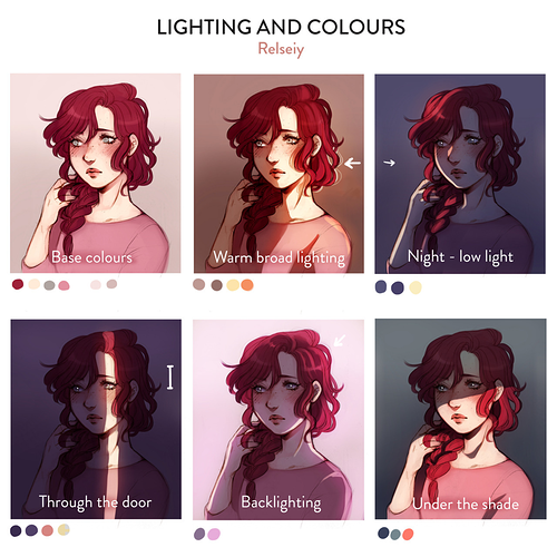
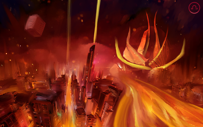
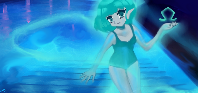
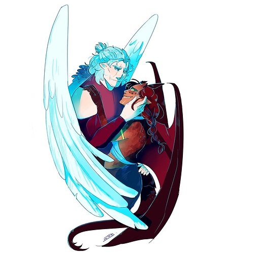
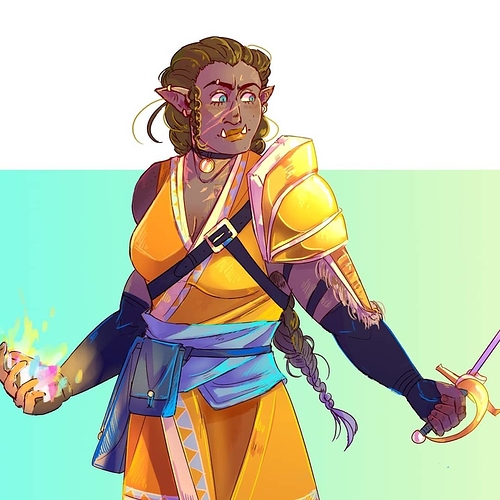
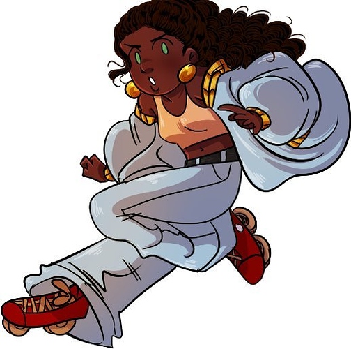
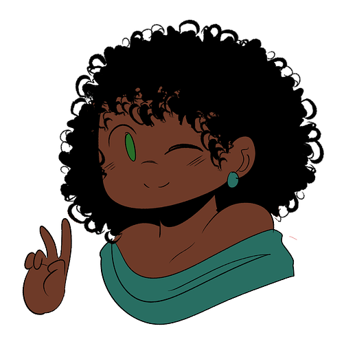
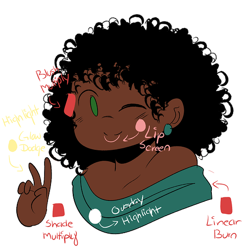
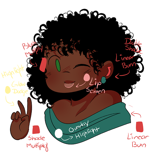
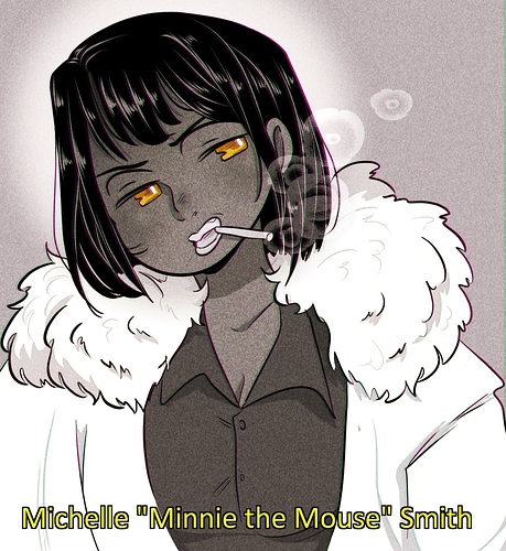
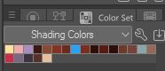
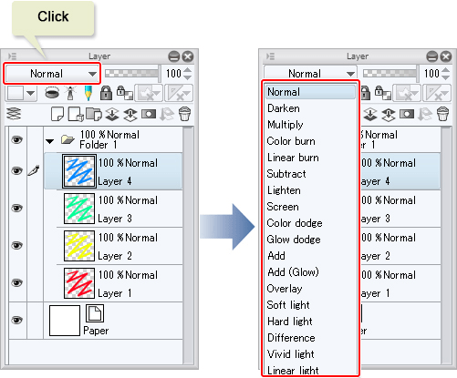
But after experimenting a bit more, especially with darker skin tones, I found that hot red/hot pink worked better for shading. It really gives more life to my characters, like blood is running through them. For a highlight, I use a soft yellow/gold and set it to gold dodge. Since I use Clip Studio, I’ve gotten to experimenting a lot with the different modes to bring out the best results. Here’s a breakdown of how I use vivid colors. Overall, I’d say I use five different modes to shade and highlight my art. I want everything to stand out and look soft in a way.


For organizing, I keep a color set with my shading colors. I also reference back to the modes whenever I need some help experimenting. Even more, I might reference the hue changer and color correction in Clip Studio to help with saturation and contrast.


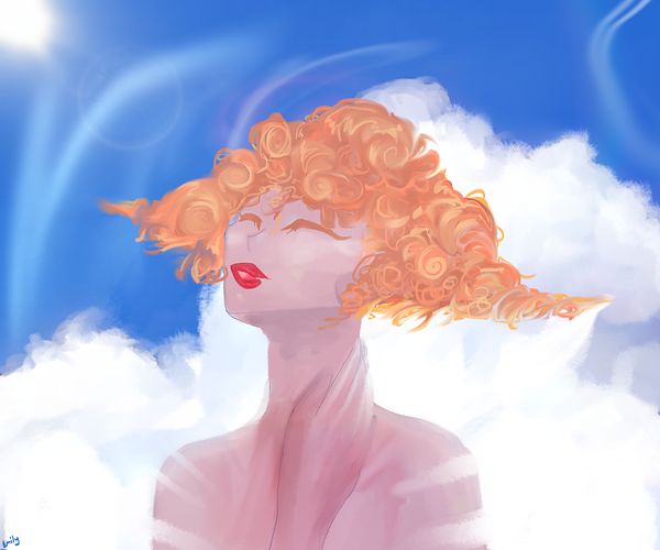
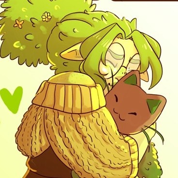
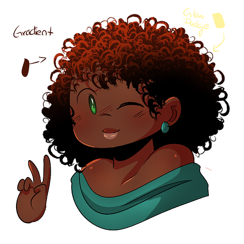
That’s mostly just for vivid colors. For my monochrome colors, I have a certain aesthetic I like to go for. When I think of monochrome, I think Film Noir. So I mostly have a golden tinge with my monochrome, as well as some Chromatic Aberration effects. I also add a light tv filter for that extra bonus.


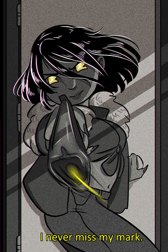
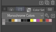
Again, I keep a color set for the flats. I mostly shade with a light gray on multiply or linear burn for these.

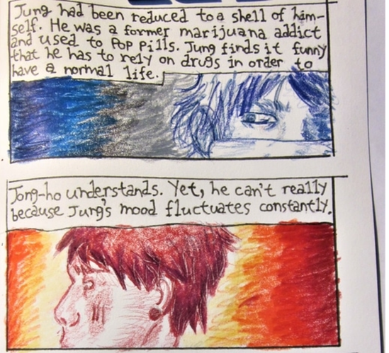
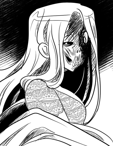
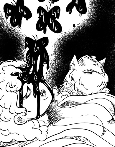
And then there’s just my black and white drawings, which dive more into hatch shading, maybe a bit of grey for color, and some patterned brushes for extra details. I did a lot of experimenting with this color method, mostly in order to understand lighting and depth without colors. A lot of my work was for my shorter Webtoons, and it helped me really understand the tone I wanted to make.

I’d say for this, I used a few of the Clip Studio pattern brushes for details, as well as downloaded brushes to do extra detailed hatch shading (though I mostly did my own).

In the end, I’d say all three of these methods overlapped with each other. I was able to take what I learned from all of them and apply them to other pieces. It’s really fun to look at my color style because it just changes so much over time XD

@Jenny-Toons
Your coloring style is actually one of the reasons I began to use Multiply layers for shading in my illustrations. :grinning: I tend to use magenta though. Before that I always just did darker or lighter shades of the colors

I think there was a thread about coloring a year back, (maybe longer?) where you mentioned some of these tips before. I decided to try it out after that.

Ah shucks, thank you!

I think I remember doing a post on that! Figured it out through experimenting, and I've never looked back. Still do some shading with purple but mostly with clothes and mood lightning.

No problem. The forums have so many great artists here, I'd be a fool not to learn what I can from my peers. XD

I only use purple if magenta doesn't jive with my eyes.