20 / 56
Feb 2021

Hey Y'all, I'm Lady T. and I make the New Adult Fantasy Comic MagicalMashup!

One of the core elements I decided before starting the comic is that it would be in color. I choose to go this route because, well for one, I LOVE color, but also because it would be a way for me to get in the habit of thinking about color and studying how using color can impact a scene.

Coloring a comic that I work on by myself is defiantly a whole extra thing, but I enjoy it and love to see my blackish (I don't use black in the art for the comic as it's a very stark and powerful color that commands too much attention in my bright magical world lol) lineart come to life!


When I first started drawing the comic I had a time trying to decide on the character and world color pallets. Due to how expansive fantasy worlds can get I quickly realized I'd need a way to organize my color choices. That is once I figured out what colors I'd be using that is...

Color is such a mindblowing thing that is as complex and vast a subject as it is beautiful. Up until I decided to make the comic, I had no need to keep track of color palettes, even for reoccurring characters. I could just fudge it and guess close enough and be good. That wouldn't fly with a whole comic though. I started crafting my colors with the characters in mind first and thinking that the colors for each character should tell a little about their personalities.

Junah is an overall optimistic person that is very open and excitable, maybe too much so, but it is what it is haha, so I choose upbeat colors for her.


Kaelen on the other hand is more of a grounded person with a more reserved personality and so I choose colors that are more mature.

I had a lot of fun picking their colors, but then I had to think about shading and highlights... that's when things got really interesting.

When it comes to shading I used to just color pick the base skin tone and just use the color slider in ClipStudio to go down (add black) for shade and up (and white) for highlight.


(Original page from my practice comic MagicalBeginnings! ).

This works aight', but I found that it felt flat in my newly designed colorful world. I was thinking of ways to improve on this when I found a Twitter thread2 started by a comic colorist names Marissa Louise talking about resources for learning about color for artists.

Now I thought I was color literate before, but wow did my eyes get opened to the possibilities I hadn't thought of when it comes to color. I checked out all of the books and resources from the list I could and watched the videos recommended. Afterward, I revised my character sheets and started to look at where my colors were placed on the color wheel using this online Color Wheel1. Being able to easily see the different color harmony rules affecting my color choices live was (is) so helpful for deciding what can work with your base color selections.

Once I got my colors selected and was happy, I had to figure out a way to make them easily accessible as I'd be using them often. At first, I just made color dots on each character sheet from print screens of my color pics that I could reference, but copy-pasting them onto each page to color pick form was annoying (even if it looks cool).

I then found out about saving color swatches into palettes in ClipStudio and BOOM!! Game changed.

(ClipStudio palette, admittedly not as organized as I wanted).

I would have stuck with ClipStudio if I hadn't started using an iPad to give myself more time to work on the comic when not at home, but switching to Procreate offered the same options for being able to color swatch and the color picker tools were a bit more intuitive for me since I knew how I wanted to approach color for my comic.

The main difference I found was that CipStudio offers more spaces in their swatch palette for more colors than Procreate, but honestly, I've found simplifying what I have to be the better option for me. Keeps things manageable and I'm able to work faster this way.

You still get a good bit of options and you can also make a secondary palette to the main one in Procreate, so if you must have more you still can.

Anywho I'm curious about how y'all do your color crafting. Do you use color in your work or stick to monochrome? Fall somewhere in between? What made you decide to go this route? How do you keep track of all of your colors or values that are used repeatedly in your work? I'd love to hear your thoughts/process!

TLDR: There's a lot that goes into the decision to work in color. I talk about my process from starting with flat color to learning how to incorporate harmonies in my palettes thanks to a few resources and how I use said colors as references in my work. I'm curious to know y'all's thoughts on the subject.

  • created

    Feb '21
  • last reply

    Feb '21
  • 55

    replies

  • 3.8k

    views

  • 21

    users

  • 155

    likes

  • 10

    links

Frequent Posters

There are 55 replies with an estimated read time of 20 minutes.

I don't know how my brain really works with picking colors. I just choose two and the rest of the palette just fills itself. :sweat_smile:

I decided to do my comics in color, because I don't think monochromatic stuff is my strong point. Also my ways of coloring are fast enough to keep up the regular uploading schedule. I also keep color palettes in separate files for every character, so colors stay consistent.

What I stay away from is shading with just darker shade of color. I need to make it cooler first. Used to shade everything with purple, but that doesn't really work with any color, right? :sweat_smile:

Also I'm insane and do most of my color work on one layer. xD


Haha that’s what’s up though! It’s an intuitive approach that totally works for you!!

Yasss working with cool and warm over light and dark was my first big color revelation. Like it makes so much sense and can make such a dynamic change in how your work comes out!

Talk about daring!!! Coloring on one layer, ohhhhh that’s bold! But like that’s pretty neat and something I aspire to. Since moving to the iPad my number of layers has had to be managed more efficiently as opposed to working on desktop where I can make layers that go on forever. At first the limit made me so nervous, but now. Shootttt I love it, less layers is less organizing and less time spent sifting through turning layers on and off to find which one I’m working on :V. It also keeps my file sizes down without affecting quality and makes me think about pages as a whole instead of a part.

I’m not there for my comic, but I’ve definitely cut back on access layers.

I really like how the colors mingle on your page and that’s definitely a plus to coloring on one layer. Easier to achieve nuance abs blending between colors.

Ty for sharing!

That is a lot, so I myself am not a comic artist but I am slowly working my way on that since I am more of a beginner in this digital world which leads to experimenting

I tend to do a lot of touching certain buttons without having any knowledge on the drawing sites or the tools they have provided on it that could either mess up the drawing in all or makes me go "well ok"


As of right now I am currently what you've done in the past, shading the drawings with their skin tone, black, and white for the highlight

(a drawing I've been working on, sorry for the messiness :cry_01: )


This whole drawing was me really experimenting the shortage of tools they have provided on a site
(A really old drawing)


I did actually use an app which is called Ibis paint I thought though it had a massive amount of tools it was easy to color because of how smooth it was.

Hahaha I know, I'm really extra when talking about topics I love :sweat_02:! Experimenting is a crucial step in the process and that's fantastic that you're taking the time to try new things and work on your building blocks gal! Gotta start trying something somewhere first before you know where you wanna go :D!

The painterly approach you have going on for Sis's thigh is looking pretty interesting. I see you've mixed a few colors on her leg and it adds visual interest! Based on the stroke direction, it adds some form as well to the roundness of her leg. Keep on creating!!

Yo that's fine ,embrace what you love!.

Yep, its gonna be a long ride for me to figure out what I like :kissing_closed_eyes:


Why thank you very much, I have been very much experimenting with this drawing a whole lot since its been taking me quite some time to finish it because of the approach I've chosen, but it is what it is :slight_smile:
:smirk:

Interesting question.

I never thought of not using colours, probably because I very rarely read comics that were not in colour. I was not a huge comic reader until recently.
My main inspirations are all coloured, sometimes brightly (eg. nature, classical paintings, old children books), so naturally I went for colours.

I'm choosing my colours very intuitively generally (whatever looks good to me), but I can also get inspiration from existing art; I'm particularly obsessed by fabric, so that's a huge inspiration for colour palettes.

The drawback to that very natural, not very thought way to choose colours is that I'm not always great in term of legibility, so that is something I try to think of more nowadays.

Also, I like using very different colours for different scenes, depending on the atmosphere, and I'm not yet really sure whether it is good or a bit too much (and makes my comic too heterogenous and not 'decided' enough).
(for eg. here 4 pages that have very different palettes, including two that are in the same location with pretty much same light, but I felt the atmosphere was different so I went for different colours and again, I'm not sure about that yet...


Really love your MC's colors @Lady_T_Musings! :heart:

Before 2016 I never drew in color and only read black and white manga, so I started really cautiously in some muddy area, trying brighter and brighter colors and I am still trying to not be shy...:sweat_smile: It's a long process, I don't know how to choose colours and I don't feel like I am good in it, as if I don't have a natural feel of it.
All and all I really do like vivid colours. I started comic about children in summer camp, so even if it's a horror, I really wanted it to be in those vivid summer colors, in the day and in the night. The kids, of course, should wear something bright too. I suppose it was one of the first steps to the bolder colour palette.

I also have a fun habit of making characters "color coded for your convenience" :smiley:


In the end what I really want is to my comics to look like some real quality anime. Look at me go :joy:


I've always drawn in colour, and I've learned to use colour in its many meanings. As emotion is so important to my novel, I use it for both the magical, whimsical stuff, but also my horror elements. I love disguising my most garish creations in fluffy, happy colours, disguising them as innocent beings that in truth soak the world in suffering.

The holy rule for my novel's characters? The more colourful, the harder the tragedy. Pastels are a worse red flag than my vibrant colours, those arts mean business. XD You see rainbow? Complex, painful storyline.

I use color in my work because I love the variety and want to experiment some combinations. I have done 2-3 monochrome pieces, but I largely do the variety. I do keep in mind the 12 principles and 6 elements of design. I just keep track of the color and/or values tbh, sometimes I look back to previous stuff for color references, but other than that I just remember it from memorization.


They help set the mood and, when it comes to beings, show characteristics.

I loooove colors and coloring is probably my fav part of making my comic, especially when it comes to adding lighting and shadows. My personal illustrations are shaded in more details compared to my comic, for my comic I take a much more simplified approach to coloring which i still find interesting and fun to work with.

For my comic, the base colors usually remain consistent it's often the shadow and lighting that changes, choice of colors can add so much to the emotion you're trying to convey in the scene and it's sometimes one of the main things I think about when I decide on a location for the scene I'm writing, like will the lighting be interesting? how will it add to the scene?

@Lady_T_Musings I think your colors work really well together on the page, I can tell you put a lot of thought into them.

@Kelheor Dude those are gorgeous :open_mouth: What lovely technique!

I use color in my work too, but I'm pretty badly colorblind, so I developed my own pipeline for painting to keep everything consistent and avoid any nasty mistakes. I have a pretty intense layer stack for every painting. I'll show you most of it, but it's kind of embarrassing how long it is.

Here's a lazy breakdown of one of my covers. I usually design characters based on either split complimentary or analogous colors, likely based on vibrant colors I can't change about their design. In this case, Nira's hair and skin. Purples and pinks go well with reds, and the green supplies a focus of cool color. For the rest of the colors on the cover, I try to use vibrant colors to control what part of the painting the viewer should focus on. I also use color grading in my post stack to reduce the amount of clashing, and give the scene a consistent tone. Keeping color grading consistent within the same scene, then changing it when moving to another location is a really easy and helpful tool when laying out pages. I'll usually pull in another color into the shadows even though it's not technically correct, just cause I like the way it looks. Often it's a blue, but a color complimentary to the light source is a nice way to add some flavor sometimes. I paint using albedo flats and light layers, so I can tightly control each light source, and build up some pretty complex looking scenes. It's flexible too, I can cut out a lot of this to simplify it for panels. If you're looking for a convenient color scheme designer, you can't go wrong with Paletton: https://paletton.com/#uid=1000u0kllllaFw0g0qFqFg0w0aF

Breakdown:

Final cover:

That's what's up! I'm loving that you have inspiration from outside of comics that you apply to your comics too! The world around us is full of references and inspiration for fellow creators!

Ahh yes, I feel you there. The intuitive vs methodical approach to coloring, both have there pros and cons, but I definitely get what you mean when talking bot legibility :sweat_01:

I'm trying to be more conscious about the colors I use when the time of day is different or it's an indoor/outdoor scene bc it defiantly does something for a scene but, but making it feel natural is definitely a big part of the puzzle. An old tip I remember hearing was using a color overlay on top of your base colors to bring unity and still show change. I have to play around with that some more as of right now I just colorful all these scenes by hand, but that would be a nice shortcut.

my 2 cents if you want them. For this scene you are talking about, I get what you are portraying with one scene being outdoors while the other is indoors next to a fire, but as they are both at night and on the same page, maybe tying a bit of the darkness into the bottom part would help make them look a bit more unified on the page. Like with the sleeping character, the side facing the window can be a bit darker than the one facing the fire. With the night scene, maybe the slightest hint of light that illuminates the outlines of the figures in darkness might make them be a bit more distinguished against the darkness. The second third and fourth pages look good to me lighting-wise, just adding more contrast between your words and text bubbles vs the scene would deffo make them easier to read. I think you're doing some great stuff with atmospheric lighting for sure!

Your world looks so lived in, I love that!!

Lots of really good coloring advice?? I'm not much of a colorist myself, but I'm really trying to get into it ( or make my coloring not look atrocious smh ). I try to find pictures online that communicate the color scheme/mood and color pick from those pictures because I'm definitely not good enough to grab colors myself.

I do wanna say that your character designs are gorgeous, tbh

First... I love when you post topics, Musings. I can tell you have so much enthusiasm for everything you bring up and when you reply to folks

Second... like many things, I decided my comic would be in color on a whim. I had made no more than four fully colored pages before then—only in black and white or monochrome. Clearly a great decision. XD
I’m over 100 finished pages deep now so I guess it worked out fine. I didn’t know much about color when I started. I think that’s partly to blame as to why my characters have such simple palettes. It usually went:
1) one main color,
2) one lighter (complementary or analogous) color for the underbelly,
3) one color for the horns or fins
4) eye color,
and universal colors for everyone’s eye whites, teeth, and tongues.


I finally introduced a character that I’ve designed more recently who is a tad more complex than this. Even that is almost only because of his outfit. I have many more waiting in the wings that I think are more interesting to look at.

I keep track of their natural palettes by referring to their portraits. That way, I can just fill them in on every page and use clipped blending modes to make them fit into whatever environment they’re in.

I started to finally get color after reading Color and Light by James Gurney. It’s more focused on traditional painting techniques, but what he brings up is still incredibly useful for any artist. The PDF is out there if you can’t buy it. Read it.
I’m still not that knowledgeable about it, but I have a slightly-greater-than-passable understanding now lol

I started thinking about how to see and pick colours just this year - for work, I draw only in monochrome, so it was something I really put off understanding :stuck_out_tongue_closed_eyes:

This blog post3 by liongirlkiara was sooo helpful to me! She makes her own analysis, and also links to lots of other artists who've talked about colours, which I really like~

Here are some images she used! but not all of them, so please check her post out!

I've always done comics in color ever since I transitioned to digital art— due to the way I work, it's actually easier than black & white. And besides, I just have way too much fun playing with colors. ^^ It's therapeutic, almost. I can't imagine taking on a long-term project without any color...

I've been learning and studying lots about color over the past few years; it's been my main area of improvement.
My current pet project is learning to create "atmosphere"...making a scene feel green or blue or whatever, but not just by making the scene monochromatic.

It's really hard...I know most digital artists would just use blend mode layers, but they usually don't work out well for me...and even when they do, if they don't turn out 100% right I never know how to tweak them to perfection. So I figure I'll just do the best thing for myself and learn the technique from scratch.

I do most of my color-picking experiments in my comics:

I think my most successful recent experiment, however, was with a group of character designs:

When I looked back at it the next day, for a second I thought something was wrong with my screen; all the colors were so consistently cool-tinted. Even now, the illusion persists a little...I think that's a good sign. :9
I can't wait until I finally get this, and can freely move on to the next color challenge. 'Cause there's always another one...colors, man...

I use limited color palates, always. Otherwise, you're going to have so many colors it gets overwhelming, and when doing comics, having too many choices leads to just stalling out because there's too many choices to make. So I had one short story comic where all the colors were based on this:

With that small red being the highlight, and with it I could make it all cohesive and nice.

And then when I've done page comics before that were painterly, I still keep it fairly tidy--not too many colors so that way the colors that are there seem vibrant and they have less of a chance of going muddy or confusing. That was one of the more difficult parts of doing a painterly comic, PS, managing the color without it all blending in a mush since you're lineless and so free.

like this is an unfinished page but the rest are still sleeping in their PSD documents and like I don't feel like opening photoshop but this example at least gets across how I designed color, although the shapes are still fuzzy on the edges.

Really it was just aqua and purple. A little bit of red for accent. You just don't need that many colors most of the time.

TYTY Kel :purple_heart:

Color is wild to think about. It fluctuates so much and even can look different depending on who or what is standing next to it or wearing it @.@. So much to consider when working in color and the wrong vs the right color combo for what you are working on can make such a drastic change in the atmosphere and feel of a pic, it's mind boggling for sure.

Yoooooo these examples of your coloring style for your work are bombastic though! So like I con totally see what you are talking about when wanting to keep the feel of summertime and youth, but there is that overlay of something eerie creeping in on each picture (well the middle one at the top is straight up scary town, but yeah hahah). Sure the elements of bones and mysterious fog add to this feeling, bit the way you played with the shadows and highlights without making glaring light spots really drives the point home that there be some scariness afoot. I also really like how the characters are looking right at and through you. Your color choices are doing a lovely job at making the characters feel grounded in something real while highlighting the surreal of what's going on around them shivers

Yooo I'm a fan of color coded characters, easier to cosplay and easier to keep track of colors that you know work for said characters. Less guess work is more artwork being made!

Looks quality A-F to mee. Look at them doe-eyes being mood set by the time of day :purple_heart:

The way you incorporate color alongside your beautifully dark-skinned characters is always such a magical sight to behind. The way you color is either perfectly crafted to your writing and world building in Jade Kingdoms1 or vice versa. Either way, it's just so magical to see how you have such a fine understanding of jewel tones and color highlights that work together and make your characters looks so elegant and otherworldly.

I love your take on switching up what's expected from a vibrantly colored world by mixing in the horrors that lurk with the same colors as the protagonist. It's totally surprising to see, but a neat take to the world you have crafted and makes you have to look beyond the surface to see what dubiousness lies beneath the bright lights.

That's what's up! Experimenting with color is a fantastic way to bring variety into your work. You go with being able to memorize your colors bc I need my palettes saved for reference haha.

Thanks for sharing!
:purple_heart:

Honey I'm blushing over here, thank you so much for seeing what I try to convey into this strange, yet magical world full of my wacky ideas. :green_heart:

That's what's up! It is pretty fun once all the linework stuff is done (and my colors are selected haha). Finding a style that works for comics that you can be happy with quality wise and the time investment it will take to complete a page in said style is a journey in itself for sure. I love to work more painterly, but it's just not time conscious for me when trying to complete pages :sweat_01:. The style I settled on has grown on me a lot though and I enjoy making the trippy color spots that cloak my characters :).

Your lighting looks fantastic in the examples of your work you have shown and I love how varied your light sources are too! Ok then, that's what's up! Instead of trying to change each color individually, you work with the lighting and shading source colors. Do you do this through overlays or airbrushing? I'm curious. I've been playing around with different ways of setting the mood that doesn't require so much individual color picking haha :purple_heart:

I love your approach to think about lighting so early in the planning phase too! It's such mood seter, and I can feel so many types of emotions radiating from your examples based on the lighting and what you chose to highlight in the scene. Lovely job!!

I doooooooo haha and I'm defiantly still evolving for sure :purple_heart: tyty!

Yooooo It's fantastic that you have found a system that works with your colorblindness, extra layers, and all lol! It works fantastically in your work so I'd say totally worth it. I love the use of color gradients to add consistency through a page and for setting the tone. It's such a simple thing, but it just really adds an element of atmosphere and mood that totally aids in setting the stage. I really need to play around with it more for moody scenes at least. I love how you really work color theory as a design element to make your work stand out too. Artistic License is a thing and I'm a fan of using it when it makes a scene look cooler. Be darned technically correct haha!!

Thank you for sharing about your process in-depth, It's been pretty dang insightful and just plain neat!

So excellent! I do both (although grayscale is actually way harder for some reason???) and your colouring is so gorgeous and vibrant. I’m not sure if you colour by paint brush or fill in the blank spaces with a paint can sort of tool, but something that’s drastically cut down on my colouring time is Krita’s smart paint bucket tool. Even though I don’t draw with fill bold lines, it always manages to fill in the drawing the way I intended. I definitely recommend it to anyone who spends more than an hour filling in colour blocks ^^

I think that's a pretty intuitive way to learn about color theory and what works with that. Drawing from nature is a fantastic resource for sure and if you are looking for any other resources on color and light, the twitter post I listed is fantastic, but in particular I would check out James Gurney's book Color and Light. It's a fantastic resources that works on many levels for folks working in color (he also makes blog where many chapters in the book are listed for free in the arhives) weather digitally or traditionally.

Ty for the :purple_heart: Marnsoa. Means a ton to m e :D!!

Yoooo Offbased you got a gal over here blushing haha! Though I'm so glad you enjoy what I post bc I just love being able to talk with other folks entrenched in the creative side of life and hearing about all the ways in which folks tackle subjects regarding creating is just :heart_03: for me!

I think it worked out fantastically! Your dragons in Night Riders have so much life in them due to how expressionate their body language is and them faceeeessss (gyahhh) and I feel like as whimsical of a choice that it was, it was definitely a complementing choice for your style and characters :purple_heart: I also think it says something for your skill as a character designer when you can have colors that are very similar in your cast yet still be able to distinguish each character apart from the other :D!

Looking forward to meeting them! I love their character portraits!! So much personality from those little pics!

High-Fives on the Gurney Jurney yo! The dude knows what he is talking about and I tell folks to check it out whenever they ask about colors.

Ok then! It's never to late to learn something new Miss and thank you for sharing links and tips to what's been helping you on your journey with colors!!

Yassss transitional colors! I love the inclusion of that tip over just color picking from your canvas to blend colors. I also super love that it's a makeup tip!! Goes to show how there is inspiration and things we can learn from all around us :purple_heart:

That's what's up! Color is really a whole nother world with all the nuances and complexities it can add. Not to say that grayscale and black and white don't have these complexities bc they do, but not having to worry about hue and focus on contrast and value narrows the focus a bit, or so I like to think, but not everyone has the same thoughts on that so neat hearing that color is more natural to you!

Oh I'm loving the individual goals you have set for your color evolution journey too! I think that's super helpful for making process that's easy to see and keeps goals obtainable.

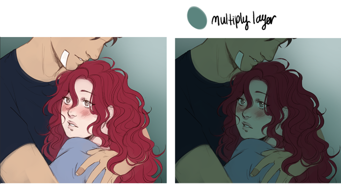
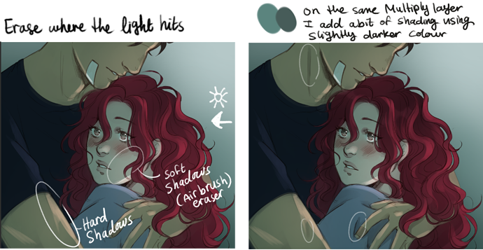
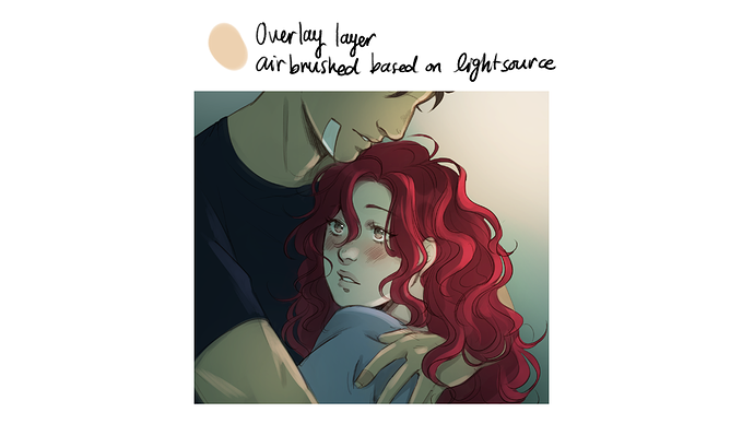
Yooooo I feel you there. I love seeing how artist are able to use layer modes to impact the feel of a page, but it doesn't work the same for all styles for sure. That's something I want to play with more, but haven't had much luck so far, but there are tons of more things to consider that i can play with and see how it looks when it comes to that though. Yeah, if somethings confusing, start from the basics, that's pretty good advice to follow.

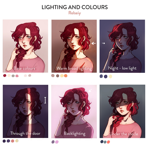
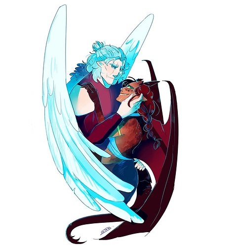
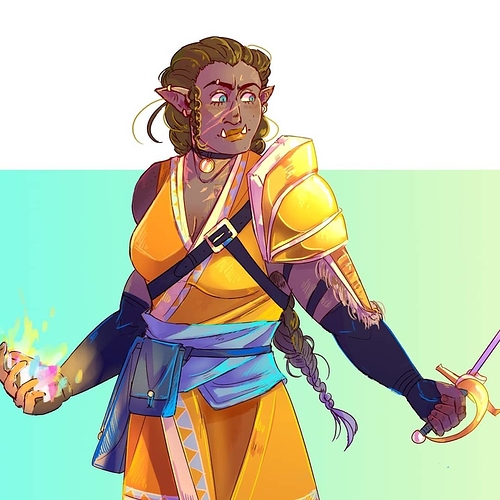
I see exactly what you mean for your character designs at the bottom. They all look like they come from the same world! Though they all have different colors, they have that unifying coolness about them that brings them together in a line up (also baller shoe designs) so your color exercises are definitely showing through! :purple_heart: (defiantly and definitely are just two of my many English grammar banes).

Thanks for sharing!!

You have a fantastic grip on working with a limited color palette that works for you and not against you! I love how in synch and well planned out your work looks from sticking to a limited palette where all the colors compliment each other. You ain't lying about how too many colors can overwhelm and cause one to take way more time than they have to complete a comic lol.

I love the control you exercise in your colors and yet it doesn't limit any of the emotion or atmospheric shifts in your work. Yeah painterly comics are gorgeous to behold. I freaking love Fiona Staples approach to digital painting when making the art for the Saga comic, but Yowza is that a level of color and form mastery something to marvel at. Painting and blending without making mud is that looming fear DX!

Thanks for sharing examples of your work and jus how much can be achieved through limiting your color choices :purple_heart:

That’s what’s up!! I know about that trouble with Grayscale. Like the most limited color palette there is and yet the shifts in contrast and values can totally make or break work done in black white and gray D:. I do love how in your comic Netvor, color is used to convey something important happening or a shift from the normal that’s done in grayscale. Clever A-F!

Yasssss I’m all about that!! Tools that make doing comics easier on us and fits with our styles is my jam!! I drag and drop my colors in Procreate by setting my line layer to reference and making sure I don’t have gaps in the line work. That lets me lay down flat colors pretty easy. I then use a brush to do my bubbly highlights and shadows. For any spots that were missed by the color fill I make a layer under the base and fill it in :D!

Ty for your insights Roses!!
:purple_heart:

The base colors all the remain the same and the colors I change are the ones in the multiply (shading) and Overlay (lighting) layers. Changing and constantly color picking base colors is time consuming and I only do it when I'm not getting the desired effect from the below technique and even when I do I just adjust the colors in the different color adjustment settings.

I had the process for this panel already saved to show a friend so I just added some notes to it, (hope you understand my handwriting lmao) but yeah my process is super simple mainly because I just can't spend that much time rendering, i love working more painterly too but it's not realistic for my comic.


Many of my comic episodes a scene based, so like every scene is an episode and I try to keep the color palette consistent throughout the scene and having the multiply + Overlay colors consistent really helps with that.

I made this ages ago but I think it's a good example of how different Mutiply/Overlay combos look (the base colors is the same in all of them):

It's just really simple and versatile, I often find myself being bored if the scene I'm drawing is in a well-lit room, like no dramatic shadows lol.

Thank you so much! Great suggestions! I can picture very well how adding more darkness in the corner in the fireplace panel could make everything more unified. It would also be good both for realism and composition of the panel itself.

This is such a nice thing to hear :slight_smile:
Thank you!

Ahhhh :heart_01: Ty for breaking it down into steps! I can read your writing just fine, I've seen far worse (mine lol).

Totally makes sense where you're coming from with the scene lighting too!

Gorgeous work and lovely examples. I really love the dramatic shift a shadow/light source can make,

I love talking about color and seeing what others do! I personally lean towards red color palettes myself because my story is dark and industrial. Red just feels correct.


...But I also really love color palettes that lean towards intense, deep blue feat. the sky or ocean!


...So yeah, I pick colors based on the mood of the scene! Simple but effective in my own art.

That cityscape painting is such mood. It's industrial, fast-paced, and you just know there is something going on that just ain't right. You can feel it in your bones. They are beautiful paintings and the contrast between the red and blue combined with the subject matter is such a shift in feeling and so dang neat.

Thank you for sharing!!
:purple_heart:

I love vibrant colors! That's why I usually pick mostly saturated hues for both coloring and shading. When it comes to shading I tend to use cyan at full saturation cause it leads to quite beautiful contrasts, specially when the characters have a warmer palette overall.


If cyan doesn't work too well with the piece I resort to either magenta or yellow, always lowering the opacity if it's the first.

Then I always take a lighter color and add highlights with a pencil like brush and the add layer mode. It really makes the details pop :yellow_heart:

Yasss I love the vibrancy in your color selections and the overlay of cool shadows or warm tones that have a hue to them depending on the colors present in each composition!

Totally feeling that method for highlighting details. Really brings depth to that cute sweater! I'm totally digging your character designs too. Lovely work :purple_heart: