10 / 11
Oct 2021

So I've been pretty happy with my art style wise but I can't help but feel like I could be doing more with colors. For example these are some pieces I've done somewhat recently where I've been messing around a little more with effects, filters and other overlays

Summary


The thing is I'd like to do more. I'm not looking to do some painterly or realistic style just stuff to make what i've already got going pop more. Some examples of what i'd like to incorporate into my own stuff would be like these

https://twitter.com/FAUNBUNS/status/144810536160974029311


https://twitter.com/Frejann_senpai/status/14466177542583541839

like the colors pop! it's hard to break down. i feel like speedpaints might help but something that goes at a pace where i can actualy kinda see whats happening

like thus far i've managed to see that coloring the lineart and adding shading and highlights can help but it's knowing when and where to place it all that's been driving me nuts. then there's like adding other colors that aren't complete opposites but kinda compliment what's already there and i just can't figure out how to hack it. i can see how it works in other folks art but figuring out how to add certain elements into my own is just not adding up

if anyones got recommendations for speedpaints or tutorials or whichever i'm more than open to check out links or if folks want to suggest any of their personal approaches to coloring stuff that's cool too. i just wanna get outta this weird rut i'm in :cry_01:

  • created

    Oct '21
  • last reply

    Oct '21
  • 10

    replies

  • 1.1k

    views

  • 6

    users

  • 21

    likes

  • 6

    links

Try skillshare (i think they have free options if you use certain codes or maybe discounted month or three ), i didn't use it myself but i see it on quite a lot of videos, so it should be okay

I don't think they're necessarily doing any special tricks with the painting or the software to make the colors like that (although the first link you showed, they most likely did put down a purple layer set to screen, soft light, or overlay to unify all the colors--but they may have just chosen those colors to start without any computer magic). I think instead they're planning out their colors before they start painting--like the 2nd link there, in particular, is really good at planning color harmony that feels like a lot of colors are happening, but when you study it, they're focusing on a few main colors and using slight variations of those colors to build form.

I can't think of any speedpaint for color theory off the top of my head, because they'll just go into it already knowing the plan, so you wouldn't see the step you're describing. Although, it may be nice to know how they maintain their neons if you're worried about your colors getting muddy.

When it comes to choosing color, what I like to do, is just like--steal the colors from people that do it well and analyze it close up (also keep the colors stored in my library so I can use them later in my own art)

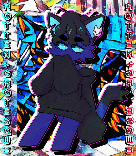
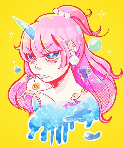
So like this image from your links, which at first glance seems complicated as hell:

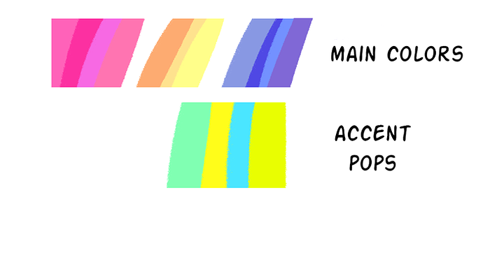
You can just take the color picker and see how many colors you get out of it saved to your library, and usually in pop art they'll reuse the same colors but in slightly different hues, and you can delete colors that are virtually the same. So after I did a bunch of choices in the color picker I get this:

And then you can blend it, since even after narrowing these down, they're still so similar I can just...simplify (also that green neon is virtually the same as the yellow neon so I'm going to ignore it for the sake of this study)

And then see a good idea of how it breaks down into color theory. The neutral orange/pink I think yellowed when I did the blur because my yellow stroke was so big, so you can see I went back in and chose one that's the more khaki to match the image before. But basically, they have a neutral pinky tan, offset by the purple/orange-pink in the character's hair--there's barely any green to detract from the purple orange, and when they use neons, it's an as accent.

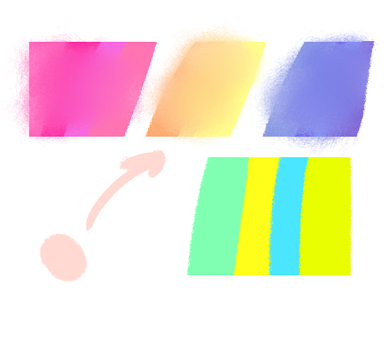
So before I do a piece, especially one that is more abstract and less based on realism, I like to start do a little test where I make like...a Rothko basically. This isn't an art school thing, PS--I have no idea why I started doing this, or when, I just do this. I make big squares of the main colors I like--and a tiny sliver of the accent, just to see if it works and vibes in a way that I like (and so like here's it laid out with the colors we just made)

It gives you a place where you can test colors before the big painting, and if you stick to the plan and don't stray too far from your original palate, changing tint or hue to define the form, the colors will always vibe together, you already tested them.

thanks for the breakdown and i'm definitely gonna try out that rothko thing. i used to work from palletes like that in the past but kinda stopped for whatever reason but i'll def be picking up again

coincidentally i'd actually used terada's art as a reference before when doing fanart of a vocaloid music video they'd worked on so i guess i'll be diving back into referencing and experimenting again

For me the two things that helped me with color is Marco Bucci's channel (especially the "10 Minutes" art series)

And James Gourney's Color and Light book, especially where he breaks down color harmony in his own terms. I believe they both talk about the same thing rajillustration pointed out, which is that you basically pick a few colors and stick with them; the more colors you pick, the muddier it gets, because they start shouting over one another. Now for me when I'm having issues with color, I usually go back and start paring down until I only have like, 5-6 for the entire scene, and then pick some accents afterwards.

some of the artists you'd listed i'd also been trying to find, par0llel especially for their speedpaints, but this helps a lot

big big thanks to the folks who helped explain things :cry_01::revolving_hearts: