1 / 13
May 2022


I’m a first time writer and my collaborator is relatively new to making comics so we’re just trying to see if the work we’ve done is good outside of our vacuum of excitement and enthusiasm.

Ravenwood is the story of Jet, a high school student with a double life. By night Jet fights crime along side infamous vigilante The Raven. By day he attends Ravenwood Prep. with his childhood friends Kara and Roy. How long can Jet keep his secret? Will his double life lead to him losing everything?

  • created

    May '22
  • last reply

    Jun '22
  • 12

    replies

  • 748

    views

  • 4

    users

  • 16

    likes

  • 2

    links

Overall, I think this was a good start. The characters are well-drawn and story seems simple enough to follow. And even though Jet wasn't featured for that long, he had a lot of personality. There are things that I do think weaken the overall result of the comic however, and I'll split them into art critiques and writing critiques.

Art

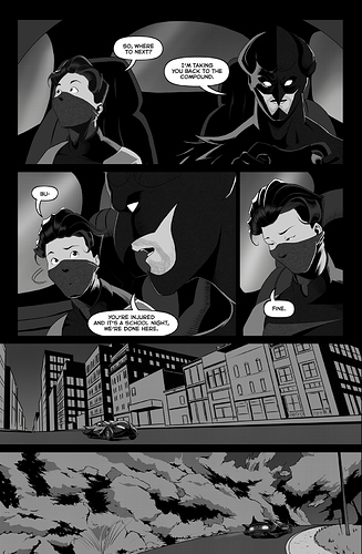
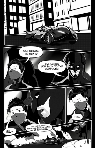
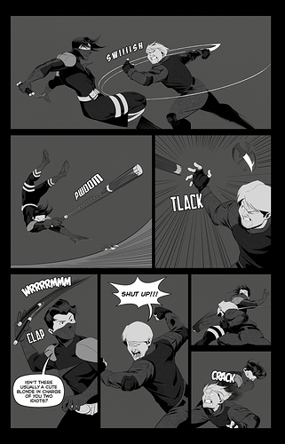
Let's start with art. The first things that stick out to me are the speech bubbles. They're too small. I read the episode on mobile and I had to pause and strain to read much of the text. Now I understand that it's partially a stylistic choice, since all of the bubbles are contained to the panels they correspond to, and also a formatting choice, since the comic is in page format. The thing is though, Tapas as a platform very much favors readability, so if one of your goals is to have the comic be some degree of popular, it's going to be a big turn off to readers if they can't see what they need to read. And it's not as though there's not enough room for bigger bubbles, the first panel features a cityscape establishing shot with plenty of open space to put text. So whatever font size it being used right now, increased by at least two or more: ex. 10 ----> 12 or 12 ----> 14.

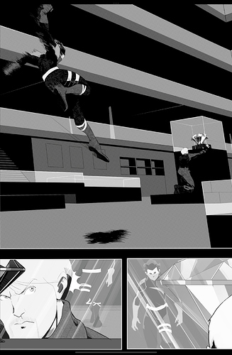
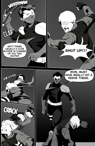
Speaking of open space, the backgrounds are so bare. It looks like they were given up on. I understand wanting to get things done in a timely fashion and I'm not knocking the use of 3D models, but the background look like they're in a separate world from the characters. The characters have these harsh, flat black shadows and stark white highlight that are missing from the background, as if the only things that cast shadows and reflect light are the characters in the scene. The clothing has a slight bit of texture to it, but the walls and floors are bare and smooth. More texture needs to be added to the background; there should be trash in the alleyway and things on the walls. Things also mostly stay in the dark gray tone, and yes it's nighttime, but the lack of contrast makes things, characters, blur and fade into the background. Things lose impact if the art lacks contrast. Urie got punched but it was hard to tell because, one: there were very little action lines, and two: most importantly, Jet's gloves (and mask) are the same color as the background.
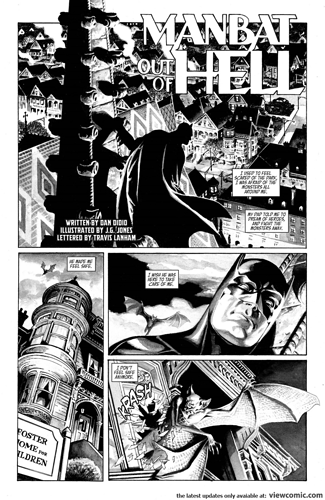
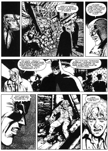
I want you and the artist to look at high contrast black and white comics, to learn from them. This doesn't mean abandoning the gray tone it just means incorporating what you do on the characters into the background so things look more cohesive. Here are some images I pulled for b/w Batman comics:

Lastly, the positioning of the 'camera' is too far! It's so far way at times resulting in little variety in panel compositions and a supreme sense of flatness. If this it going to be a gritty action comic, you need to get down and dirty with your choice of shots. Again, Urie got punched (and kicked) but both actions from Jet left little impact because of the choice of angle. If we were closer to ground and to Urie when he got kicked, I would have felt it. If we were behind Jet's shoulder when he punched Urie, I would have felt it. I make an action comic as well, I know how hard it is to come up with clear and interesting angles to show action from, but don't let the artist rest on their laurels; they need to experiment and refer to other action content whether that be movies, shows, or other comics, to make at least the action scenes more interesting.

Writing

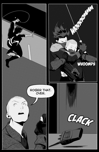
There isn't really much to say about writing since this is the first episode of the first chapter. But what I will say is more of a personal grievance. It's a matter of showing versus telling. In a effort to show the reader that Poval is an idiot, we were told what the plan was and how it was going to be executed unnecessarily. To an extent I get it, the plan didn't go the way they expected with Poval's grappling hook snapping and him bein knocked unconscious, but the opening panels easily could've been cut in lue of just starting with them speechlessly ziplining to the building and then upon them descending to the lobby having a conversation showing the dichotomy between the characters and still ending with Poval's grappling hook snapping. That way we are both shown the plan and shown characters interactions.

Honestly, there are other specific things that are getting to me with some panels, but that'd bee too nitpicky, so I'll leave it at that. Again, overall good work. It's just a matter of polish and details and tightening up the script.

Edit: I didn't realize there was more than one episode, my mistake. Think of this as a general critique that comes from what I noticed on the first episode. :sweat_02:

Hi there!
Nice webcomic you have there!

As you asked for feedback, I gonna writte a bit here. Divided on writter and drawings, as two people do those things~

1.-Writting: The good - Good pace and understanding of time on the page/scene. Characters don't tend to speak more than needed, and that's good because on hero comics is very easy to fall on the cliche of the banter. Here it feel natural and fluid, so good for that.
The bad - There are things that are better shown than explained. Been in charge of the script as your only job doesn't mean that you must put text on every page to justify your job, because all the action taken by the characters is your decision, they don't need to speak it. I mean that as the first pages of chapter one, when instead of explaining the whole operation, the characters could have just entered, looke a bit more profesional, and then Povel falls and everyone start interacting and we understand that they are not that good in their job.
Even with that, chapter 2 and 3 are very well developed, and if people get over chapter one, they might subscribe to see what else will happen.

2.- Drawing: The Good - Great understanding of body muscles, and movement. You even know how to make a nice character on weird angles, as high and low angles. Another good detail is the position of bubbles. I never had to ask myself where to read, and that helped a lot with the pace of the comic. The first 'uhh' from Povel was a bit little, though, but nothing that will make someone stop reading.
The Bad - You tend to forget about backgrounds and just add a line to make the horizon level. I don't know if you use CSP, or another program, but on CSP you can use 3D models as background, and then transform them into vector lines, or make them yourself. Its way easier than drawing by yourself, and it adds a lot of detail to something that you don't want to -like doors, I mostly saw a hole and that was it. The line as horizon is way noticeble specially when you used too many times in a row, like when Jet was kicking Uriel in the ground. A change of angle would had helped that, or less panels, or just a 3D model. One last thing, about panels, try to add more dinamyc panels, like turning them some degree, or vertical gutters to express more action, or forget the panel and make the characters on open space in some key panels. It will do wonders in the dynamic of your pages once you start looking at them as a whole. Now if you decided to make them linear as a artistic choice, then don't mind me.
Last thing, nice Spiderman reference on chapter 1-2.

Read the first 3 episodes and here is my take.
Art: It's good but boring. The action scenes are well drawn but they is no sense of movement. Speed lines would do wonders for you. I like toned artwork and you have done a good job with it. I would put some gradients to the backgrounds and not have them a single color. I personally don't have a problem with limited backgrounds. Focus on the action and leave the backgrounds to establishing shots.
Story: There really isn't one. It's borrows heavily from Batman, so it seems you are counting on people knowing the tropes of the bat world. Naming the goons I don't see as needed unless they are going to be a common feature of the book. The dialogue was fine (I read this on a computer so I didn't have a problem of small font. But your average webtoon reader reads on a phone so be careful with that.).
Overall: I think dragging out a heist over your first three episodes is a mistake and I got very little information what this book is about. You have a setting but not a story. I don't feel a need to read this as it's a little generic and nothing grabs my attention.

I really appreciate you taking the time to read the comic and give such a detailed critique you put a lot of care into everything you said and I completely understand and integrate it into the comic going forward!
Thank you so much​:grin:

15 days later

You should be proud the new layouts are better, but unfortunately I do have a small things to say about them.:sweat_02:

When it comes to deciding which panels should be more dynamic, I would recommend having action scenes (verbal fights, physical fights, etc.) with more slanted and sharply shaped panels and keeping talking-head scenes, and general scenes with subdued action and subdued emotion more boxy and stable. I see that there is a slight slant in the panels of the second batch of pages, but the slants are more severe in the first batch where the two character are just having a conversation. I'm not saying change that page as of now, but keep that in mind for future pages. Also speech bubbles, keep the text centered and ensure that the words have enough space in the bubble, meaning that they don't touch or come close to touching the edge of the bubble. One more thing, (this is just something I like to do) layer your speech bubbles when characters interrupt each other. So have the words cut off when the first person speaks, and then that bubble ins overlapped with the next bubble of whoever is interrupting them. It just reinforces what happens in the scene, one person's words getting cut off and over shadowed by another person's words.

Like I said you and your partner should be proud. You've made good changes making the action easier to following the comic more appealing to look at. It's just a matter of polish and paying attention to details. Anyway, good work!

10 days later

Thank you so much for all the help and feedback! It will result in a better end result for sure !

1 month later

closed Jun 29, '22

This topic was automatically closed 30 days after the last reply. New replies are no longer allowed.